Adding Services to Grocery for Mac with Catalyst and AppKit

The two things I was most excited about while sitting in the audience for the WWDC 2019 keynote were the hotly anticipated encore for the Mac Pro tower computer, and the hotly debated introduction of the Catalyst framework for building Mac apps with UIKit. As a life long Mac user, and previous owner of earlier Mac towers, the introduction of the newest (and perhaps final) giant tower Mac was super exciting. But in some ways, the introduction of Catalyst was more meaningful to me personally as an engineer. Even though I've used a Mac for my entire life, and been programming since high school, I had never built an app for the Mac before.

So when I set out to build a version of my app Grocery for the Mac I knew from the beginning that I wanted it to be as Mac-like as possible. That meant menu bar menus full of keyboard actions, arrow key navigation for lists, right click context menus, expected features like open recent files, and adopting the Mac look and feel with translucent sidebars, a native Mac layout, and supporting system Dark mode and accent colors.

Honestly, getting Grocery to work the way I wanted it to with Catalyst was a lot easier than I thought it would be. Almost all of the work necessary was work I already had to do to build a great iPad app. Everything past that point, like supporting the menu bar, translucent sidebar, accent colors, dock actions, file open menus, etc. fell into place one piece at a time in a fairly orderly fashion.

But this isn't actually an article about Catalyst itself. Rather, this is an article about the final step in the process to Mac-ass the hell out of Grocery by publishing actions to the Mac services menu.

That step started when I re-read an excellent article by Steven Troughton-Smith called Beyond the Checkbox with Catalyst and AppKit. I had read the article over a year ago, and in hindsight it's incredible to me that Steven wrote this literally the first week that Catalyst was announced. Despite reading it a few days after he wrote it, I really needed to go through the process of getting my app ready for the Mac before I was able to really appreciate the additional power it contains. Here's what it let's you do.

What Steven describes in that article is how developers can create an AppKit plugin for their UIKit app running on the Mac. Normally, the UIKit part of a Catalyst app has no access to AppKit and thus can only interact with the parts of the Mac that Apple exposes through the Catalyst layer. But sitting behind all of that is AppKit itself, and the plugin system is the key to unlocking it.

The process of creating a plugin has a few hoops to jump through. The plugin is a bundle that is built and embedded in the target app at compile time. The bundle contains essentially whatever code you want it to. I called my bundle "Catalyst Bundle" and called its primary class "Catalyst App".

class CatalystApp : NSObject, CatalystDelegate {
    weak var callback : CatalystCallback?
}

The next step of the process is to actually load the bundle in your iOS app so that you can use it to talk to your plugin. Our bundle knows the name of its principal class, and also knows some information about its type (thanks to the Objective-C runtime). In my case, my principal class is a subclass of NSObject that conforms to an Objective-C protocol called "Catalyst Delegate". That way, I can create an instance of my principal class and cast it as a Catalyst Delegate. By storing a reference to that object in my app, I can treat it as a delegate to access functionality provided by the plugin.

class CatalystBridge {
    static func loadDelegate() -> CatalystDelegate? {
        #if targetEnvironment(macCatalyst)
        guard let url = Bundle.main.builtInPlugInsURL?.appendingPathComponent("Catalyst Bundle.bundle") else {
            return nil
        }
        guard let bundle = Bundle(path: url.path) else { return nil }
        guard bundle.load() else { return nil }
        guard let catalystBundle = bundle.principalClass as? NSObject.Type else { return nil }
        guard let delegate = catalystBundle.init() as? CatalystDelegate else { return nil }
        return delegate
        #else
        return nil
        #endif
    }
}

One other note about the bundle and protocol. I tried creating a Swift protocol of various forms (conforming to Class, NSObjectProtocol, etc.) but I was not able to get any of those protocols to work like this. Therefore, I resorted to declaring the protocol in Objective-C and including it in an Objective-C Bridging Header in both the plugin and my app target.

@protocol CatalystDelegate <NSObject>

- (void)setCallback:(nullable id<CatalystCallback>)callback;
- (void)setProxyIconFileURL:(nullable NSURL *)url;
- (void)setDockTileImageURL:(nullable NSURL *)url;

@end

Steven's article talks about all of the crazy things that an AppKit plugin like this lets you do. The first ones I tried involved overriding NSApplicationDelegate lifecycle methods. I wanted my app to quit after you closed the window: there's a delegate method for that. I experimented with changing the Dock tile, adding Dock menu actions, and adding a proxy icon in the title bar for the open Recipe file. I'm not shipping any of those changes yet because I didn't get everything to work the way I wanted to, but I am shipping the last thing that I tried which is publishing Services actions to the Services menu.

Services have been around on macOS X since the beginning, or close to it, but I only started using them personally fairly recently. Services are actions that operate on a type of content. The most common content types are text, images, files, and website URLs. I've created several services that operate on images and files as productivity tools. One of my favorites is a service to convert HEIC images into JPEGs (which should probably be built into the system at this point). I've got a few others for dealing with common types of files I use at work. When I saw Steven's mention of Services at the end of his article I knew I had to at least try it so I jumped in.

Trying to find documentation about how to define a Service action is virtually impossible. The most common search results all pertain to what we think of as "services" today, like iCloud or Apple Fitness+. The next most common search results are for user-facing ways to use Services, like Macworld and iMore articles for power users. The Apple tutorial for Services and this 2017 article by Kelvin Ng were the best documentation that I found but they still weren't enough to get everything working correctly for me. I'll try and fill in some of the missing pieces below.

A service definition starts with an entry in the Plist file. This is certainly where the bulk of Apple's documentation focuses, and most of it is pretty helpful. Under the NSServices key there's an array of service dictionaries. The most important keys in each service are the NSMenuItem, which defines the title of the service, the NSMessage, which defines signature of the method that will be called to activate the service, and the NSPortName, which is just the name of the app.

The other 3 keys that I made use of are the NSRequiredContext, NSSendTypes, and NSReturnTypes. The first lesson I learned is that NSRequiredContext needs to be defined with an empty dictionary before the service will appear at all - so that's step one. NSReturnTypes is only required if you plan on building a service that modifies data and sends it back, so if your service is only used for sending data from another app into yours then you can ignore that one.

<dict>
    <key>NSMenuItem</key>
    <dict>
        <key>default</key>
        <string>Add Items to Grocery List</string>
    </dict>
    <key>NSMessage</key>
    <string>addToList</string>
    <key>NSPortName</key>
    <string>Grocery</string>
    <key>NSRequiredContext</key>
    <dict/>
    <key>NSSendTypes</key>
    <array>
        <string>NSStringPboardType</string>
    </array>
</dict>

NSSendTypes was the trickiest for me to figure out. For text based services you only need to put NSStringPboardType in here. But I had trouble finding the right send types for a service I wanted to make that operated on files. I tried a few things that didn't work, but in the end I ended up checking the Info.plist file for BBEdit to see how they defined their "Open File in BBEdit" Service. They provide both the public.file-url and public.utf8-plain-text send types, which is what I ended up using for my Service (and so far is working great).

<dict>
    <key>NSMenuItem</key>
    <dict>
        <key>default</key>
        <string>Send Recipe to Grocery</string>
    </dict>
    <key>NSMessage</key>
    <string>importRecipe</string>
    <key>NSPortName</key>
    <string>Grocery</string>
    <key>NSSendTypes</key>
    <array>
        <string>public.utf8-plain-text</string>
        <string>public.file-url</string>
    </array>
    <key>NSRequiredContext</key>
    <dict>
        <key>NSTextContent</key>
        <array>
            <string>FilePath</string>
        </array>
    </dict>
</dict>

Back in my Catalyst App plugin class, I have a function that gets called after the app starts up that registers itself as the NSApplication's servicesProvider. By registering as the services provider I'm telling the system what class to send messages to when a service is activated.

extension CatalystApp {
    func setCallback(_ callback: CatalystCallback?) {
        self.callback = callback

        NSApplication.shared.servicesProvider = callback == nil ? nil : self

        NSUpdateDynamicServices()
    }
}

That also means that I need to implement methods on my Catalyst App class for each of the services that I defined in my Info.plist file. The method is named with the value I provided in the NSMessage key of my Info.plist file, and is passed 3 parameters: an NSPasteboard, a userData string, and a pointer to an error that can be displayed in the console if something goes wrong.

Since these have to be Objective-C compatible methods for the services system to send messages to them, I had a few hoops to jump through to implement them in Swift. Here's an example of what one of them looks like for the "addToList" Service that adds the selected text content to the grocery list.

@objc func addToList(_ pboard: NSPasteboard, userData: String, error: NSErrorPointer) {
        if let string = pboard.string(forType: .string) {
            callback?.didReceiveAddItems(toList: string)
        }
    }

Getting data out of the pasteboard and putting it back into the pasteboard is pretty much the same as it is in UIKit. The only two issues I ran into here were that the string representation of a fileURL needs to actually be converted into a real URL using the URL(string:) initializer before you can read it. Otherwise it's not useful.

@objc func importRecipe(_ pboard: NSPasteboard, userData: String, error: NSErrorPointer) {
        if let path = pboard.string(forType: .fileURL) {
            callback?.didReceiveAddRecipe(toGrocery: path)
        }
    }

The other issue was that adding items to the clipboard using setString: didn't actually do anything. I had to call clearContents() on the pasteboard first and then use the writeObjects method to add content back before it would actually replace my selected text in another app.

@objc func cleanUp(_ pboard: NSPasteboard, userData: String, error: NSErrorPointer) {
        if let string = pboard.string(forType: .string) {
            let returnText = callback?.didReceiveCleanUpRequest(with: string) ?? string

            pboard.clearContents()
            pboard.writeObjects([returnText as NSString])
        }
    }

The final piece of the puzzle for me was creating another delegate protocol for my plugin to communicate back to my iOS app to tell it when the Service received a new request. I created this as another simple Objective-C protocol to share with the same header file that I used earlier, and made my iOS app's app delegate conform to it. Now my plugin can send action requests and lifecycle events back up to my iOS app that it can pass through the appropriate methods that it already has access to. That works out nicely because all of the Services I created already map closely to NSUserActivity-based Shortcuts that my app supports, so the necessary code to handle them already exists.

@protocol CatalystCallback <NSObject>

- (void)didReceiveAddItemsToList:(nonnull NSString *)text;
- (void)didReceiveAddRecipeToGrocery:(nonnull NSString *)path;
- (void)didReceiveCreateRecipeWith:(nonnull NSString *)text;
- (nonnull NSString *)didReceiveCleanUpRequestWith:(nonnull NSString *)text;
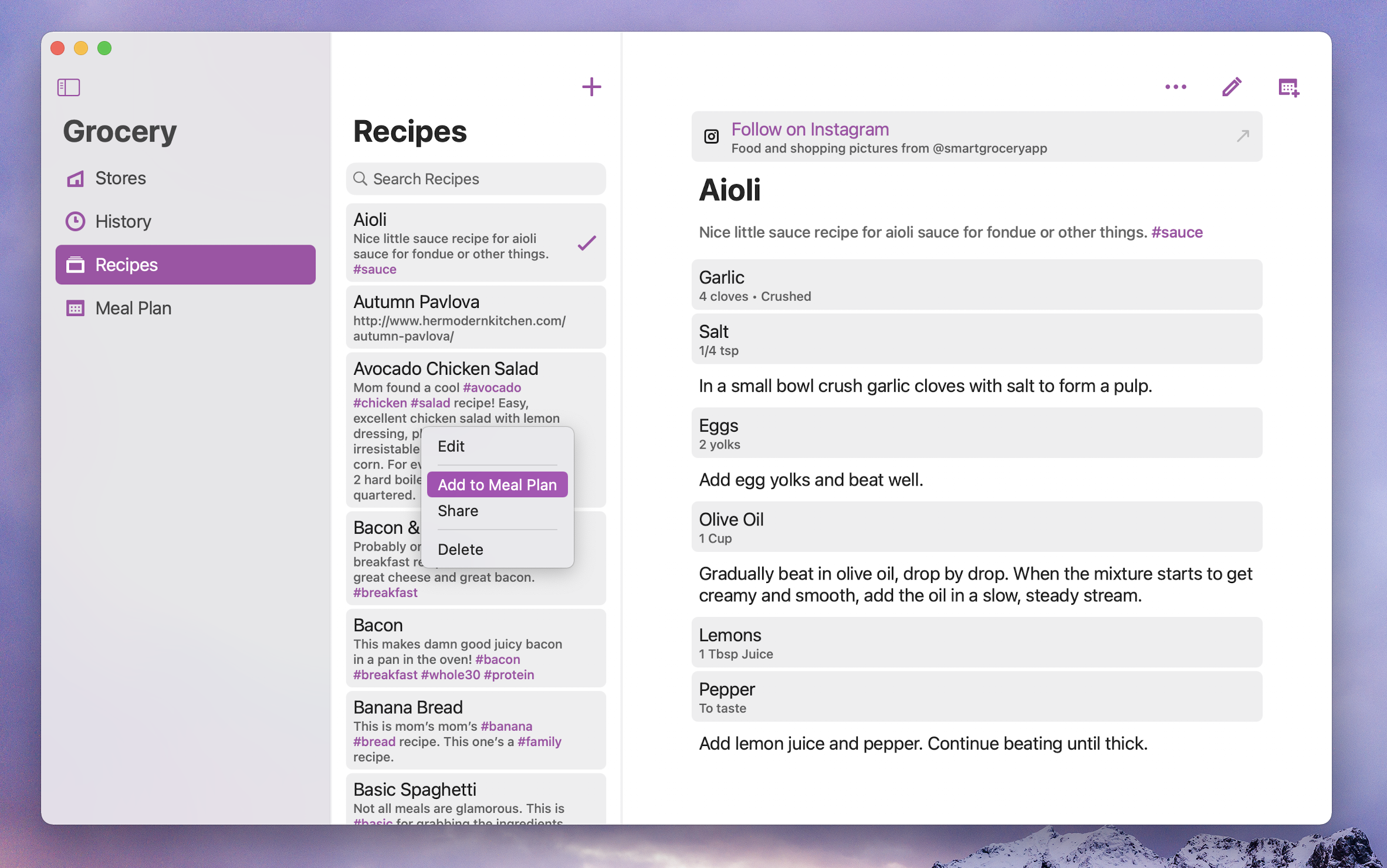
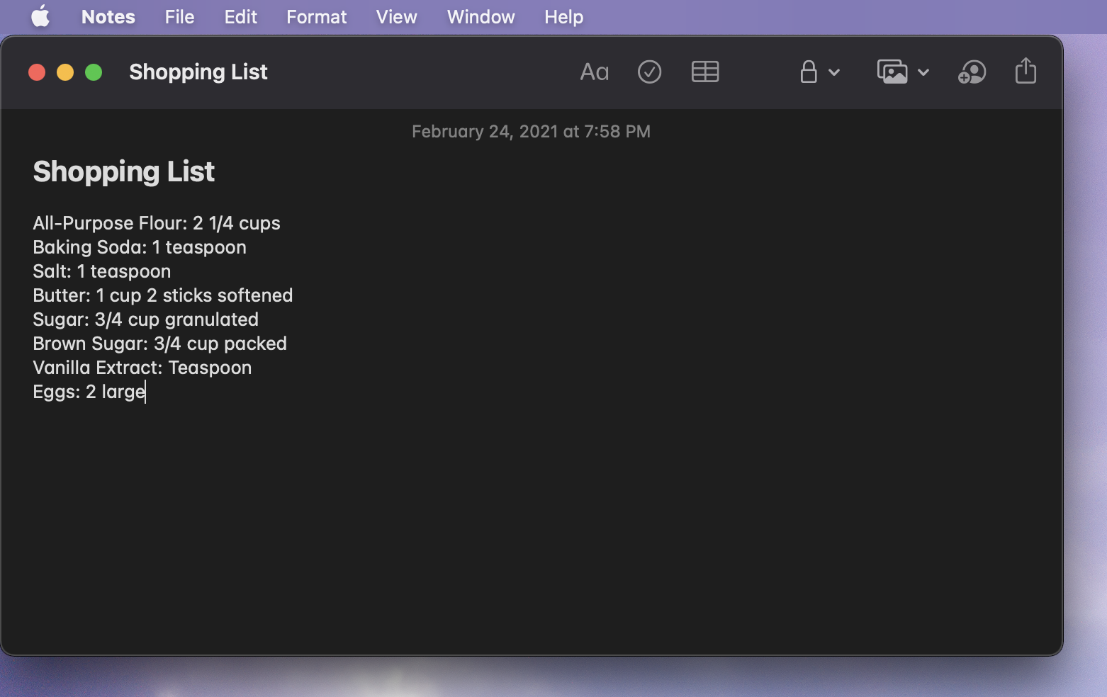
@end

The end result for Grocery is 4 different Services that provide access to some of the most important features of the app:

  • Add Items to Grocery List - add selected text separated by newlines to the current grocery list
  • Clean Up Items using Grocery - modify the selected text using Grocery's CleanUp feature to prettify text
  • New Recipe with Selection - start a new recipe with the selected text
  • Send Recipe to Grocery - import a plain text file containing a Recipe into Grocery
Screen Shot 2021-02-24 at 7.58.18 PM.png

Unmodified Text

Screen Shot 2021-02-24 at 7.58.39 PM.png

Selected Service

Screen Shot 2021-02-24 at 7.58.46 PM.png

Cleaned Up Text

I'm really happy with how these Services turned out. I doubt this is a feature that many users would have asked for, but for me that wasn't the point of trying to build it. I just wanted to prove to myself that it was possible to build something supremely Mac-like in my Catalyst-based app, and I'm very happy to report that it is. And even more importantly to me, this brief little forray into AppKit has me even more excited about continuing to add more Mac-ness to Grocery in the future so that it will continue to be as Mac-assed as it possibly can be.

State Driven Development - The Beauty of Enums in Swift

State Driven Development

Like many developers, I noticed enums pretty quickly after I started programming in Swift. I had used enums in other programming languages too, but they had never been as exciting to work with and use as enums in Swift. I remember reading this blog post by Casey Liss a few years ago and feeling the exact same excitement enums. Enums in Swift are awesome and fun to use!

The more I use enums in Swift, the more convinced I am that enums are so valuable that they're worth designing software around. We have terms like object oriented programming and protocol oriented programming for describing how we design software around types. How we design software around enums is just as important and useful. I think of designing software around enums as State Driven Development, and that's what I hope to describe here.

But the story of state driven development doesn't start with enums. We need to start with a different programming tool that we're all even more familiar with. It's something that we probably use every day while writing code.

That of course, is BOOL. Specifically BOOLs used as instance variables that represent the state of an object. It's actually a tool that we use ALL the time. We define these properties on objects we create ourselves, often out of convenience, or we set these properties on other objects that we interact with.

var instanceVariable : Bool


So how often do we use BOOLs? We can use a regular expression to search our Xcode project for this pattern to see what all of the examples look like.

// Regex for boolean state
// Match Bool typed vars that aren't computed properties
var.*:.*Bool(\n|.*=.*)
var.*=\s?(true|false)


In the project find navigator in Xcode, select Regular Expression from the dropdown and enter the pattern you want to match. If your project is anything like mine you'll probably be pretty surprised at what you find! Below are some of the examples I found in my app Grocery.

var active : Bool
var contentLoaded : Bool
var dataLoaded : Bool
var editing : Bool
var enabled : Bool
var expanded : Bool
var handlingTouches : Bool
var hasTakenUserAction : Bool
var isCompleted : Bool
var isRunning : Bool
var lastTouchedButtonSide : Bool
var lastTouchedRightSide : Bool
var notified : Bool
var previewEnded : Bool
var saved : Bool
var started : Bool


Some of these seem fairly clear in terms of what they mean and when they should be true or false. But the problem with BOOLs is that it's not always clear what they mean. How often do their values change and who is responsible for changing them? How do different BOOLs relate to each other? For example: when one BOOL is true, should another BOOL be false?

Starting a workout

Let's go through an example together. We're working on an app for tracking workouts. The app has one purpose: to allow the user to track a workout. When the user opens the app they can always start a workout. Imagine there's just a giant button that says "start workout". So we write a function that starts a workout when the button is tapped.

func startWorkout() {
    // ...
}


This works great, but later on we realize our app can start two workouts if the button is tapped twice. How do we prevent that?

One variable

We add a BOOL to represent whether or not a workout is in progress. Now we can guard against starting a second workout if the first one hasn't finished.

var workoutInProgress : Bool = false

func startWorkout() {
    guard workoutInProgress == false else {
        return
    }

    workoutInProgress = true

    // ...
}


This also works great, for a while. But then we realize there's another requirement missing from this method. If a user hasn't logged into the app yet then we won't be able to save their workout.

Two variables

To prevent that from happening, we add another BOOL to track whether or not the user has logged in. We expect this property to be set to true when the user logs in, and we add another case to our guard statement to make sure it's still true. Now the user has to be logged in to start a workout, and we can only have one workout running at a time.

var hasLoggedIn : Bool = false
var workoutInProgress : Bool = false

func startWorkout() {
    guard hasLoggedIn && workoutInProgress == false else {
        return
    }

    workoutInProgress = true

    // ...
}


This is getting pretty complicated though. First, we need to trust that something will set hasLoggedIn to true. We also need to set workoutInProgress back to false at the end of the workout, or we won't be able to start another workout later. The potential for bugs to creep in has gone up quite a bit just from adding one more variable.

Now we receive another requirement for our start workout method. We want to prevent starting a new workout while we're in the middle of saving the prior workout so we add a new variable to track if we are currently saving a workout.

The tangled web of state

This is where the web of state starts to get very tangled. First we set workoutInProgress equal to false since we've stopped tracking the workout, but saving the workout is an asynchronous task, so we set the savingWorkout variable to true when we start saving, and back to false when we finish saving.

var hasLoggedIn : Bool = false
var workoutInProgress : Bool = false
var savingWorkout : Bool = false

func stopWorkout() {
    workoutInProgress = false
    savingWorkout = true

    saveWorkout { (success) in
        self.savingWorkout = false
    }
}


Back in our start workout method, we need to add a third case to our guard. The user still has to be logged in, and they can't start a workout if there is a workout still in progress or being saved.

var hasLoggedIn : Bool = false
var workoutInProgress : Bool = false
var savingWorkout : Bool = false

func startWorkout() {
    guard hasLoggedIn && workoutInProgress == false && !savingWorkout else {
        return
    }

    workoutInProgress = true

    // ...
}


But that's turning into a really long guard statement. There's a lot that we need to remember to do as programmers to make sure that all of these state variables operate the way that this function expects them to.

Valid and invalid states

So here's what's crazy about this. We have 3 BOOL values, but by combining them together we can represent 8 completely distinct states, even though only 4 of them are actually valid states for our application to be in.

var hasLoggedIn : Bool
var workoutInProgress : Bool
var savingWorkout : Bool

These are the four combinations of values that are actually valid. They follow the user's expected path through the application. The user logs in, starts a workout, and saves the workout.

  • User Not Logged In, No Workout, Not Saving
  • User Logged In, No Workout, Not Saving
  • User Logged In, Workout In Progress, Workout Not Saving
  • User Logged In, No Workout, Workout Is Saving


But with BOOLs we can represent combinations of values that shouldn't be possible. These four combinations represent potential bugs. They are states we could accidentally find ourselves in if we fail to update our BOOLs correctly. Something like the user not being logged in, but still having both a workout in progress and another workout being saved.

  • User Not Logged In, Workout In Progress, Not Saving
  • User Not Logged In, Workout In Progress, Workout Is Saving
  • User Not Logged In, No Workout, Workout Is Saving
  • User Logged In, Workout In Progress, Workout Is Saving


This is the perfect case for creating an enum. We have four valid states that we've identified, and we know that our object should only ever be in one of these states. We need to construct an enum that shows exactly which of those 4 states our object is in.

These are our four valid states:

  • Hasn't logged into the app yet
  • In the middle of a workout
  • Saving the last workout
  • Idle


And here's what they look like as an enum:

enum WorkoutApplicationLifecycle {
    case notLoggedIn
    case workoutInProgress
    case savingLastWorkout
    case idle
}


By using an enum instead of multiple BOOL values we've actually made the invalid states impossible to represent in code. That's going to make an entire class of bugs impossible to write, because we can't cause our app to be in a state that can't be represented.

But our job isn't done yet. Even though we've created an enum to accurately describe the state of our object, we still have to update our code to ask specific questions using the enum we’ve defined.

Asking specific questions

The question we're trying to ask in our guard statement is: "Can I start a workout? 🤔" But that's not what the code here is asking yet. The question it's asking is actually pretty vague. These three variables are describing the state of the object. They're intended to answer questions like whether or not the user has logged in. They weren't designed to answer questions about starting workouts.

var hasLoggedIn : Bool = false
var workoutInProgress : Bool = false
var savingWorkout : Bool = false

func startWorkout() {
    guard hasLoggedIn && workoutInProgress == false && !savingWorkout else {
        return
    }

    workoutInProgress = true

    // ...
}


We can improve the code by referencing our lifecycle enum. The idle case happens to be the only case where we can start a workout, so technically this code will work. But we're still comparing two values to see if they’re equal instead of asking a specific question about starting a workout.

var lifecycle : WorkoutApplicationLifecycle = .notLoggedIn

func startWorkout() {
    guard lifecycle == .idle else {
        return
    }

    workoutInProgress = .workoutInProgress

    // ...
}

Extending enums with variables!

Fortunately, Swift gives us a great way to ask more specific questions and implement custom behavior with our enums. We can extend our lifecycle enum with a variable that answers the question: can we start a workout? We know that the app should only start a workout in the idle case, so we return true there and return false for the other cases.

enum WorkoutApplicationLifecycle {
    case notLoggedIn
    case workoutInProgress
    case savingLastWorkout
    case idle

    var canStartWorkout : Bool {
        get {
            switch self {
            case .notLoggedIn, .workoutInProgress, .savingLastWorkout:
                return false
            case .idle:
                return true
            }
        }
    }
}


Here's what using our new canStartWorkout extension looks like in the guard statement.

var lifecycle : WorkoutApplicationLifecycle = .notLoggedIn

func startWorkout() {
    guard lifecycle.canStartWorkout else {
        return
    }

    lifecycle = .workoutInProgress

    // ...
}


Our stopWorkout method also sets our lifecycle correctly to indicate when the app is saving a workout and when the app is back to being idle.

var lifecycle : WorkoutApplicationLifecycle = .notLoggedIn

func stopWorkout() {
    lifecycle = .savingLastWorkout

    saveWorkout { (success) in
        self.lifecycle = .idle
    }
}


This way, our enum cases can cleanly represent state, and our enum extensions can clearly describe the questions that our enum is able to help answer.

Avoiding direct case comparison


Here's another example of why it's best to avoid direct case comparison with enums and implement extensions to answer specific questions. Consider a collection of possible activity types. We have an ActivityType enum that enumerates running, walking, and yoga activities.

enum ActivityType {
    case running
    case walking
    case yoga
}


There are plenty of questions that the activity type can help us answer. One of them is whether or not to start the GPS system. Let's say that we only want to use GPS for running workouts. We check if our activity type is equal to running, and turn GPS on or off.

if activityType == .running {
    gpsProvider.start()
}

if activityType == .running {
    gpsProvider.stop()
}


Eventually we decide to use GPS for walking workouts too, so we update our first if statement to support walking. But we forgot to update the second if statement, and now our app has a bug because we won't turn GPS off when the user stops walking.

if activityType == .running || 
   activityType == .walking {

    gpsProvider.start()
}

if activityType == .running {

    gpsProvider.stop()
}


When we check for equality between two enum cases, we lose the opportunity to create a single source of truth for state driven behaviors. Let's say we wanted a hiking activity to support GPS as well. Wouldn't it be nice to have one place to make that change?

The question we're trying to ask is whether or not our activity type supports GPS. We can extend our enum with a variable to answer that question, using its own cases to customize the behavior. Whenever we're ready to add hiking, we'll just have one change to support GPS.

enum ActivityType {
    case running
    case walking
    case yoga

    var supportsGPS : Bool {
        switch self {
        case .running, .walking:
            return true
        case .yoga:
            return false
        }
    }
}

if activityType.supportsGPS {
    gpsProvider.start()
}


It's important to consider how enum extensions can help us describe custom behavior and answer specific questions about the state of our objects. Once we start thinking about specific questions, we can start extending our enums to help provide specific answers.

There are lots of questions we might want to ask our enums that aren't inherently answered by the names of specific cases. Nothing about the name of an activity type describes if it should support GPS. Adding an extension for that specific question is how we describe that custom behavior.

The best rule of thumb here is that any time that a program needs to use state to answer a question, there should be enum extension to help answer it.

Extend enums with functions!

We can also extend enums with functions so that we can take different actions depending on the state of the object.

Back in our original example, we've defined an action taken method on the enum that accepts a reference to the view controller. The enum can then take advantage of the view controller’s public API without having to know anything about its internal structure. The view controller exposes start, stop, and save methods that our enum can use.

enum WorkoutApplicationLifecycle {

    // ...

    func actionTaken(from viewController : WorkoutViewController) {
        switch self {
        case .notLoggedIn:
            viewController.login()
        case .workoutInProgress:
            viewController.stopWorkout()
            viewController.saveWorkout()
        case .savingLastWorkout:
            break
        case .idle:
            viewController.startWorkout()
        }
    }
}


What's nice about this is that the logic for what to do when the button is pressed is entirely encapsulated in the thing that describes the possible states of the button. All we have to do when we want to change behavior is change the options described by that enum case.

It may seem strange to literally pass something like a view controller to a function on an enum. Should the enum actually have access to something that substantial? I like this pattern for a few reasons. First, the dependency is explicitly created because the view controller is passed as an argument to the function, rather than implicitly accessed as a property. Second, the enum can't hold onto the view controller, so it can only use it's API inside of this specific function. It ends up being a safer way to reuse code than many other types of less-specific dependencies.

Our view controller benefits from this encapsulation too with a very clean IBAction implementation.

@IBAction func didTapActionButton() {
    lifecycle.actionTaken(from: self)
}


Describing custom behavior

We can keep extending our enum to describe more behaviors. We can ask the state for the answers to questions like what the title of an action button is, or what background color to use.

enum WorkoutApplicationLifecycle {
    case notLoggedIn
    case workoutInProgress
    case savingLastWorkout
    case idle

    var canStartWorkout : Bool
    var actionTitle : String
    var backgroundColor : UIColor
    var barButtonItems : [UIBarButtonItem]
}


In this example, the enum knows what the state of our lifecycle is, so it can return the correct action title for each state.

enum WorkoutApplicationLifecycle {
    var actionTitle : String {
        get {
            switch self {
            case .notLoggedIn:
                return "Sign In"
            case .workoutInProgress:
                return "End Workout"
            case .idle:
                return "Start Workout"
            default:
                return ""
            }
        }
    }
}


Note: It's important to be careful using default switch statements, because the compiler won't warn us when new cases are added to our enum. I typically avoid using it unless absolutely necessary, even when only one case needs to return a different value.

We can also return different background colors for different states.

enum WorkoutApplicationLifecycle {
    var backgroundColor : UIColor {
        get {
            switch self {
            case .notLoggedIn:
                return UIColor.blue
            case .workoutInProgress: fallthrough
            case .savingLastWorkout:
                return UIColor.red
            case .idle:
                return UIColor.green
            }
        }
    }
}


Note: Some switch statements benefit from using the fallthrough syntax to return the same values for multiple cases. Fallthrough requires the explicit use of the fallthrough keyword as opposed to implicit implementations in other languages like Objective-C. So we have to opt-in to using fallthrough, but I like this option and I've started using it more often.

The temptation of BOOL

Every time we add a state, it's tempting to use a BOOL instead of an enum. They're easy to create and simple to use.

var workoutInProgress : Bool = false

func startWorkout() {
    guard workoutInProgress == false else {
        return
    }

    // ...
}


But even from just the first BOOL we defined, it would have been better to use an enum. The purpose of the workoutInProgress state variable is different from the guard statement's question of whether or not it can start a workout. Having the enum gives us an obvious extension point when the states and behavior of the object need to change in the future.

As I've been exploring State Driven Development, I've been trying to always describe state with an enum instead of a BOOL. But sometimes I do still use a BOOL just to see how it goes.

var trap : Bool


Every time I've gone ahead with creating a BOOL I've gone back and replaced it with an enum. Enums are just a better tool for being specific about state, and being able to answer a broad range of questions that depend on state. It's become a foundational part of how I like to write software.

When we set the value of an enum, we're telling the object what state it's in. Our lifecycle enum is describing the states the object can be in. It's telling us that we're in the workout recording state, or the saving a workout state, or the not logged in state, or the idle state.

Any time that a program enters a state, there should be an enum defined with a case to describe it.

Adding new states

The real ah-ha moment for State Driven Development comes when we need to add a new case to our enum. We need to add a new state to support restoring a workout.

enum WorkoutApplicationLifecycle {
    case restoringWorkout
}


After adding the new case, our switch statements prompt us to implement it in all of our extension variables and functions.

enum WorkoutApplicationLifecycle {
    var backgroundColor : UIColor {
        get {
            switch self {
            case .notLoggedIn:
                return UIColor.blue
            case .workoutInProgress: fallthrough
            case .savingLastWorkout:
                return UIColor.red
            case .idle:
                return UIColor.green
            case .restoringWorkout:
                  // return ?
            }
        }
    }
}


This turns our enum extensions into the public API for extending the behavior of our object! As long as we avoid direct case comparisons and the default switch statement, the compiler will tell us exactly what we need to change to support the new case. That allows us to answer each of the specific questions below:

  • Can start workout? - false
  • Action title? - default
  • Background color? - UIColor.red
  • Action taken? - break

This ends up being a much faster and safer way to extend behavior to support new states. Since we have a single source of truth for making decisions that involve state, we don't need to remember where various BOOLs or enum cases were used throughout the code base and check to see if they require updates to handle the new state.

Associated values

Now that we've covered the basics of State Driven Development, I want to focus on a few features of enums in Swift and how they make State Driven Development even better. Associated Values are my favorite Swift enum feature! An associated value is basically a tuple that we can add to any enum case. We can access the values stored in that case's tuple whenever we need to.

Here's what the syntax looks like for specifying that an enum case has an associated value. The enum case is workoutInProgress, and current is the parameter name of a Workout object.

enum WorkoutApplicationLifecycle {
    // ...
    case workoutInProgress(current : Workout)
}


When we want to get the associated value out of an enum case we can do it with Swift's pattern matching syntax. Since the value is a constant we have to use let to tell swift to treat it as a constant.

if case .workoutInProgress(let workout) = lifecycle {
    // ...
}


Slightly confusingly, all of these are actually valid syntax for obtaining an associated value from an enum case. The call-site name can be used or ignored, and let can be after the case or inside the parentheses. When we use let after case then it applies to all of the associated values within the tuple, which is actually pretty handy if you have multiple associated values for one enum case.

if case let .workoutInProgress(current: workout) = lifecycle { }
if case let .workoutInProgress(workout) = lifecycle { }
if case .workoutInProgress(let workout) = lifecycle { }


The associated value can also be ignored if it isn't needed.

if case .workoutInProgress = lifecycle { }


These are the same examples for building switch statements, all of which are valid syntax as well.

switch self {
    case let .workoutInProgress(current: workout):
    case let .workoutInProgress(workout):
    case .workoutInProgress(let workout):
    case .workoutInProgress:
}


This is the syntax that I prefer using. The compiler autocompletes the call-site name "current" for us, so all we have to do is hit enter and type a variable name. I like using let after case so that it applies to all of the associated values.

if case let .workoutInProgress(current: workout) = lifecycle { }

switch self {
    case let .workoutInProgress(current: workout):
}


Here's what setting an associated value looks like. Back on our start workout method, we create the new workout object and pass it along when we set our lifecycle to the workout in progress state.

var lifecycle : WorkoutApplicationLifecycle = .notLoggedIn

func startWorkout() {
    guard lifecycle.canStartWorkout else {
        return
    }

    var newWorkout : Workout = Workout()

    // ...

    lifecycle = .workoutInProgress(current: newWorkout)
}


We can use the associated value to help answer more types of questions by expanding the scope of our enum cases. Here we're using it to return a different title based on our current workout's activity type.

enum WorkoutApplicationLifecycle {
    // ...
    case workoutInProgress(current: Workout)

    var navigationTitle : String {
        switch self {
        case let .workoutInProgress(current: workout):
            return workout.type.activityName
        }
    }
}


Highly relevant values

Associated values are highly relevant to the states of our objects. It makes a lot of sense to have the workout property live within the workoutInProgress case because that's the only state where our object can have an active workout.

We can pass the in progress workout's associated value to our save workout method to specify the workout that needs to be saved.

enum WorkoutApplicationLifecycle {
    // ...
    case workoutInProgress(current: Workout)

    func actionTaken(from viewController : WorkoutViewController) {
        switch self {
        case let .workoutInProgress(current: workout):
            viewController.stopWorkout()
            viewController.saveWorkout(current: workout)
        }
    }
}


Result is another example where having highly relevant values is useful.

@frozen enum Result<Success, Failure> where Failure : Error {
    case success(Success)
    case failure(Failure)
}


It makes sense that the Result enum only includes Error as an associated value on the failure case because the error is only relevant when there's been a failure. When we need to handle the failure we have the error available to use within that context. Otherwise we don’t need to worry about it.

Providing useful context

Enum cases with associated values can help provide useful context. In this example, our table view cell has defined a protocol for the types of content it can display. Most of the content properties are optional though, because the cell can support showing an image without text, or text without images.

protocol TableViewCellContent {
    var titleText : String?
    var descriptionText : String?
    var image : UIImage?
    var accessoryType : UITableViewCellAccessoryType
}

// Supported Configuration Options
* Simple cell with one line of text
* Detailed cell with two lines of text
* Image Cell
* Accessory Image Cell


We can create a cell configuration enum with associated values to provide the context for when specific cell content should be used. And since enums can conform to protocols, our configuration enum will implement property getters for all of the variables defined by the cell content protocol and return the associated values specified by each configuration.

protocol TableViewCellContent {
    var titleText : String?
    var descriptionText : String?
    var image : UIImage?
    var accessoryType : UITableViewCellAccessoryType
}

enum CellConfiguration : TableViewCellContent {
    case simpleCell(title : String)
    case detailedCell(title : String, description : String)
    case imageCell(image : UIImage)
    case accessoryCell(title : String, 
                       image : UIImage, 
                   accessory : UITableViewCellAccessoryType)
}


With our cell configuration enum in place, we can define mapping functions on our model objects to return the cell configuration best suited for the data they need to show.

extension Workout {
   var cellConfiguration : CellConfiguration {
        return .detailedCell(title: workoutTitle, 
                description: activityType.description)
    }
}

extension User {
    var cellConfiguration: CellConfiguration {
        return .imageCell(image: profileImage)
    }
}


What's nice about this pattern is that it keeps details of the data models outside of the cell configurations. The part of our app that chooses how to represent a model object is basically reading a menu, and choosing what to order from of it.

"I'll have a detailed cell with a workout title and an activity type description".

Our cellForRowAtIndexPath implementation is a lot simpler too because we don't have to worry about performing any configuration here. When we dequeue our cell we just get our model object for that row, and setup the cell with the enum case for that type of model object.

func tableView(_ tableView: UITableView, 
   cellForItemAt indexPath: IndexPath) -> UITableViewCell {
    let cell = tableView.dequeueReusableCell
        (withReuseIdentifier: reuseIdentifier, 
                          for: indexPath) as! CustomTableViewCell

    let workout = workouts[indexPath.row]

    cell.setup(with: workout.cellConfiguration)

    return cell
}


And because our cell defined a protocol for its content, the cell doesn't need to know anything about the enum that implemented the protocol. It's just using the content that it was provided with.

class CustomTableViewCell : UITableViewCell {

    @IBOutlet weak var titleLabel : UILabel?
    @IBOutlet weak var descriptionLabel : UILabel?
    @IBOutlet weak var imageView : UIImageView?

    func setup(with content : TableViewCellContent) {
        titleLabel?.text = content.titleText
        descriptionLabel?.text = content.descriptionText
        imageView?.image = content.image
        accessoryType = content.accessoryType
    }
}


Single source of truth

Enums can also be the single source of truth for complex objects like view controllers.

There are usually several "modes" that a view controller can be in. The modes might be designed around features like viewing or editing a document, or recording or saving a workout.

A lot of things can change based on the mode. The navigation bar title and bar buttons may be different. There might be an overlay view that's hidden or visible. There might be an activity indicator that's started or stopped. Reasoning about all of these appearance customizations can be a big challenge without a single source of truth that describes what they all do in each possible state.

protocol ViewControllerAppearance {
    var title : String
    var leftBarButtonItems : [UIBarButtonItem]
    var rightBarButtonItems : [UIBarButtonItem]
    var overlayAlpha : CGFloat
    var activityIndicatorActive : Bool
}

enum ViewControllerState : ViewControllerAppearance {
    case .editing(Workout)
    case .saving(Workout)
    case .viewing(Workout)
}


I fixed an issue recently where I was showing the wrong navigation bar button items for the state that the view controller was in. The screen was showing a cancel button instead of a close button because the navigation items where changing separately from where my view controller's state was being changed.

A great way to fix these types of issues is to implement appearance customizations as a function of state.

Appearance as a function of state

We can define a setupView function and pass in the state that we're transitioning to. The function can perform any necessary setup based on the requirements specified by our state enum.

func setupView(for state: ViewControllerState) {
    navigationItem.title = state.title
    navigationItem.leftBarButtonItems = state.leftBarButtonItems
    navigationItem.rightBarButtonItems = state.rightBarButtonItems

    UIView.animate(withDuration: 0.35) {
            self.overlayView.alpha = state.overlayAlpha
        }

    if state.activityIndicatorActive {
        activityIndicator.startAnimating()
    } else {
        activityIndicator.stopAnimating()    
    }
}

Behavior as a function of state

Other behavior is likely to change based on our view controller's state too. We might have different table view cell selection behavior for editing a document versus viewing it. We might also have a completely different data source to show in each state.

protocol ViewControllerBehavior {
    func didSelectCell(at indexPath: IndexPath)
    func highlightCell(at indexPath: IndexPath)
    func handleDragOnCell(at indexPath: IndexPath)
    func numberOfRows(in section: Int) -> Int

    var numberOfSections: Int
    var supportsDragAndDropInteraction: Bool
}

extension ViewControllerState : ViewControllerBehavior {}


At some level, everything about a screen depends on the state it is in. By moving all of this logic into an enum, especially a single enum that describes all of the possible states that the screen needs to represent, we greatly simplify our view controller implementation and keep all of our complex logic contextual to where the states are defined.

Swift special features: CaseIterable

There are of course several other features that make using enums in Swift even easier. It's entirely possible to write an entire app without using some of these features, but when you do need them it really is nice to have them.

One of these features is CaseIterable. If we need to iterate through all of an enum’s cases we can conform to the CaseIterable protocol. When we conform to CaseIterable, Swift automatically implements an allCases property for us and keeps it updated when we add or remove cases.

enum WorkoutApplicationLifecycle : CaseIterable {
    case notLoggedIn
    case workoutInProgress
    case savingLastWorkout
    case idle
}

WorkoutApplicationLifecycle.allCases 

[notLoggedIn, workoutInProgress, savingLastWorkout, idle]


Note: While it is possible to conform to CaseIterable inside of an extension, we do need to conform to the protocol in the same file that our enum is defined in or it won't work.

We can also provide a custom implementation of allCases if we want to, which is important for enums that use associated values. Swift can't know all of the possible associated values, so it will complain unless we provide an implementation.

enum WorkoutApplicationLifecycle {
    case notLoggedIn
    case workoutInProgress(current : Workout)
    case savingLastWorkout
    case idle
}

extension WorkoutApplicationLifecycle : CaseIterable {
    static var allCases: [WorkoutApplicationLifecycle] {
        return [.notLoggedIn, .savingLastWorkout, .idle]
            + WorkoutActivityType.allCases.map(.workoutInProgress)
    }
}


The downside, of course, is we do have to remember to keep this updated if our cases change.

Swift special features: RawRepresentable

Enums in Swift can also have raw values. Traditionally, most enums use Ints as their raw values, but we can use Strings too. This is really useful for defining things like keys that we want to reuse in multiple places.

enum DefaultKeys : String {
    case loggedInUserId
    case selectedActivityType
}

print(DefaultKeys.selectedActivityType.rawValue)

selectedActivityType


Swift can define the raw value as the name of each case automatically, or we can provide our own raw value for each case. Here we're defining a specific string for the selected activity type case, and that's the string we get back when we access the raw value.

enum DefaultKeys : String {
    case loggedInUserId
    case selectedActivityType = "SelectedActivityTypeDefaultKey"
}

print(DefaultKeys.selectedActivityType.rawValue)

SelectedActivityTypeDefaultKey


Support for String and Int raw values is built into Swift, but because Enums can conform to protocols we can actually make an enum work with any raw value by conforming to the RawRepresentable protocol. Here we have an Application Theme enum that defines different color schemes. The enum is defining the options, but there is a separate struct that is actually defining the values that our interface needs to configure itself.

enum ApplicationTheme {
    case defaultLight
    case darkMode
    case blueberry
    case eggplant
    case mustard
    case broccoli
}

struct Theme : Equatable {
    let name : String
    let background : UIColor
    let cell : UIColor
    let tint : UIColor
    let foreground : UIColor
    let statusBar : UIStatusBarStyle
}


How can we return the correct Theme struct for each ApplicationTheme enum case? One option is to define a custom raw value on the ApplicationTheme enum. We conform to RawRepresentable on our ApplicationTheme enum and make the Theme struct its raw value. Once we're done we'll have direct access to the theme struct right from the enum case.

enum ApplicationTheme : RawRepresentable {
    typealias RawValue = Theme

    init?(rawValue: Theme) {
        // ...
    }

    var rawValue: Theme {
        // ...
    }
}

print(ApplicationTheme.broccoli.rawValue.name)

Brocolli


Enums with custom raw values don't support associated values, so we do have to pick and choose which approach makes the most sense for our use case. We could have decided to use associated values to solve this problem by initializing every case with a Theme struct.

enum ApplicationTheme {
    case defaultLight(theme : Theme)
    case darkMode(theme : Theme)
    case blueberry(theme : Theme)
    case eggplant(theme : Theme)
    case mustard(theme : Theme)
    case broccoli(theme : Theme)
}


The problem with using associated values in this example is that we need to know which Theme struct to pass in to create each case. That's hard to define, since the enum case can be initialized with any theme struct and not just the specific one intended for that case. This makes it almost impossible to enforce correctness which in-turn makes the enum harder to use.

Since there are tradeoffs between associated values and custom raw values, I recommend looking at associated values first. If most or all of the associated values are duplicates, then it's a good indication that a custom raw value makes more sense for the use case.

Another benefit of using a custom raw value is that it makes supporting CaseIterable easier, since we don't have any associated values.

enum ApplicationTheme : CaseIterable { 
    case defaultLight
    case darkMode
    case blueberry
    case eggplant
    case mustard
    case broccoli
}

ApplicationTheme.allCases

[.defaultLight, .darkMode, .blueberry, .eggplant, .mustard, .broccoli]


The default implementation of CaseIterable works perfectly for our ApplicationTheme enum and gives us back an ordered list of all our theme options from one variable that the compiler will maintain for us.

🎉 Confetti Moments 🎊

I wanted to end this post with something fun by sharing one of my favorite real-world enums that I've created.

During a recent hackathon project I added easter egg confetti effects to the MapMyRun and MyFitnessPal apps. I used an enum to define the type of confetti we could show, including custom colors, images, or even emoji.

public enum ConfettiMoment {
    // Color Confetti
    case confettiMMF
    case confettiMFP
    case confetti🏳️‍🌈

    // Emoji Confetti
    case 🌮

    // Custom Confetti
    case customColors(colors : [UIColor], name : String)
    case customImages(images : [UIImage], name : String)

    func effectScene() -> SKScene
}

We have some colors and emoji confetti moments pre-specified, and two additional cases for specifying custom colors and images. Each case just needs to return an effect scene for creating the confetti. The confetti can appear when someone completes their diary, congratulates someone on a great workout, or mentions tacos in a workout post on Taco Tuesday.


Try it!

I've loved hearing from other developers who, after hearing about State Driven Development, have gone back to try it in their projects. I've talked to many people who have used enums as a way to simplify complex states within their applications and be more specific about answering questions as a function of state.

If you want to try State Driven Development in your project, try creating an enum to describe state instead of a BOOL. I like this approach to getting started because creating an enum instead of a BOOL is easy to remember. Once you've done that, try defining an extension to answer a question as a function of state.

I've adapted this post from two different conference talks where I've spoken about State Driven Development and enums in Swift. I loved putting those talks together and sharing them, which is what motivated me to create a written account of this content and share it here. If you want to see the original talks check out the links below.

Additional resources

If you want keep exploring enums, there are a few specific blog posts and articles that I've found very helpful in thinking about enums in my own work. These are a few examples on enum driven table views, and an awesome series on pattern matching.

These are a few posts that serve as helpful references on Swift enum features.

And these examples focus on strategies that improve code quality in Swift and have some awesome references for how enums can help you do that.

CloudKit Sharing for Grocery Households

Soon after Ryan and I released Grocery, our smart shopping list app for iOS and watchOS, we had a decision to make. We were already planning to add new features like support for recipes, so we had to decide what our app was going to be. Would Grocery always be a shopping list app, or would it become something else?

We decided then that Grocery would first and foremost be a shopping list app, and we don’t expect that to change. We’ve always kept that principle in mind while adding new features like recipes and later inventory tracking. We want anything we add to Grocery to make shopping better.

With that in mind, I’m really excited today to be launching a major new feature to Grocery that we call “Households”. We’ve been building towards Households for over a year now in order to support sharing almost all of Grocery’s features between family members.

Households enables shared sorting data, inventory status, and meal plans.

Households enables shared sorting data, inventory status, and meal plans.

Grocery actually launched 3 years ago with support for shared shopping lists through Reminders. Since Grocery keeps list content in Reminders, users can invite other people to a shared Reminders list and see all of the same content in their Grocery lists. That feature still works great and isn’t going anywhere, but we know that a lot of people want to share more than just the Grocery list content with their Family. That’s why we built our Households feature.

Creating a household allows families to share a common set of meal plans (planned recipes), stores (sorting order and shopping history), and inventory status (when things were bought and when they expire). All of this is made possible by Apple’s CloudKit Sharing feature which lets the household creator invite other people to join the household. That way, no one needs to create accounts or sign in with any kind of third party platform. Everything just works as long as everyone uses iCloud.

Grocery’s key feature is our smart sorting system that learns how to automatically sort your shopping list based on the order you shop in your stores. Sometimes people want to share the same sorted list order with other people in their family. If one person is creating the shopping list for another person to shop with, getting that list in the right order can help the person shopping be more efficient at the store. That’s a more important feature now than ever before, when people need to minimize the amount of time they spend in the grocery store.

When people are in a household together they’ll start seeing these kinds of behaviors:

  • When one person adds a recipe to the shared meal plan, everyone in the household will see that recipe

  • When two people are viewing the same store, the items will be sorted in the same order

  • Everyone in the household will get the same set of autocomplete suggestions

  • Everyone in the household will see the same purchase history and frequently purchased items

  • Everyone in the household will see the same in-stock items in the household’s inventory

The two behaviors that Households won’t cover at launch are Reminders list sharing and recipe folder sharing. Grocery still uses Reminders for the actual shopping list content, which means we still rely on the system Reminders app for actually sharing the Reminders list with other people. When people in the same family share a Reminders list from the system Reminders app, each person can see that shared Reminders list on their iOS device and in Grocery. 

We are planning to introduce our own version of iCloud shopping lists as an alternative to Reminders at some point in the future, but for now people that want to share list content still need to use the system Reminders app to invite people to shared lists.

We are also also planning to eventually support recipe folder sharing via the newly released iCloud Folder Sharing API, but since that feature just shipped we’re planning to wait a little while before adopting it fully.

We’ve found that sharing meal plans, shopping history, and inventory are helpful to how we use Grocery. When everyone in a household gets the same autocomplete suggestions, you get more consistently named list items. When everyone can see the meal plan, it’s easier to share recipes amongst people and to see what’s for dinner. When everyone can see the pantry contents it’s easier to answer the “should I add this to the list?” question before shopping.

Members of a household also gain access to all of Grocery’s premium features, so creating a household is a way for a family member to share Grocery Premium with everyone in their family without requiring everyone to buy their own premium subscription.

Household syncing is completely non-destructive. When multiple people join a household, everyone’s data is added to the shared household. If someone leaves the household they retain a copy of all of the data.

From a developer standpoint, building Households with CloudKit was actually a great experience. The mental model for sharing is all about parent references. When someone creates a household, all of their grocery data starts using that household as the parent record in CloudKit. That means all of their data needs to be uploaded back to CloudKit with the new parent reference, which can take some time. When you’re setting up Households for the first time it might seem like it’s going to take forever. I definitely wish it’s as faster to setup, but once it’s complete, incremental syncing is incredibly fast, with changes appearing on different devices usually within seconds. That’s a testament to how well the CloudKit subscriptions feature works which is what makes the real-time nature of this possible.

Since this release really is all about shopping we did also take time to fix several key bugs related to shopping and list sorting. We fixed two very hard to reproduce issues where the sorting history of some items could be forgotten, and an issue where adding new items to a manually sorted list could have strange consequences.

Last but not least, Grocery now supports PRINTED shopping lists! This feature has also been on our todo list since the beginning, and this felt like the right time to introduce support for it since having a printed, disposable, shopping list can actually help people stay safe while shopping at the grocery store.

Households are a big step forward for us and we’re excited about the potential. We’ll be continuing to improve how Grocery can be shared amongst families in future releases as well.

Writing Recipes in Grocery

Grocery first launched with a major improvement to how grocery lists are automatically sorted. The app remembers the order that items are checked off and maintains that order the next time you shop. That's a major improvement over manual sorting, and over beacon-based sorting systems that rely too heavily on the user's location inside of a building and are only available at a handful of stores.

Grocery 2.0 represents a major improvement to how recipes are displayed on iPhones. The app lets users optimize their recipes by placing the ingredients next to the steps they're used in. That's a major improvement over traditional recipe apps and websites that structure a recipe as a block of ingredients and a block of steps. The screen isn't big enough to show the entire list of ingredients alongside all of the steps, and so you end up scrolling back and forth between steps and ingredients to see how much of something you need to add for the step you're working on. It's very inefficient and it's also easy to get lost and forget a step or ingredient. It's not a great cooking experience.

Markdown is what we're using to make this possible. Our recipe format uses a subset of markdown to represent key components of a recipe. When users create recipes in Grocery, we're adding each ingredient, step, header, and note as a separate line to a markdown text file in the order they specify. We've found that to be all the flexibility required to write very intuitive and easy to follow recipes that work really well when displayed on iPhone!

Of course, that flexibility also allows users to structure their recipes in Grocery the traditional way, with a block of ingredients and a block of steps. Indeed, if you try to copy a recipe from a website into Grocery that's essentially what you'll end up with. Optimizing the recipe into sections with their associated ingredients and steps takes a little bit of work, but I think it results in a much nicer recipe that's more fun to cook with.

Before Grocery 2.0 launched I went through all of my recipes that I had saved and added them to Grocery. I had recipes saved in other apps, bookmarked, sent to me in emails, and saved as photos from family recipe books. I went through each one and optimized it for our new format. The result is a personal recipe book that I hope to keep forever. That feels like a realistic goal when each recipe stored as a markdown file that can be opened by any text editor!

One example of a recipe I added is my mom's Fudge recipe. This is a recipe I remember helping her make for years and something I never want to forget. The original recipe was handwritten on a piece of paper. As expected, all of the ingredients are at the top and the steps are at the bottom because they all fit on one piece of paper. But they won't all fit on one iPhone screen so we need to figure out what order to arrange everything in while adding the recipe to Grocery.

Original fudge recipe

Original fudge recipe

Making Fudge starts with melting together the butter, sugar, and evaporated milk, so that's the first section in the recipe. Those three ingredients are the first things in the recipe, followed by a step that describes what to do and includes a 5 minute timer.

Fudge Recipe in Grocery

Fudge Recipe in Grocery

I was actually home with my mom while adding this recipe, and we remembered that Fudge requires heating the mixture to a specific temperature, but we couldn't remember what that temperature was. After looking it up and adding to the recipe we also decided to add a note to the recipe with a link to where we found that temperature! Now we'll have that as reference if we forget again.

The next steps are mixing in the chocolate, marshmallow cream, and vanilla, followed by nuts if desired. I added each of these to the recipe as ingredients or steps, specifying the amounts for each ingredient. The result is a recipe for making delicious Fudge that's easy to follow on an iPhone!

Checked off ingredients and steps for making fudge

Checked off ingredients and steps for making fudge

Grocery's recipe view includes a few other features to help make sure you'll never forget an ingredient or a step. Tapping on an ingredient or step while cooking checks off that cell in the viewer, marking it as completed. That state is preserved until the recipe is finished cooking so you can go browse other recipes or quit the app and still come back to the recipe later.

Efficiency with cooking paired with efficiency for shopping makes for an amazing cooking experience. I've always loved cooking but working on Grocery and adding these recipes has made me more passionate about it than ever. I hope you try it out and let us know how you like the recipes you create!

A Recipe for Building Grocery 2.0

The story of Grocery 2.0 begins around Christmas of 2017 with a family recipe book.

Grocery 2.0

Grocery 2.0

Ryan and I were back home with our families looking up recipes and planning holiday meals. After picking a recipe to make you typically add the ingredients to your grocery list and go shopping. We both wanted to have our recipes in Grocery to make adding those sets of ingredients easier.

I think it's important that this realization happened with family recipes because family recipes are very special. To many people, they’re as special as family photos: passed down generation to generation. If we added recipes to Grocery it would need be a great recipe feature that we could trust with those recipes. We set out to do just that and started design in January of 2018.

The obvious next step after design would have been to hit File -> New View Controller in Xcode and start adding a recipe screen to Grocery. Instead, we created an entirely new Xcode project to iterate quickly on our recipe concept. Our goal was to prove that our design worked and bring what we learned back to Grocery and quickly ship our recipe feature.

We eventually did bring that recipe feature back to Grocery and we’re excited to be shipping it in the app today! But along the way, we also re-wrote virtually all of Grocery’s UI in a way that greatly improves the consistency of elements throughout the app, as well as how code is structured for re-use across screens.

One way to look at it: Version 1.0 was basically our prototype. Version 2.0 is the real deal.

That probably sounds weird if you've already been using 1.0 and love it. We love it too! But for multiple technical and user experience reasons I can safely say that 2.0 is a huge improvement, not only to the experience of using Grocery but also to its technical future for many releases to come.


What’s the deal with a new Xcode project?

I initially resisted adding recipes to Grocery because I was in love with the idea that Grocery is just a simple shopping list. Building recipes seemed incredibly complicated. You need a list to view all your recipes, a recipe viewer for cooking and selecting ingredients, and an editor to create new recipes. You need a place to safely store all of the recipes a user adds, with all of their section headers, ingredients, steps, notes, timers, and photos.

Using a new Xcode project gave us space to work through design and technical hurdles without worrying about breaking Grocery. Once we had the new project we started attacking all of the problems involved with building recipes:

1. Using Markdown as a storage system for recipes

Our entire concept for recipes hinged around using markdown to improve flexibility for displaying recipe content. We wanted our recipes to stand the test of time with an open document format that supports interleaved ingredients and steps.

Testing this theory in the new Xcode project proved that a basic UI for creating recipe-focused markdown files was easy to use for adding recipes. ✅You can read more about the recipe markdown format we arrived at on GitHub.

2. iCloud Drive

Recipes need to be shareable across devices and with friends and family members. But we weren’t sure how well recipes sync between devices if we stored our recipe markdown files in iCloud Drive.

We tested this feature by adding support for reloading a recipe in real time as changes are made on another device, which actually works VERY well! Syncing is surprisingly quick.

3. How to support multi-line text in list cells

Multi-line text has always been a challenging problem because every cell in your list could have a different height.

Grocery 1.0 supports Dynamic Type, which requires some variation in the height of each cell, but we still limited the length of items in the list to a single line. That would never have worked for recipes that usually include long steps that span several sentences.

So instead of a standard table view, we built the recipe screen as a collection view and worked through all of the details to get multi-line text working. Our solution worked really well for recipes, and we even made the solution re-usable so that we could use it in other screens like the recipe list and ingredients list.

4. Themes

We'd been wanting to introduce different app theme colors for a long time. Because why not?

Themes!

Themes!

Building new UI components from scratch in the new project seemed like the perfect time to try it! We ended up with a very clean solution using a notification system that lets each component style itself for the selected theme. We even used Swift enums for all of the theme options!

We had assumed that there would be a new system dark mode setting in iOS 12 that we'd be well on our way to supporting, but that only debuted on the Mac. We'll be ready if that ships in iOS 13 though!


What else did we get from a new project?

Using a new Xcode project to develop recipes helped us solve a lot of problems quickly, but we actually got a lot more out of it than we could have predicted.

We eventually realized that our new Xcode project had essentially become a component-based layout system for building lists that fit our app's style. A component is just a collection view cell with enum-driven customization options like:

  • Title font style

  • Note font style

  • Left thumbnail image

  • Right thumbnail image

  • Full size image

  • Background visible or invisible

  • Attributed text (e.g. for timers and links)

  • Checkmark visible or invisible (e.g. for grocery list items)

  • Disclosure indicator visible or invisible

Example of most of the types of cell configurations that Grocery supports

Example of most of the types of cell configurations that Grocery supports

All of these cells are actually the same type of component-based collection view cell

All of these cells are actually the same type of component-based collection view cell

Each component supports theming and multi-line text for all of its labels right out of the box. Multi-line support also extends to images which are automatically sized to fit the width of the screen with their aspect ratio intact. The components were exactly what we needed to build a flexible recipe layout system, but also worked great for building any other screen we wanted to.


The recipe feature works! Now what?

Our original plan called for iterating quickly on recipes in a new Xcode project before bringing the recipe feature code back into the Grocery project. In my head that essentially meant moving some files from one project to another and linking them together to present the new recipe screens.

There still wasn’t anything wrong with that plan. Grocery was still working well, and we wouldn’t have to make any changes to Grocery before inserting the new recipes feature. There was essentially zero risk to Grocery by going this route. Why would we consider doing anything else?

The other option was to go nuclear and make some major code changes to Grocery itself, while moving the recipes from the new Xcode project back into the main Grocery project. There were a few reasons why this seemed like a great idea:

  • We were way more excited about the UI system we had created in the new project than we were about the UI we had created in Grocery. The code was a lot nicer to work with, and the components fully reflected our entire visual style for the app.

  • By this point we had committed to shipping new app themes alongside recipes, and our component-based layout system already supported theming.

  • We'd been fine tuning the marginal layout in the prototype and it simply felt nicer and more consistent than some of the layout in Grocery. We were building every new screen with these components, and so all of the screens benefited from those improvements.

  • The original Grocery project essentially used different table view cells for each screen. The Grocery List and Quick Add screens had different cells to accommodate one having a checkmark selection and one having a circle selection. There were different cells for settings too, and for lists and stores. This of course caused plenty of issues any time we decided to tweak our layout spacing in the app...which led to us not doing that very often. You never want brittle code to be a reason to avoid change, and our original layout code was too brittle for our liking.


Plot twist

Instead of just moving recipes back into Grocery and calling it a day, we decided to re-build the existing Grocery UI using the new component-based layout system without changing Grocery’s existing model layer.

Grocery List + Recipes

Grocery List + Recipes

We still loved Grocery's internal model and controller layers. The interaction with Reminders, our internal sorting algorithm, Apple Watch, and the Realm database that we use for sorting were all very solid and abstracted out into their own classes.


The Merge

Besides support for themes, we also knew that two of the screens in Grocery needed to be overhauled before our next major version anyway: Stores & Lists, and Settings.

Stores & Lists:

Confusion about the difference between Stores and Lists and how to have items associated with a specific Store was easily the largest source of customer feedback from Grocery 1.0. We'd been brainstorming solutions to that almost as long as we'd been working on recipes!

The solution we arrived at was to merge Stores & Lists into one feature called Stores, and give each Store an assigned Reminders List. That gives users the flexibility to configure Stores however they want to: with a shared list for multiple stores, or a unique list for each store.

New Stores:

The new Stores feature was different enough from the original that it really needed a brand new UI no matter what. The original store/list selection screen just didn’t make sense for the new feature.

Building the new screens with the component-based layout system was incredibly fast! They were easy to build because the components handle all of the layout. The data source for each screen is essentially the a-la-carte counter at a restaurant:

"I'll take three cells with images on the left, titles, and notes on the right; a section header with some top spacing; two cells with some text and images on the right; one cell with two lines of note text; and two cells with tinted titles that make them look like buttons."

Settings:

We re-built settings in the same manner, and that only took a weekend to finish. Because the logic behind most of these screens is relatively minimal, handling all of the layout through shared components cuts out most of the work for adding new screens.

Of course, this component-based layout system only works within the constraints of what our shared components can be configured to do. Adding an entirely new "type" of component still means work. But knowing which components exist and how they can be customized is also really helpful from a design perspective because you have a better sense of what your palate looks like while designing a new screen. If you use those components in the design, you know it's going to be easy to build. It's really a tide that lifts all ships.


The Grocery List Refactor

Grocery is still a pretty simple app. When you exclude the Recipes, Stores, and Settings screens that we already re-built...the only thing left to rebuild is the list screen itself.

I have to admit, the list screen was a little embarrassing to behold. It was actually still called ViewController.swift from when I first created the Grocery Xcode project in January of 2017!

ViewController.swift wasn't quite as massive a view controller as it could have been, in part because of how much logic Grocery had abstracted out into classes that could be shared with the Apple Watch app. But it was still cluttered and disorganized and largely incompatible with the multi-line layout and theming features we were adding in 2.0.

The new list screen is infinitely nicer and actually has a real name: GroceryListViewController.swift!

GroceryListViewController + Extensions

GroceryListViewController + Extensions

Developing the new GroceryListViewController was an incredible lesson in refactoring that I want to describe for you here. This is what the process looked like:

The simple stuff:

Some pieces of the original ViewController had an obvious home in the new GroceryListViewController. If a method is simple and important, just putting it into a more organized place in the new GroceryListViewController or one of its extensions was all that was needed. I saw those pieces as low hanging fruit and tried to move all of them first.

Anything I moved to the new GroceryListViewController I also deleted from the old ViewController.

More complex parts:

Certainly some parts of the original ViewController weren’t needed anymore, or could be better replaced by newer components we’d been developing alongside recipes. After clearing out the low hanging fruit I started combing through the remaining methods following this pattern:

  • Select a method in the old ViewController.

  • Figure out what it's doing.

  • Write a new method in GroceryListViewController that implements the essential features of the old method, generally using newer support systems.

  • Delete the old method from the old ViewController.

As the ViewController file shrank, other files related to the new GroceryListViewController grew. The refactor would be complete when ViewController.swift was empty and could be deleted from the Xcode project.

Drag and Drop:

The most care was needed around features like Drag and Drop. Grocery's original table-view-based drag and drop was incompatible with the new iOS 11 Drag and Drop that supports dropping items from other apps. That sort of refactor required saving the underlying logic of what to do when an item is dropped while supporting a new type of user interaction.

Gaining support for features like iOS 11’s Drag and Drop was yet-another reason that I'm glad we decided to give the grocery list screen a do-over. Eventually the last method was removed from the old ViewController.swift and the file was deleted from the Xcode project. Refactor complete!

Once the refactor was finished, every screen in the Grocery project worked the same way. Having one way of doing things makes the app easier to maintain because there's less context switching across features, and less surface area for bugs to pop up. That by itself can be a very valid reason to perform a major refactoring effort if it means unifying the way core functionality in your app works!


Grocery list, recipes, and back again

A friend at work asked an important philosophical question recently: if you replace every plank on a ship is it still the same ship? Grocery still feels like the same app to me. Sorting the list and adding items still works the same way. Settings carry over to 2.0, with the addition of a few new ones. Quick Add works the same way. But using the app with recipes and themes is so much nicer as a user, and the code base is easier to work with as a developer. I'm not sure if it's truly the same ship or not, but I do know it's a ship I love using and working on!

We're really excited for people to try the new version and hope that you enjoy it. Grocery is free to download and available on the App Store!

Nineteen Step Process to Faster Apple Watch Button Actions

The upcoming release of Grocery focuses on speed. We can all agree that the main thing your app does should be fast, and for Grocery that's checking items off your list. As we added features to the apps the performance of checking items off a list slowed down - a lot. For some users, checking off items could take 3-4 seconds on iPhone, and 5+ seconds on Apple Watch. We needed to address that now before adding more features.

The problem on iPhone was simple to understand and solve using Instruments. When you mark an item off your list on the iPhone, we were waiting for the update to Reminders to finish before moving the table cell. Making that update asynchronous and moving the cell immediately solved the problem. When you mark an item off your list now, the list update happens instantly, just like it should be!

The problem on Apple Watch was harder to understand and harder to solve, and that's the focus of this blog post. Troubleshooting performance on Apple Watch can be tricky. You can try to identify red flags if they exist by running Instruments against the simulator, but the only way to truly evaluate performance on Apple Watch is with the physical device itself. Everything that seems slow on device will feel completely normal on the simulator. You have to test on hardware to solve the problem.

Grocery's Apple Watch app is very simple - just one table view where tapping on a cell checks the item off your list. That's why this particular issue was so perplexing: the app isn't doing anything that seems too complicated. When an item button is pressed, the app sends a message to the iPhone to tell it which item was checked off, and then removes the cell from the table view. The app isn't updating the Reminders database itself, so why is it so slow? Time to investigate!

This blog post describes my nineteen step process to faster buttons on Apple Watch, which is composed of the following individual steps that can be used repeatedly starting with the first one:

  • Disable Everything and Re-evaluate Performance
  • Refactor/Extract Functionality As You Go Into Their Own Methods
  • Start Adding Trivial/Simple Functionality Back
  • Turns Out Some "Trivial" Functionality Actually Hurts Performance
  • Identify Major Problem Areas and Either Improve or Remove Them
  • Put it All Together and Test The Final Version on Device

Step 1 - Disable Everything and Re-evaluate Performance

When tapping on a button feels slow on the Apple Watch the best thing to do is remove everything from the IBAction method and test it again. Button taps should feel as close to instant as possible on the watch. That's a major focus for watchOS 4 with the Unified Process Runtime - making touch interaction feel even faster and more reliable. If you remove everything from your action method and performance returns to normal, then you know something in that method is causing the slow down.

Commenting out the implementation also made me realize just how much functionality had been added to that button press action over time. What started out as a very simple method now included a laundry list of functionality:

  • Update the Apple Watch's Sorting Database
  • Updating the Table Data Model
  • Removing the Table Cell
  • Sending a WatchConnectivity Message to the iPhone
  • Playing a Haptic Feedback
  • Updating the Remaining Items Count
  • Hiding a Placeholder Group
  • Updating the Complication

Sure enough, after commenting all of that out things felt fast again. This approach is also very motivating because you get to see how fast it can feel which makes you want to achieve that performance with the rest of the functionality restored.

Step 2: Refactor/Extract Functionality As You Go Into Their Own Methods

While you're working on the button action method I think it's a great idea to refactor and re-organize the functionality of that method into smaller methods with a single responsibility. As I had been adding features and functionality to that button action I had just been adding them to the same method. I took this opportunity to move each area of functionality into its own method. This has the dual benefit of cleaning up the code as well as making it easier to see what you're turning on and off while evaluating button performance.

Step 3-7: Start Adding Trivial/Simple Functionality Back

I started adding functionality back one piece at a time, beginning with the most trivial pieces that I assumed wouldn't have any impact on performance. I installed a new device build after each piece to test performance on a physical watch. 

Most of the trivial features didn't affect performance at all. Haptics and hiding the placeholder group had no impact. Drawing a strike-through line through the item label with an attributed string didn't seem to hurt. Removing the table cell and removing the item from the array didn't hurt either.

Updating the remaining item count was the first place that I noticed a small change in performance. That involved counting the number of remaining items and updating the Interface Controller's title property. The change was barely noticeable though, so I decided to keep that feature in.

Step 8-10: Turns Out Some "Trivial" Functionality Actually Hurts Performance

The next seemingly trivial feature I added back to my button action was updating the complication. Updating the complication isn't slow on its own, but the way I was updating the complication was triggering a reload from the Reminders database. When I added this method back to my button action performance slowed down considerably. Once that happened it gave me an area to investigate further, which lead to identifying the database reload. By addressing that issue I was able to reload the complication after marking an item off the list without hurting button performance!

Step 11-18: Identify Major Problem Areas and Either Improve or Remove Them

The two major problem areas turned out to be updating the sorting order on the watch, and sending the message to the iPhone to tell it which item was marked off the list.

Updating the sorting order was actually completely unnecessary. In an earlier version of the Apple Watch app we had been moving marked off items down to the bottom of the list instead of removing them. Removing them from the list made more sense because of the small size of the Apple Watch screen. When we changed that behavior we didn't remove the sorting change - which was actually a pretty significant performance penalty. Removing that made a huge difference!

Sending the message to the iPhone using Watch Connectivity made more of an impact than I expected it would. Making that method call asynchronous by calling it on a background queue made our button action feel a lot faster, so that was the only change we needed to make there.

Step 19: Put it All Together and Test The Final Version on Device

Once all of the button action features are refactored, removed, disabled, moved, or improved then it's time to put it all back together and test the final product out to make sure that all the effort actually made a difference in performance. After a few days of testing it's definitely feeling like a big difference.


Conclusion

Troubleshooting performance on Apple Watch can be tricky but the effort is well worth it, especially for a device intended for small and quick interactions. It's truly a device where every second counts, and a little bit of testing can help make the difference between an app that feels fast and an app that feels too slow to use. Even with the upcoming improvements to app performance with watchOS 4, anything that we can do to help our apps feel faster will make a big difference for Apple Watch users.

Introducing Grocery - An Opinionated Shopping List App for iPhone and Apple Watch

I'm excited to introduce Grocery, a new app that Ryan Considine and I built specifically for grocery shopping with the goal of making trips to the store more efficient. We started the project with a question — what if our app knew the path we took through a store, and how would it use that to make the trip more efficient? What we are launching is a simple shopping list with a focused interface that includes a lot of intelligence to always keep your list sorted in the order that you shop.

Grocery for iPhone

Grocery for iPhone

Smart Sorting

Sorting a grocery list is no small task. There's no end to the variety of different ways that people shop. Paper lists are still very common, and people have different ways of manually sorting their lists. Grocery store layouts are almost as varied as individual people's shopping behavior — even among the same chain of stores. Some stores have tried to solve this problem with technologies like geolocation and beacons, but those are expensive to install, unreliable to use, and just haven’t caught on.

We wanted to build something that would be easy and reliable for everyone to use, regardless of store location or shopping habits. Our first step was to create our own intelligent sorting algorithm that can learn from an individual's shopping behavior. This is a new approach that we haven't seen applied before, but we chose to pursue it because it doesn't require hardware or analytics, or even a user's location to build a custom sorting order.

The algorithm we built learns from each trip you make to the store and sorts based on the order you shop for items and check them off your list. All of this analysis is taking place on the user's phone and stored locally. We aren't doing any machine learning in the cloud — not just for privacy reasons, but because there's no need. Everyone shops differently, and we don't need to learn from someone else's behavior to build a better sorting order for you.

Let's say you make a trip to the store for a few essentials, in this case:

  • Eggs
  • Milk
  • Avocados

You move through the produce section of the store first, and this was the order that you picked up the items and checked them off your list:

  • Avocados
  • Eggs
  • Milk

From now on, Grocery knows that Avocados come before Eggs and Milk. The next time you go to the store and only need to visit the produce section, but added a few new items to your list:

  • Kale
  • Carrots
  • Onions
  • Bell Peppers
  • Avocados

After this trip to the store, Grocery knows how to sort all of these items relative to each other, and because you previously shopped for Avocados, it also knows that these items all come before Eggs and Milk. If your next trip to the store is for Kale and Eggs, Grocery will know which item comes first and sort your list accordingly.


Apple Watch

Grocery for Apple Watch

Grocery for Apple Watch

Efficiency in the store is our number one goal for Grocery, and an even more efficient place for the app is on the Apple Watch. We learned early on that the Apple Watch was a great device to use at the grocery store because it keeps your hands free to hold items or push a shopping cart.

We wanted the Apple Watch experience for Grocery to be the best possible. To that end we actually built the Apple Watch UI before we started on the iPhone. We spent a lot of time optimizing it to be as fast as possible - which is key for third party watch apps.

Always having your Grocery list in sorted order is the key to an efficient and effortless user experience on the watch. Because your list is in order, the item you just put in the cart that you’re looking to check off is visible immediately after raising your wrist without your needing to scroll to find it.

Raise your wrist, tap the item to check it off, look at the next item on the list, and lower your wrist. It’s a very quick interaction that makes shopping with the Apple Watch feel easy and efficient.


Adding Items

We also wanted adding items to your list to be as simple and fast as possible. The iPhone UI for adding items is optimized around speed and efficiency. The text field for adding an item and associated notes is always present at the bottom of the screen, within easy reach. Tapping the + button after entering an item keeps the keyboard up, ready to enter more items. And we built our own autocomplete system that populates from your personal history of purchased items, making repeat entries fast and easy.

You can also add items to the list on your Apple Watch, via dictation or scribble, or by picking a past item to add back to your list. We've all been in places where using our watch to do something is simpler than taking our phone out, and we wanted to make sure Grocery supported that use case.

But we didn't stop there. You can also add items to your Grocery list from the Mac, iPad, iCloud, and Siri! And even, via IFTTT, from Alexa. That's because Grocery is built on top of the iOS Reminders database, which supports shared lists on iCloud. When you start using Grocery, we prompt you to create a new list called "Grocery" (which you can change if you want to), that can be edited from any device with the Reminders app, or access to iCloud.com.

Support for Siri is something we've really grown attached to. Even the phrasing is simple with the default list name — "Add Eggs to my Grocery List", and items show up immediately after they're added. Voice assistants like Siri and Alexa work great in kitchen settings, and adding items to your shopping list that way is a great example of why.

And finally, because we're supporting iCloud Reminders lists, you can also share your list with a partner or roommate, and they can add items to your shared list from Grocery or from the Reminders app. You'll each see the items the other added in your list - but each person will still have a unique sorting order based on the order in which each person shops for items.


Conclusion

Grocery is launching today as a free app that includes Google app install ads, with an optional in-app purchase to remove ads and support future development of Grocery. We love using the app and are excited to introduce it. We hope you enjoy it!
 

Thoughts on a New Mac Pro

Like many other pro Mac users I was very surprised and excited to hear that a new Mac Pro is in the works. I don’t think I actually believed the Mac Pro was dead, at least not deep inside. But I had certainly come to terms with never buying one again…until now.

Before the Retina iMac, I used pro Mac towers for almost 10 years. I used a Power Mac G5 from 2005 to 2010 and a Mac Pro from 2010 to 2014. If there’s anything I took away from the experience of using pro Mac towers, it was the incredible performance. When I upgraded to the Mac Pro in 2010 the dual PowerPC CPU’s in my Power Mac G5 still felt like they had more in the tank. Those Mac Pro’s are famous for their longevity - mine was still performing very well when my iMac arrived.

What I want out of a new Mac Pro is a return to that level of performance longevity. The old Mac towers were relevant for 5+ years after you bought one. They stayed relevant because they used the highest quality parts currently available and had some user-replaceable parts. In both towers I owned I upgraded the RAM several times after I bought them - eventually reaching max capacity as I could afford it and the system felt like it needed it. I upgraded the Power Mac’s GPU to an Apple-sanctioned optional X800. I upgraded the Mac Pro’s storage many times over the years before eventually installing PCI-e SSDs in the giant tower - a massive boost to storage performance.

When I moved away from the towers to the iMac I also moved all of my primary storage to external drive enclosures. That experiment was a success. Apple made a big bet on Thunderbolt for expansion. From my experience, that was the right move. My Mac Pro had 8 internal drives at the end (4 in the 3.5 bays, 2 in the optical bays, and 2 PCI-e slots). That setup was convenient, but it wasn’t necessary. Thunderbolt enclosures are more affordable and the available storage capacity of SSDs and cloud storage has risen significantly. There are plenty of options to choose from now to increase storage capacity and performance. I’m very happy with the Thunderbolt storage system that I’ve been using with my iMac.

The biggest concern I had with the Retina iMac was graphics. Unfortunately I think that concern was valid. The GPU industry is advancing at an incredible pace, and the lack of an ability to upgrade the GPU is going to limit how long my iMac stays relevant for performance graphics. I don’t blame the iMac for that - the iMac was never intended to have upgradable or full-size GPUs. But what I want from a new Mac Pro is exactly that: upgradeable industry-standard GPUs. The older Mac towers had upgradeable GPUs after a fashion, but it was clearly an edge case. I’d really like to see Apple focus on solving this particular problem for pro users.

The 2013 space-age cylinder Mac Pro cut a lot of features from the 2010 Mac Pro. Some of those include:

  • 3.5” bays
  • Optical bays
  • PCI-e Slots
  • FW-800

As a long time Mac tower user, I agree with all of those cuts except for PCI-e. Optical drives are clearly dead, and Firewire support is easily gained through Thunderbolt hubs for legacy drives. Storage expansion through Thunderbolt is a very reasonable option for virtually everyone - and for the folks that don’t want to deal with spinning disk enclosures, the price of large SSDs is very close to affordable levels. But dropping PCI-e expansion was a step too far. PCI-e is a requirement for upgraded graphics, and is a great option for a lot of other expansion, including storage. 

I’m 100% on board with the suggestion ATP hosts made in “Thermal Corner” regarding adding additional PCI-e SSD expansion ports to the new Mac Pro. That would be a great step forward and go a long way towards keeping these machines relevant for years after you buy one.

The other wish that I have for the new Mac Pro is this - keep at least two Thunderbolt 2 ports. I can see why Thunderbolt 2 might be on the chopping block for the new Mac Pro. USB-C may be the future, and I understand why Thunderbolt 2 was removed from the new MacBook Pro’s. But when Apple signaled the shift to Thunderbolt storage, a lot of pro users invested heavily in Thunderbolt storage setups for an iMac, 2013 Mac Pro, or MacBook Pro. Apple should make using these storage expansions as easy as possible for Mac Pro users, especially on a machine where storage expansion through Thunderbolt will be required.

So will I buy a new Mac Pro? I think I will. My iMac will be about 4-5 years old at that point, and out of Apple Care. I wasn’t kidding about the graphics not holding up on the iMac. The iMac used to run Blizzard games at high settings when it was released, but lately I’ve had to reduce all of the settings to fairly low levels. The CPU is still one of the fastest that Apple has shipped in a computer, and the display is still amazing, but I think the graphics performance could be enough to convince me to upgrade.

Apple Watch at 360iDev

Next week I'll be presenting a talk on developing apps for Apple Watch at 360iDev in Denver, Colorado. I've been wanting to go to this conference for a long time and I'm really excited to be presenting this year.

I've written and talked a lot about watchOS, and this time I'm going to try and share as much technical detail as I can about what it's like to develop for the watch. I think that watchOS 3 will make developing for the watch much more appealing for a huge number of teams and developers. I'm hoping that people who attend my talk will come away excited about building a watch app and ready to get started.

My only regret going into the conference is the other talk during my time slot is one I'd really like to see! There are so many great topics and speakers that I'm really looking forward to being there this year.

CocoaConf Yosemite

When I first heard about CocoaConf Yosemite I couldn't believe there was a conference designed around three very different things that I love: Apple, Photography, and the outdoors. I enjoyed the experience so much that I went back for seconds this year and had an even better time. The conference is returning for 2017, and I'm very much hoping to attend next year.

It's hard not to feel inspired in Yosemite National Park. Spending time outdoors has always been a great way for me to recharge, but the serenity you can experience in Yosemite Valley is quite unique. There really is nothing else like it. If this were just a tech conference then Yosemite would still be a very special setting that people would get a lot out of. But CocoaConf Yosemite is more than that. It's a place to focus on the human side of working in the technology industry and why what we do with technology matters to other people.

When I came to Yosemite last year I spent some time after the conference exploring the park. I had a chance to hike around by myself, which was a unique experience for me: I almost never go out hiking on my own. But it lead to some of the most amazing things I've had happen to me on the trail, like getting snowed in above Yosemite Valley!

Snow! I woke up around 6am with a foot of snow outside my little backpacking tent.

Snow! I woke up around 6am with a foot of snow outside my little backpacking tent.

Getting out and hiking by myself was actually pretty far outside my comfort zone. But that also fits the theme of the conference, which really focuses on learning more about yourself. Pushing myself lead some amazing experiences, including witnessing the most amazing sunset I've ever seen, above Half Dome. A picture of the sunset from Cloud's Rest is my favorite picture that I've ever taken. But it's not just the picture I like, it's the experience that it represents. Talking to people in the valley to get ideas on where to hike to. Planning the hike and determining if I could make it safely to where I needed to go. Being totally isolated, knowing I was the only one witnessing this in person up in the snow, but being able to share the experience with people later through photographs. And knowing the whole time that I was out there doing something new that I enjoyed. Such is the power of exploring the outdoors, that just one sunset can mean so much to you.

Sunset from Clouds Rest, overlooking Half Dome in Yosemite National Park.

Sunset from Clouds Rest, overlooking Half Dome in Yosemite National Park.

While I was exploring Yosemite that first year I had a few books with me. I read Becoming Steve Jobs by Brent Schlender, as well as Creativity Inc. by Ed Catmull. Both books taught me a great deal about leadership that I don't think I would have understood as well outside of a place like Yosemite. The conference and the environment were the perfect backdrop for listening to these types of stories.

This year leadership was a central theme at the conference, as well as another trait I wasn't expecting: vulnerability. I had started reading Daring Greatly by Brené Brown before the conference and I kept marveling at the similarities between what was being discussed in the conference talks and the themes of Brené's book.

Daring to be mediocre. The only thing between you and what you want to do is doing it. Be a little wild because we are in the wilderness. Be your own replacement. Challenge yourself. Having empathy for the point of view of others.

Many speakers told stories of using 31 day challenges as a way to coach yourself into doing something you were interested in but not comfortable getting started with. It takes courage to start something new, especially something you don't know you'll be good at. Daring to be mediocre helps you take a step towards something you want to achieve but are having trouble getting started with.

But the biggest takeaway I had from Yosemite this year was community, and how important it is. Sometimes it's easy to forget in the interregnum between WWDC's just how special the community is around the technology industry. The tech community is one that I think can be of immense service to others. I was so impressed by the talk Christa Mrgan gave on Civil Comments, a tool that is actually helping change people's behavior and positively influence the nature of discussion online. That's the type of impact we can have on the world, and I think it's a perfect example of why CocoaConf Yosemite is so great. It's about inspiring you to make a difference, in your team, in your company, in your community, in the world.

CocoaConf Yosemite is the best experience I've had at a conference. If you haven't been I highly encourage you to go. I'm hoping to return again next year.

App Launching on Apple Watch

Let me start by saying that I am very excited about watchOS 3. If I could have made a list and told Apple, "Here are the improvements I would like to see made to watchOS at WWDC this year" then I would consider that list to be thoroughly crossed off. A focus on performance, background updates for workout apps, and ditching the Friend button in favor of the new Dock are exactly what I wanted to see.

A lot of people watching the announcements caught that one notable Apple Watch feature was omitted from the commentary. The App Launcher, or Honeycomb / Home Screen, wasn't mentioned in the keynote or subsequent discussion about how users interact with Apple Watch. The subtext is clear. I don't think Apple intends or expects people to interact with their watch by launching apps from the Honeycomb any more than we do.

It's still clear that launching third party apps on the watch is very important. The Dock is a big step forward here but it can't be the only answer. The Dock is a more concise list of apps than the Honeycomb is, but the only context its aware of is which apps were launched recently or that the user favorites. The Dock is glance-able and meant to keep apps visible and freshly updated, but it's still not as easily accessible as the user's watch face with all of their complications.

It's been clear for several months that complications truly are the best app launchers. That's why the new ability to easily swipe between watch faces is absolutely game changing for Apple Watch despite not being something I was expecting. Next to the flashy new Dock it's an easy thing to miss, but I think it will have the biggest impact in how I interact with apps on my Apple Watch. 

The Apple Watch apps that I launch regularly are ones that I have complications visible for. I routinely use two fitness apps, UA Record and Runtime, because their complications are so easily accessible to me. The only time I go deeper into the Honeycomb is to launch apps that I don't have room to show their complications...like Stopwatch, or Timer. I choose not to keep their complications visible on my watch face because they usually don't have any content that is contextually relevant to me.

The significance of complications being the best way to launch apps is why swiping between watch faces is so valuable. It allows users to literally switch their context on the Apple Watch. One day this could presumably happen automatically, but at least it only takes one swipe to switch from your primary daily watch face to one with the type of information you want to have at a glance in another context.

This is going to completely change the way I use my Apple Watch. I'll be experimenting with this for a while in the coming weeks, but for now I've created three watch faces that I intend to switch between depending on what I am doing:

- Cooking
- Daily Activity
- Distraction Free / Movies

I love using the Stopwatch and Timer apps while I'm cooking or brewing coffee, but I don't want their complications visible during the rest of the day. The ability to swipe left and bring up an entire watch face devoted to them and any other complications relevant to cooking is a game changer for me. I'll keep my existing primary watch face configured with the date, and a few activity / fitness complications, and I'll also have my Movie watch face with no distractions that Ryan Considine inspired me to use.

Apple clearly intended for this usage pattern to take hold when designing watchOS 3. Craig Federighi stated so himself in tonight's live episode of The Talk Show in San Francisco. Watch faces are the true app launcher for watchOS, and users will start to customize their watch faces based on the contexts that are most important to them. This is where I could see some really exciting things happen with the platform. Collections of activity and fitness complications seem very likely to become popular, as well as watch faces with complications related to travel. I hope Apple will use curation to promote this concept and apps with great complications because of how much better this will make the experience of using an Apple Watch.

This is a really exciting week for watchOS developers. This is where the platform really starts to take off and we start to see what people will really do to build amazing watch apps.

The Twenty-First Floor

Lately I've been following along on the Swift conversation about static and dynamic features and the importance of the dynamic runtime. I'd like to share some of my thoughts as a developer who is using both Swift and Objective-C on an almost daily basis.

The concept of using the right tool for the job is a bit of a cliché, but it describes my views on the static nature of Swift very well. I like that we as developers for Apple's platforms have great options on both ends of the spectrum. Swift is an excellent static language, and Objective-C and the associated dynamic runtime is a great tool as well. I haven't found myself only wanting to use one or the other.

Maybe the point of Swift is to have a strongly-typed static language to use for the things that should have compile time type checking, like building application layers. Having the capability to build your application in a type safe environment while still leveraging a sophisticated dynamic runtime that supports tools and behaviors that make our applications easier to build feels like a huge advantage to me.

I think Swift is a great language and I've been enjoying using it to build applications and internally used frameworks. A team I work with just shipped an app built entirely in Swift with a 0.0% crash rate. There's a lot of places where using a static language makes sense, and I'm not ready to judge Swift's future based on whether it could be used today to replicate UIKit, Core Data, or any other Cocoa frameworks.

The measure of Swift's success shouldn't be whether or not it eradicates Objective-C from our tool chain. Honestly, I don't think that it should. The value it is adding to our existing tool chain as a foundational component, and the capability it brings to build highly sophisticated and powerful tools like Interface Builder and Core Data earn it a place in our tool kit for a very long time to come.

I liked this quote from Manton's blog post about Apple's mindset on Swift dynamic features:

Remember when Steve Jobs came back to Apple and compared NeXTSTEP to constructing a building by starting out on the 20th floor, with so much of the foundation and common patterns already taken care of for you? Cocoa allowed apps to be built significantly faster than before. Steve said at Macworld Expo in 1997 that the goal was to “eliminate 80% of the code that every developer has to write for their app.”

I love this, because I think the building metaphor applies really well to where we are with Objective-C and Swift. The building is Cocoa, and we don't need to re-build the first 20 floors. What's great about the static nature of Swift is it gives developers an option to make that last 20% of code type safe, faster, and more expressive. For a lot of applications and use cases, that's a really great tool to have.

–––

As a brief aside, I know that Swift has a lot of promise in areas with no history of a dynamic runtime, like Linux or perhaps even with embedded devices. I'm not trying to diminish that, or imply that Swift has to exist on top of Objective-C. I'm actually very excited about all of those areas and hope that Swift becomes widely used on other platforms. But I won't mind if much of the core platform for Mac and iOS continues to rely on the dynamic runtime.

Great Watch Apps are Great Complications

A great point came up in the Wrist UX panel I was on yesterday at SXSW, prompted by a user question about what makes the best watch app.

The best Apple Watch apps in my mind are the ones that include the most useful and frequently relevant complications. The watch face itself is the best piece of real estate on the watch. That's park avenue. It's what people will see all the time. The complications that inhabit it are the fastest way for users to launch your app. Having a great complication puts you in a prime position to have users interact frequently with your app while inherently giving them quick, timely updates at a glance. It’s an amazing feature for users, and the most rewarding should you get it right.

Designing a great complication is actually very hard to do. For complications to be used frequently they need to be something that a user would keep on their watch face at all times, meaning they should always have something relevant to show. 

Weather and fitness apps are great use cases, and I think the biggest reason why is the data they present you with is easy to take action on. If your activity ring or dashboard wheel isn’t full when you check the time before dinner, you might choose to go for a run. If you glance at your watch while getting ready in the morning and notice the temperature, you’ll remember to bring a coat. The fact that you notice these bits of information while doing something unrelated like checking the time helps you in a way you didn’t expect it to.

A complication that tracks a flight or a package is also very useful, but it's only relevant for a limited portion of time. These are the types that power users might set on a secondary watch face to use occasionally. Ultimately, I hope that Apple will eventually allow complications to be more dynamic based on context, but for now the best complications are the ones that are literally always relevant to the user.

Complications are also very difficult to design for because they have to provide relevant data without needing to be updated frequently. Generally speaking, a complication can only update itself once every 10 minutes. If your concept for a complication requires more frequent updates than that, then you may have to go back to the drawing board.

Getting the complication right is the key to unlocking a huge amount of potential on the Apple Watch. Once you get your one main use case nailed on the watch app, I would focus the rest of your energy on designing a great complication. It's difficult to do, and competition for space on the watch face is stiff, but when a user chooses to place your complication on their watch face that's when you know you've built a great watch app.

Wrist UX - Designing for Apple Watch

Today I was on a panel at SXSW focusing on the challenges designers face when creating apps for Apple Watch and Android Wear devices. I've spent the better part of the last year and a half building different apps on the Apple Watch, ranging from fitness trackers to news readers and collaboration tools. I really enjoyed speaking on a design focused panel and wanted to continue the conversation by sharing some of my thoughts here on what works and what doesn't when it comes to smartwatch UX.

The Apple Watch is both a blessing and a curse for designers. It has a very small screen that provides natural constraints for what you place inside of it. The watch invites simplicity, and welcomes a minimal approach to app design. But it is also very easy to overthink your design and create a complex and confusing user experience.

One of the reasons people complain that the Apple Watch is too slow and that apps on the watch aren't great is that many of them are trying to do too much. We're used to iPhone apps that can do 10 things really well. An Apple Watch app can’t really be great if it’s trying to do more than one of them.

Pick One Feature, and Maybe Not Your Most Obvious One

When it's time to gather around a whiteboard and start designing your Apple Watch app, draw all of your features and start discussing some of your least obvious ones. It’s very likely that one of them represents a better use case for the watch. If you start with the secondary features you might realize that focusing there can actually improve the utility of your overall product.

I think there are two great questions to ask yourself when considering a feature for the watch. Will having this feature on the watch make my combined wrist+phone experience better? Or is this feature simply a better fit for the watch than the phone?

I think that we are moving towards a place where watch apps become standalone. The Apple Watch is already a great standalone fitness tracker and information dashboard. It's great for quick updates and simple bursts of interaction. But it’s also still safe to assume that the user has their phone with them, so an augmented experience that improves with both devices is also important to consider.

What each app does best on the watch will be very different. And honestly it doesn't even need to be an app. Notifications are a core feature of the watch for many users, and providing excellent contextual notifications that a user can take action on is huge win for many apps. Richly detailed notifications are a big differentiator on the watch, and I think that’s an important area for any iOS designer to consider.

It’s very hard to do more than one thing well in a watch app. Screen space is one issue, but there’s also limited context around what the user might be doing while using your app. It’s very hard to build an app that will be easy to use in multiple different situations. Scrolling through a grocery list on your watch while sitting on the bus is a very different experience than trying to scroll through it with two hands while pushing a grocery cart. That's why it's better to solve for one use case, and make that one interaction simple, fast, and intuitive in as many contexts as possible.

Protect The User

One of the reasons it’s so important to focus on a single use case and keep your design simple is so that you can protect the user from getting lost or feeling like they can’t get to where they want to go. The watch just isn’t big enough for bread crumbs or detailed error states or handling issues like that. Think about protecting the user to keep your interactions quick and to the point.

On our panel we discussed the concept of an undo action. How would you undo something on the Apple Watch? Would you scroll down to reveal more buttons, or force press to find a reset button? Or would you just shake your wrist, like the system undo gesture on the iPhone? In reality, none of those interactions work or are standard for this action, and that’s probably for the best because we ought to design our apps such that they aren’t necessary.

One example of very focused simplicity on the Apple Watch are the Activity rings. A discerning user might think that if they stood for 6 full hours on a walk and at the park that it should count as a full 12 hours credit on the stand ring, because 6 full hours is a greater amount of time than 12 partial ones. But the beauty of the activity rings is how simple the UX is. There is only one way that system ever behaves. If that ever changed, it would confuse people.

The same principle applies to our apps too. If you have to invent logic that changes the behavior of a feature based on information the user doesn't have or that isn't obvious to them, then you can't expect for them to understand what is happening.

One of the hardest things to do well in an Apple Watch app is to keep its scope and feature set limited. Usually when you start building the app you’ll be surprised at how easy it is, and that success will lead you to want to do more. Remember that is a slippery slope and take care to avoid overcomplicating your app by trying to make it do more than it should. Avoid the Hamburger Force Touch navigation pattern.

It’s also important to prototype and test your designs with users before shipping the final product. The fastest way to prototype a watch design is on paper. Draw out your screens and see how it makes sense to you and your team. You can actually get really far into your design just using paper or a whiteboard, because of how simple a watch app should be.

One of the lessons we learned while user testing our apps is that even experienced Apple Watch users are trained to tap and scroll and don’t intuitively reach for the Digital Crown as an interaction mechanism. Adding a coach mark or guide post to the screen to indicate interactivity actually improved the usability of our app quite a bit. We actually validated this by prototyping the feature in code, which was a really great way to try our assumption and get it in front of users quickly to see how they reacted to it in a real situation with working software.

Apple Watch Users Are Passionate

It's easy to look at Apple Watch users as just a subset of iPhone users, but I think that’s too shallow of a view of the smartwatch landscape. People that own an Apple Watch and use it every day LOVE that watch. If they're passionate about your app too then you have a great problem on your hands, which is that they want to use the app on their wrist too.

There have been a number of key moments for me that showcased just how much users of the Apple Watch care about the device and its software. I remember scrolling through the App Store reviews after shipping a new watch app several months ago, reading the comments left by people excited about the update. People that were excited about the watch app took the time to leave a positive review. Many included ideas for improvement or feature requests.

Users of another Apple Watch app I worked on are incredibly engaged on Zendesk. Proportionate to the number of users, there are a lot more comments left about the Apple Watch app, and many of them include very useful feedback from people who WANT to use the app. That was really the key moment for me with this lesson. Apple Watch users are clearly using the app enough to WANT it to be better so that they get more out of it.

Remember that these users are motivated to go the extra mile to make the experience on their watch better. I think it’s important to consider that and add watch-specific settings to your iOS app to allow people extra control over the type of notifications they receive on the watch or prioritize content they see on the watch. That’s a great way to keep people using your app who might have otherwise lost touch with it.

A lot of people think that third party apps on the Apple Watch are dead. I disagree. I think that third party apps on the Apple Watch are a big opportunity to delight your most passionate iOS users who also use an Apple Watch.

Conclusion

Apple will eventually ship a better, faster, newer model of Apple Watch and a new version of watchOS. But the principles of design that we apply to watch apps now will continue to serve us well even as people expect more from apps on the watch. Keeping things simple and focusing on doing one thing really well is the best way to make your passionate users love what you made for them, and serving those users is a very worthy goal while you think forward to future versions of the platform.

Designing in Swift

I've been slowly easing into Swift over the past few months. Some projects I've helped with at work have been in Swift, and my last personal app, Picturesque, was written completely in Swift. I've really enjoyed using the language, but until recently hadn't designed a major new component from the ground up in Swift. Fortunately, last year at WWDC I think we got a great primer for doing this: Protocol Oriented Programming.

I've been attempting to follow a protocol oriented methodology, and so far I've really enjoyed it. The rule of thumb I've been trying to follow is not to use classes for anything. It's obviously possible to take this rule to the extreme, but I think it is a good standard to start by for learning how to design in Swift.

Without using classes (much), you're left with Protocols, Protocol Extensions, Structs, and Enums. I'm going to cover how I am currently using each of these in my design.

Protocols

Protocols are, of course, the primary interface to what I am building. They represent the capital-T Types that another developer would be interacting with, and the methods they would be calling. But they also represent the plumbing between internal components. 

For a message passing framework there are public facing protocols like Listening, and internal protocols like Persisting or Encoding. Since Protocols are also just Types, the Listening protocol can have a reference to the Encoding Type that its implementation can use to decode a message. This form of dependency injection has always been a good idea, but the reason this is so useful in a Swift design should become clear below.

Protocol Extensions

Not only can Swift protocols inherit from other protocols, but they can also be extended to provide a base implementation of their methods, or add new ones. Using this feature to provide a base implementation of a common protocol is a huge deal for Swift. You know exactly what I mean if you've ever defined a protocol in Objective-C that many classes implement, and had to copy-paste the same method implementation between all of them.

I'm also using protocol extensions to drive out the dependency injection scheme described above. Since a method implemented in a Swift protocol extension has very limited access to Self (after all, this isn't a Class implementation), you have to make sure that anything that implementation needs is available from the protocol definition. 

That's why having your protocol reference other Types, like an Encoding type, is so useful. Those referenced types end up forming the shared base implementation of the protocol. If your varying implementations of the protocol need to change the behavior of one of the base methods, they won't override the method, they'll just override that dependency instead.

Structs

One nice thing about structs is that they're really not intended to mutate. Once I find myself starting to insert mutating keywords in front of method definitions I start to think through A) whether or not I should just use a class, or B) does this method really need to be changing state after all? Many times, having a struct (instead of a class) implement a protocol has helped me make better decisions about how my methods handle object state, which I think makes me more careful when adding or changing state. Of course, structs shouldn't be encapsulating state anyways, which leads us to:

Enums

Enums are my favorite feature of Swift. I don't think we could have asked for a better tool to manage state and branching in our programs. Enums can have methods, hold associated values, and conform to protocols. Their initializers can even take parameters. They're beyond cool.

One of the ways that I use enums is to support different behaviors for different cases - a common programming problem. I have an enum conform to various protocols that can return a Type. A message passing system could use an Enum to represent the form of messaging, which could return a different version of the Encoding type for each case. Other implementations only need to hold onto the current case in order to receive an Encoding type for that case, and don't need to care about state. All of that is managed by the enum itself. Generally speaking, if you start to define a switch statement outside of an enum, consider just using an enum instead or adding your functionality to the existing enum.

Conclusion

We're still in the early days of discovering what makes for good design in Swift. From what I've seen so far, I'm very excited about adopting a protocol oriented methodology and continuing to learn more about good code design in swift.

Swift is clearly a language that presents us with a lot of options from a design perspective. Once we get accustomed to protocol oriented programming, the next big decision to master is going to be when to use reference types (classes) versus value semantic types (structs, and enums). That's a decision we really weren't accustomed to making regularly with Objective-C, but one which presents a whole new set of options to consider in Swift. I don't have an answer for this one yet, but stay tuned for a future blog post.

Review: Running Belts for the iPhone 6s Plus

It's prime running season here in Austin, TX and I've finally finished up a new batch of running belt reviews. I've been using several of these belts for a while now with my iPhone 6s Plus, though the FlipBelt Zipper is a very recent (if greatly anticipated) addition. The iPhone 6s Plus is of course the same basic size as it's predecessor, so running with a large iPhone isn't a very different experience than it was last year. But, I do think the popularity of the large phones is fueling a larger market for iPhone running belts, which warrants expanding my reviews to include more products as they come on the market.

Note: The links below are Amazon Affiliate links. If you find this review useful and decide to purchase any of these belts, consider using the links below and you'll support this site.

Note: You can find a link to all of my previous (and future) running belt reviews here at the Running Belt Mega Review.

Daswise Waterproof Running Belt

Daswise Waterproof Running Belt

Daswise Waterproof Exercise Runners Belt (Amazon) - Facebook

I picked up the Daswise runners belt after seeing the great reviews on Amazon and being curious to try a waterproof belt. Even though I'm usually not taking my phone out to run in the rain, protection from sweat was a key reason for me switching to running belts over armbands in the first place, so moisture protection is a welcome feature.

The pocket on the Daswise feels like the right size for an iPhone 6s Plus. It needs to stretch a little when headphones are plugged in, but that's very typical with most running belts. The snugness means that the phone will lay flat while running and not tilt down to either side.

I did notice that the Daswise straps were fairly smooth. The friction point between the straps and the buckles is low, making it fairly easy to adjust by pushing on the buckles. For this reason, I feel like this belt was probably designed to be worn with the pocket on your back. In this orientation, one would simply grab both buckles and pull backwards to tighten, or flick forward to loosen. That seems like a natural interaction to me, but for someone who wears their belt facing forwards, I had a little trouble getting the right fit. Once I found the right fit it did stay put without accidentally loosening.

While I haven't tested the Daswise out in a storm, I have noticed that my phone feels less damp after a long run when using this belt. I definitely think that it protects against moisture better than my other belts, but I would hesitate to call it waterproof. Fortunately though, the iPhone 6s Plus has been tested as far more resistant to moisture than previous iPhones, and the iPhone 7 is rumored to be totally waterproof, so this feature may not be required for long.

The build quality of this belt felt better than the TAPP-C, but not quite up to the level of the higher priced and very popular SPIbelt or FlipBelt. But for the price ($9.99 at time of writing) and with the additional moisture protection, this belt feels like a great bargain.

FlipBelt Zipper

FlipBelt Zipper

FlipBelt Zipper - Website

A favorite from my original Running Belt review last year, FlipBelt recently released a Zipper addition that addresses one of my early qualms with the original. Adding a zipper pocket makes a lot of sense for people running with loose items like a credit card or a single key that they don't want to worry about losing.

As I noted in my expansion review last year, the FlipBelt has actually become one of my favorite and most used running belts. A lot of this just comes down to comfort. The FlipBelt is soft and fits evenly around you, which makes it feel great for longer runs.

One downside is the sizing. FlipBelt isn't adjustable, so if you're really on the bubble between sizes I suggest ordering the smaller of the two. I actually ran into this issue this year because of losing weight. I'm now closer to the Large fit than the XL. My FlipBelt still fits and does work, but it's not quite as comfortable as it was previously.

The FlipBelt Zipper retains the great ease of use of the original. Getting your large iPhone 6s Plus in and out is still the easiest of any belt I've tried. Distributing snacks and other objects around the belt to spread out weight or bulk is also still a thing you can do.

As for the zipper pocket, it feels well made with a quality zipper, and is actually pretty large. It's big enough to hold an iPhone 6s Plus, but I wouldn't recommend putting it there. You have to really stretch the pocket to make the phone fit, but I think that's fine because that's not the intended use for that pocket. Keep the phone in the primary pockets, and use the zippered pocket for keys/cards/cash. If you've been holding out on FlipBelt until they added a zipper, then this is definitely the one for you.

Run Baby Running Belt

Run Baby Running Belt

Run Baby Running Belt (Amazon) - Facebook

Run Baby's belt borrows an aspect of its design from FlipBelt, going with a slot opening pocket rather than a zipper. While this design for a pocket works well, especially given its size, the other aspects of this belt are very different from FlipBelt.

The Run Baby belt uses a large band with a wide buckle. It's actually the largest buckle of any of the belts I've tested. In practice, this buckle felt too large for me. The size of the band and buckle are necessary to support the size of the rest of the belt and its pocket. Of course, having a buckle also makes this belt more adjustable than the FlipBelt, but the tradeoff didn't make this belt any more comfortable.

The downside of the Run Baby belt's pocket design and how it impacts comfort is the woven seems around the edges of the main pocket. The seems were irritating whenever they came in contact with skin, scratching in a similar way to velcro. If you tend to wear your belts over clothing this wouldn't be an issue, but I usually run with mine underneath my shirt.

The final area where this belt differs from the FlipBelt is around the pocket slot openings. The FlipBelt slots are fairly easy to locate because of an inseam that separates them from the rest of the main seam. The slots on the Run Baby blend in a little more, and are also a tad smaller. My iPhone 6s Plus still fits, but experienced a fair bit of friction when used with a case.

While I appreciate the ability to adjust a belt with a slotted pocket, the comfort issues were enough for me not to want to use this belt day to day.

Gear Beast Running Belt

Gear Beast Running Belt

Gear Beast Running Belt (Amazon) - Website

Gear Beast's belt is of a minimal style similar to SPIbelt or Daswise. The pocket is only barely big enough to hold an iPhone 6s Plus, and does hold it tightly. The straps are thin, but not too thin. The material is wicking, but isn't advertised to be waterproof.

After testing a large number of running belts, I appreciated the tight-elastic nature of the band on the Gear Beast. You can definitely tell that your phone isn't going to end up bouncing around, because the band does hold very fight after you snap the buckle.

The band attaches to the pocket in an interesting fashion, whereby the pocket itself sort of wraps around the back of the band. While I can see this being a win for durability, it has the side effect of torquing the pocket around the band. This means that unless your phone is perfectly leveled within the pocket, the compartment could be torqued up into your waist, or down towards your groin while running. This likely wouldn't be an issue for people that run with their belt behind them on their back, however I found it to be a little fiddly until I got the positioning right.

Similar to the Daswise belt, the straps on the Gear Beast were fairly low friction. I found them to be just a little bit tighter than the Daswise, making it easier to get the right fit while wearing the belt facing forwards.

With the same price and a very similar build quality to the Daswise, it might be difficult to choose between these two belts. I think the difference will come down to fit preference. The Gear Beast will be easier to get and keep the right fit, because of it's higher friction point and tighter elastic. The Daswise pocket is more evenly leveled though, so your phone will sit straighter in the pocket while at rest. Either way, both belts are quite cheap and are a good value.


SPI H20 Companion

SPI H20 Companion

SPI H20 Companion (Amazon) - Website

While not itself a running belt, the SPI H20 Companion water bottle does fit nicely as an accessory to really any running belt because of it's clip on design. The companion is marketed as an add on to the SPIBelt (Amazon), but really applies to anyone interested in trying to add hydration to their running routine.

What I found while testing the companion is that carrying hydration during my workouts was an adjustment I hadn't really considered before. It's something extra you need to plan for and optimize, and I honestly just hadn't thought about that challenge before. I've been very used to running in urban areas with lots of water fountains, but that's not always something that people have available to them while training.

I found the companion bottle to be an easy fit on the belts I tested it with. The clip on the back is easy to use while running. Drinking out of any bottle while actually running is a skill all of its own, but I appreciated the nozzle design of the companion that felt easy to direct the flow of water.

The one area that I wish were improved was the angle of the nozzle backwards towards the clip. When worn beneath clothing, I could feel the nozzle rub against my skin. I found myself just tucking the edge of my shirt around it, which had the benefit of preventing the rubbing as well as making it easier to pull out of the belt.

While the companion isn't something I carry with me on every run, it is something I can add to one of my belts for longer runs or when I'm out running in a place with less hydration available.

Note: SPIBelt supplied me with a SPI H20 Companion bottle for the purpose of this review.


Conclusion

So which belt do I choose which running belt I use for a given run? I usually go with lighter weight ones for longer runs, unless I need to carry bars or gels, when I'll choose one like the FlipBelt that offers more options for packing extra goods. Moisture protection isn't a big factor for me, and neither is fit. All of these belts fit me well. Comfort is very important though, and I usually find the smaller/lighter belts to be more comfortable for me, with the exception of the FlipBelt which remains my most comfortable belt.

Whichever belt you go with, I'll give one more shout out to running with the Apple Watch. In watchOS 2, Apple further expanded the workout tracking capabilities of the watch, making it a wonderful companion to any runner. I still carry my phone with me when I go running though, which is why I still feel it's important to have a good running belt.

I hope this helps you choose the running belt that is right for you. I think it's safe to say that larger iPhones are here to stay, which will make these running belts great running companions for us for a long time to come.

Mega Review: Running Belts for the iPhone

When the iPhone 6 Plus came out I decided to buy several running belts to try out for my own use as a runner, and after realizing how much I enjoyed using each unique belt I decided to start reviewing them.

FlipBelt Zipper

FlipBelt Zipper

Running belts have been a trend for a while now because of how well they solve the issue of carrying a large phone while running. They're quite comfortable, and not overly distracting while running. They're worn over your shorts or shirt which makes them get far less sweaty than an arm band, and they hold other things like keys or food. They're useful for more than just running, more comfortable than velcro arm bands, and are now made in dozens of models.

This post is a reference point to those reviews to make it easy to find information about each of the belts that I've reviewed. You can visit each of the reviews for details and images of each belt, or tap the links to visit the Amazon page or manufacturer's website for more information.

Review: Running Belts for the iPhone 6 Plus

Further Review: Running Belts for the iPhone 6 Plus

Review: Running Belts for the iPhone 6s Plus

Running with my phone in a belt ends up being a far better experience than running with an arm band. It's more comfortable and less intrusive, doesn't get as sweaty, and lets me carry some extra goodies for longer runs.

For runners looking to stay connected with their phone in a belt, running with the Apple Watch has been a great experience for me. It allows me to keep my phone tucked in its zipper pocket while tracking my workout and changing music tracks from my watch.

If you found any of these reviews useful and plan to purchase a running belt through Amazon, please consider using one of the affiliate links above to help support this site.

Look and Feel

Today Apple unveiled what's going to become a whole new world for the iOS ecosystem. Alongside an impressive update to OS X and new hardware announcements like a refreshed MacBook Air and long-awaited Mac Pro came a complete re-thinking of iOS from what seems like the ground up. No stone was left un-turned with this new beginning for iOS. I wanted to talk about what that may mean for the iOS ecosystem's users and developers.

Apple has always been a champion for great design. That's apparent in the look of their products. The iconic Macintosh for example, or the elegant and attractive iMacs and MacBooks. The iPhone 5 may be the most attractive device Apple has made yet, with details like the chamfered edging and matte black finish. But in many ways, more important than how it looks is how it feels to hold, and to use. An iPhone just feels right to many of us, the same way that a Mac felt right to us before smartphones.

My favorite Steve Jobs quote, which received a mention today at the keynote, is that 'design is how it works'. What Apple has done with iOS 7 is a true testament to that. The design of iOS is no longer about the appearance of rich controls and detailed artwork and buttons. The focus has shifted to how the software makes the experience feel. Instead of rich textures, the layers in an application show through to provide depth and context and keep the focus where it should be: on content. The chrome becomes more muted and gets out of the way when you don't need it and comes back when you do.

But more than just the depth and translucency, we can see a big emphasis on motion and interaction. Shifting a background image based on how you hold your phone. Changing the angle of tabs in Safari. Even something as small and simple as shrinking, but not hiding, the URL bar in Safari as you scroll up. All of these are delightful touches that help bring an app to life through interaction. Parallax, blur and many of these techniques have been possible on iOS for some time now but this shift in iOS 7 shows which direction Apple sees the design winds blowing and I am excited to see them embracing it and taking the lead on the future direction for the platform.

At Google I/O a few weeks ago, I was disappointed with the lack of focus on developers building immersive experiences centered around great look and feel. Design is clearly important to Google. The polish and design in many of their own recent products is a testament to that. And while there were some good sessions around animation technology and UI design, I don't think you could say that it was a major emphasis from them to developers.

And that's why I am so excited about iOS 7. To me, it's not just about the lack of skeumorphic elements or linen backgrounds. It's about a focus from all angles on delightful user experience and engaging motion design in applications. Like with the introduction of iOS, Apple has set the bar for developers with iOS 7, and is giving us great tools to build these same kinds of experiences on the platform. I'm excited that they are pushing us forward and can't wait to see more of what everyone is going to build on the new version.