Let me start by saying that I am very excited about watchOS 3. If I could have made a list and told Apple, "Here are the improvements I would like to see made to watchOS at WWDC this year" then I would consider that list to be thoroughly crossed off. A focus on performance, background updates for workout apps, and ditching the Friend button in favor of the new Dock are exactly what I wanted to see.
A lot of people watching the announcements caught that one notable Apple Watch feature was omitted from the commentary. The App Launcher, or Honeycomb / Home Screen, wasn't mentioned in the keynote or subsequent discussion about how users interact with Apple Watch. The subtext is clear. I don't think Apple intends or expects people to interact with their watch by launching apps from the Honeycomb any more than we do.
It's still clear that launching third party apps on the watch is very important. The Dock is a big step forward here but it can't be the only answer. The Dock is a more concise list of apps than the Honeycomb is, but the only context its aware of is which apps were launched recently or that the user favorites. The Dock is glance-able and meant to keep apps visible and freshly updated, but it's still not as easily accessible as the user's watch face with all of their complications.
It's been clear for several months that complications truly are the best app launchers. That's why the new ability to easily swipe between watch faces is absolutely game changing for Apple Watch despite not being something I was expecting. Next to the flashy new Dock it's an easy thing to miss, but I think it will have the biggest impact in how I interact with apps on my Apple Watch.
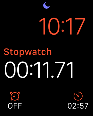
The Apple Watch apps that I launch regularly are ones that I have complications visible for. I routinely use two fitness apps, UA Record and Runtime, because their complications are so easily accessible to me. The only time I go deeper into the Honeycomb is to launch apps that I don't have room to show their complications...like Stopwatch, or Timer. I choose not to keep their complications visible on my watch face because they usually don't have any content that is contextually relevant to me.
The significance of complications being the best way to launch apps is why swiping between watch faces is so valuable. It allows users to literally switch their context on the Apple Watch. One day this could presumably happen automatically, but at least it only takes one swipe to switch from your primary daily watch face to one with the type of information you want to have at a glance in another context.
This is going to completely change the way I use my Apple Watch. I'll be experimenting with this for a while in the coming weeks, but for now I've created three watch faces that I intend to switch between depending on what I am doing:
- Cooking
- Daily Activity
- Distraction Free / Movies
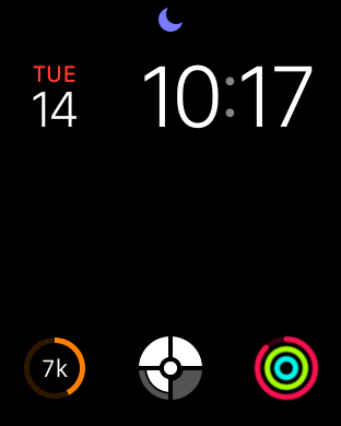
I love using the Stopwatch and Timer apps while I'm cooking or brewing coffee, but I don't want their complications visible during the rest of the day. The ability to swipe left and bring up an entire watch face devoted to them and any other complications relevant to cooking is a game changer for me. I'll keep my existing primary watch face configured with the date, and a few activity / fitness complications, and I'll also have my Movie watch face with no distractions that Ryan Considine inspired me to use.
Apple clearly intended for this usage pattern to take hold when designing watchOS 3. Craig Federighi stated so himself in tonight's live episode of The Talk Show in San Francisco. Watch faces are the true app launcher for watchOS, and users will start to customize their watch faces based on the contexts that are most important to them. This is where I could see some really exciting things happen with the platform. Collections of activity and fitness complications seem very likely to become popular, as well as watch faces with complications related to travel. I hope Apple will use curation to promote this concept and apps with great complications because of how much better this will make the experience of using an Apple Watch.
This is a really exciting week for watchOS developers. This is where the platform really starts to take off and we start to see what people will really do to build amazing watch apps.


