Nineteen Step Process to Faster Apple Watch Button Actions

The upcoming release of Grocery focuses on speed. We can all agree that the main thing your app does should be fast, and for Grocery that's checking items off your list. As we added features to the apps the performance of checking items off a list slowed down - a lot. For some users, checking off items could take 3-4 seconds on iPhone, and 5+ seconds on Apple Watch. We needed to address that now before adding more features.

The problem on iPhone was simple to understand and solve using Instruments. When you mark an item off your list on the iPhone, we were waiting for the update to Reminders to finish before moving the table cell. Making that update asynchronous and moving the cell immediately solved the problem. When you mark an item off your list now, the list update happens instantly, just like it should be!

The problem on Apple Watch was harder to understand and harder to solve, and that's the focus of this blog post. Troubleshooting performance on Apple Watch can be tricky. You can try to identify red flags if they exist by running Instruments against the simulator, but the only way to truly evaluate performance on Apple Watch is with the physical device itself. Everything that seems slow on device will feel completely normal on the simulator. You have to test on hardware to solve the problem.

Grocery's Apple Watch app is very simple - just one table view where tapping on a cell checks the item off your list. That's why this particular issue was so perplexing: the app isn't doing anything that seems too complicated. When an item button is pressed, the app sends a message to the iPhone to tell it which item was checked off, and then removes the cell from the table view. The app isn't updating the Reminders database itself, so why is it so slow? Time to investigate!

This blog post describes my nineteen step process to faster buttons on Apple Watch, which is composed of the following individual steps that can be used repeatedly starting with the first one:

  • Disable Everything and Re-evaluate Performance
  • Refactor/Extract Functionality As You Go Into Their Own Methods
  • Start Adding Trivial/Simple Functionality Back
  • Turns Out Some "Trivial" Functionality Actually Hurts Performance
  • Identify Major Problem Areas and Either Improve or Remove Them
  • Put it All Together and Test The Final Version on Device

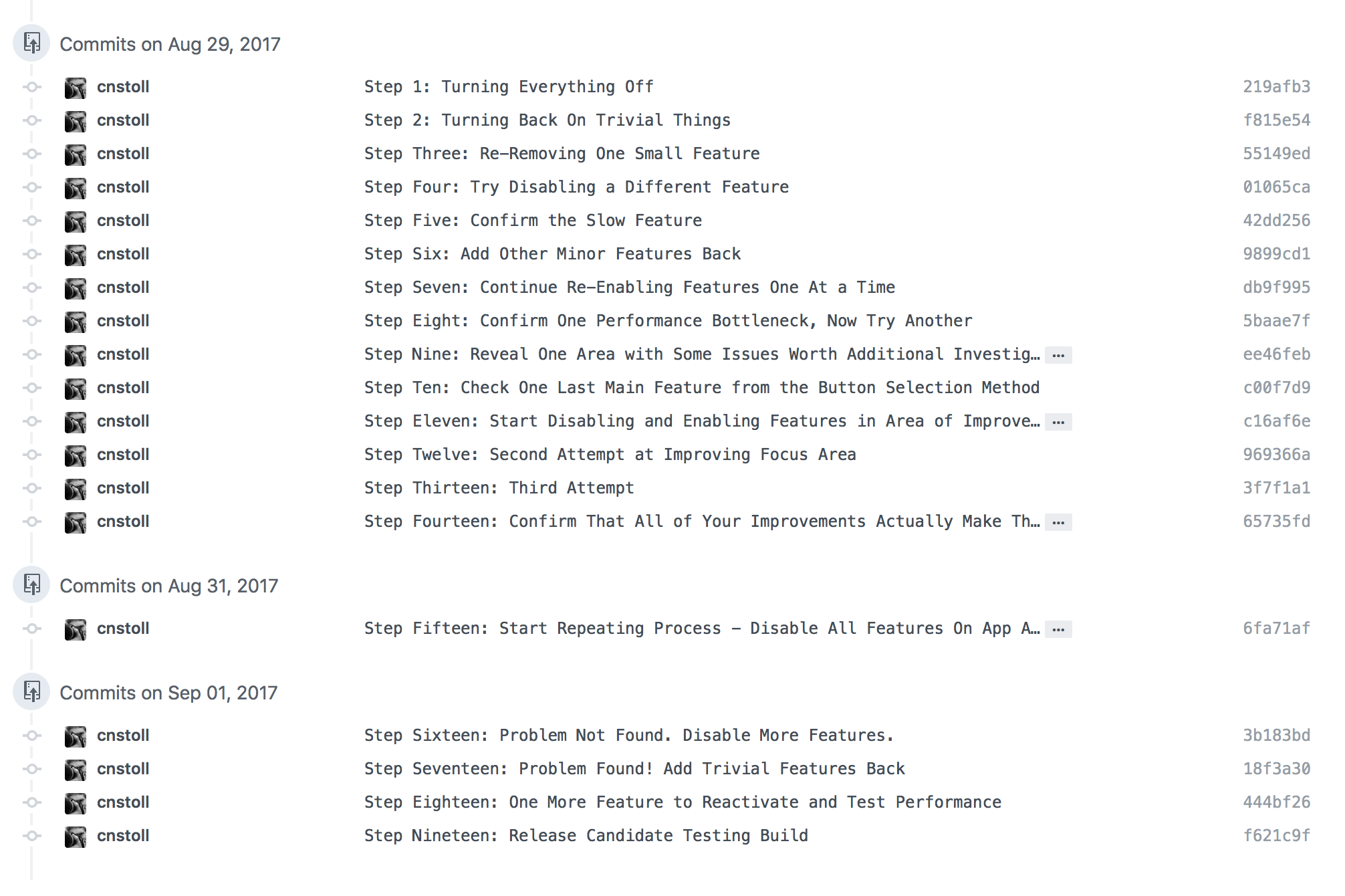
Step 1 - Disable Everything and Re-evaluate Performance

When tapping on a button feels slow on the Apple Watch the best thing to do is remove everything from the IBAction method and test it again. Button taps should feel as close to instant as possible on the watch. That's a major focus for watchOS 4 with the Unified Process Runtime - making touch interaction feel even faster and more reliable. If you remove everything from your action method and performance returns to normal, then you know something in that method is causing the slow down.

Commenting out the implementation also made me realize just how much functionality had been added to that button press action over time. What started out as a very simple method now included a laundry list of functionality:

  • Update the Apple Watch's Sorting Database
  • Updating the Table Data Model
  • Removing the Table Cell
  • Sending a WatchConnectivity Message to the iPhone
  • Playing a Haptic Feedback
  • Updating the Remaining Items Count
  • Hiding a Placeholder Group
  • Updating the Complication

Sure enough, after commenting all of that out things felt fast again. This approach is also very motivating because you get to see how fast it can feel which makes you want to achieve that performance with the rest of the functionality restored.

Step 2: Refactor/Extract Functionality As You Go Into Their Own Methods

While you're working on the button action method I think it's a great idea to refactor and re-organize the functionality of that method into smaller methods with a single responsibility. As I had been adding features and functionality to that button action I had just been adding them to the same method. I took this opportunity to move each area of functionality into its own method. This has the dual benefit of cleaning up the code as well as making it easier to see what you're turning on and off while evaluating button performance.

Step 3-7: Start Adding Trivial/Simple Functionality Back

I started adding functionality back one piece at a time, beginning with the most trivial pieces that I assumed wouldn't have any impact on performance. I installed a new device build after each piece to test performance on a physical watch. 

Most of the trivial features didn't affect performance at all. Haptics and hiding the placeholder group had no impact. Drawing a strike-through line through the item label with an attributed string didn't seem to hurt. Removing the table cell and removing the item from the array didn't hurt either.

Updating the remaining item count was the first place that I noticed a small change in performance. That involved counting the number of remaining items and updating the Interface Controller's title property. The change was barely noticeable though, so I decided to keep that feature in.

Step 8-10: Turns Out Some "Trivial" Functionality Actually Hurts Performance

The next seemingly trivial feature I added back to my button action was updating the complication. Updating the complication isn't slow on its own, but the way I was updating the complication was triggering a reload from the Reminders database. When I added this method back to my button action performance slowed down considerably. Once that happened it gave me an area to investigate further, which lead to identifying the database reload. By addressing that issue I was able to reload the complication after marking an item off the list without hurting button performance!

Step 11-18: Identify Major Problem Areas and Either Improve or Remove Them

The two major problem areas turned out to be updating the sorting order on the watch, and sending the message to the iPhone to tell it which item was marked off the list.

Updating the sorting order was actually completely unnecessary. In an earlier version of the Apple Watch app we had been moving marked off items down to the bottom of the list instead of removing them. Removing them from the list made more sense because of the small size of the Apple Watch screen. When we changed that behavior we didn't remove the sorting change - which was actually a pretty significant performance penalty. Removing that made a huge difference!

Sending the message to the iPhone using Watch Connectivity made more of an impact than I expected it would. Making that method call asynchronous by calling it on a background queue made our button action feel a lot faster, so that was the only change we needed to make there.

Step 19: Put it All Together and Test The Final Version on Device

Once all of the button action features are refactored, removed, disabled, moved, or improved then it's time to put it all back together and test the final product out to make sure that all the effort actually made a difference in performance. After a few days of testing it's definitely feeling like a big difference.


Conclusion

Troubleshooting performance on Apple Watch can be tricky but the effort is well worth it, especially for a device intended for small and quick interactions. It's truly a device where every second counts, and a little bit of testing can help make the difference between an app that feels fast and an app that feels too slow to use. Even with the upcoming improvements to app performance with watchOS 4, anything that we can do to help our apps feel faster will make a big difference for Apple Watch users.

Thoughts on a New Mac Pro

Like many other pro Mac users I was very surprised and excited to hear that a new Mac Pro is in the works. I don’t think I actually believed the Mac Pro was dead, at least not deep inside. But I had certainly come to terms with never buying one again…until now.

Before the Retina iMac, I used pro Mac towers for almost 10 years. I used a Power Mac G5 from 2005 to 2010 and a Mac Pro from 2010 to 2014. If there’s anything I took away from the experience of using pro Mac towers, it was the incredible performance. When I upgraded to the Mac Pro in 2010 the dual PowerPC CPU’s in my Power Mac G5 still felt like they had more in the tank. Those Mac Pro’s are famous for their longevity - mine was still performing very well when my iMac arrived.

What I want out of a new Mac Pro is a return to that level of performance longevity. The old Mac towers were relevant for 5+ years after you bought one. They stayed relevant because they used the highest quality parts currently available and had some user-replaceable parts. In both towers I owned I upgraded the RAM several times after I bought them - eventually reaching max capacity as I could afford it and the system felt like it needed it. I upgraded the Power Mac’s GPU to an Apple-sanctioned optional X800. I upgraded the Mac Pro’s storage many times over the years before eventually installing PCI-e SSDs in the giant tower - a massive boost to storage performance.

When I moved away from the towers to the iMac I also moved all of my primary storage to external drive enclosures. That experiment was a success. Apple made a big bet on Thunderbolt for expansion. From my experience, that was the right move. My Mac Pro had 8 internal drives at the end (4 in the 3.5 bays, 2 in the optical bays, and 2 PCI-e slots). That setup was convenient, but it wasn’t necessary. Thunderbolt enclosures are more affordable and the available storage capacity of SSDs and cloud storage has risen significantly. There are plenty of options to choose from now to increase storage capacity and performance. I’m very happy with the Thunderbolt storage system that I’ve been using with my iMac.

The biggest concern I had with the Retina iMac was graphics. Unfortunately I think that concern was valid. The GPU industry is advancing at an incredible pace, and the lack of an ability to upgrade the GPU is going to limit how long my iMac stays relevant for performance graphics. I don’t blame the iMac for that - the iMac was never intended to have upgradable or full-size GPUs. But what I want from a new Mac Pro is exactly that: upgradeable industry-standard GPUs. The older Mac towers had upgradeable GPUs after a fashion, but it was clearly an edge case. I’d really like to see Apple focus on solving this particular problem for pro users.

The 2013 space-age cylinder Mac Pro cut a lot of features from the 2010 Mac Pro. Some of those include:

  • 3.5” bays
  • Optical bays
  • PCI-e Slots
  • FW-800

As a long time Mac tower user, I agree with all of those cuts except for PCI-e. Optical drives are clearly dead, and Firewire support is easily gained through Thunderbolt hubs for legacy drives. Storage expansion through Thunderbolt is a very reasonable option for virtually everyone - and for the folks that don’t want to deal with spinning disk enclosures, the price of large SSDs is very close to affordable levels. But dropping PCI-e expansion was a step too far. PCI-e is a requirement for upgraded graphics, and is a great option for a lot of other expansion, including storage. 

I’m 100% on board with the suggestion ATP hosts made in “Thermal Corner” regarding adding additional PCI-e SSD expansion ports to the new Mac Pro. That would be a great step forward and go a long way towards keeping these machines relevant for years after you buy one.

The other wish that I have for the new Mac Pro is this - keep at least two Thunderbolt 2 ports. I can see why Thunderbolt 2 might be on the chopping block for the new Mac Pro. USB-C may be the future, and I understand why Thunderbolt 2 was removed from the new MacBook Pro’s. But when Apple signaled the shift to Thunderbolt storage, a lot of pro users invested heavily in Thunderbolt storage setups for an iMac, 2013 Mac Pro, or MacBook Pro. Apple should make using these storage expansions as easy as possible for Mac Pro users, especially on a machine where storage expansion through Thunderbolt will be required.

So will I buy a new Mac Pro? I think I will. My iMac will be about 4-5 years old at that point, and out of Apple Care. I wasn’t kidding about the graphics not holding up on the iMac. The iMac used to run Blizzard games at high settings when it was released, but lately I’ve had to reduce all of the settings to fairly low levels. The CPU is still one of the fastest that Apple has shipped in a computer, and the display is still amazing, but I think the graphics performance could be enough to convince me to upgrade.

Great Watch Apps are Great Complications

A great point came up in the Wrist UX panel I was on yesterday at SXSW, prompted by a user question about what makes the best watch app.

The best Apple Watch apps in my mind are the ones that include the most useful and frequently relevant complications. The watch face itself is the best piece of real estate on the watch. That's park avenue. It's what people will see all the time. The complications that inhabit it are the fastest way for users to launch your app. Having a great complication puts you in a prime position to have users interact frequently with your app while inherently giving them quick, timely updates at a glance. It’s an amazing feature for users, and the most rewarding should you get it right.

Designing a great complication is actually very hard to do. For complications to be used frequently they need to be something that a user would keep on their watch face at all times, meaning they should always have something relevant to show. 

Weather and fitness apps are great use cases, and I think the biggest reason why is the data they present you with is easy to take action on. If your activity ring or dashboard wheel isn’t full when you check the time before dinner, you might choose to go for a run. If you glance at your watch while getting ready in the morning and notice the temperature, you’ll remember to bring a coat. The fact that you notice these bits of information while doing something unrelated like checking the time helps you in a way you didn’t expect it to.

A complication that tracks a flight or a package is also very useful, but it's only relevant for a limited portion of time. These are the types that power users might set on a secondary watch face to use occasionally. Ultimately, I hope that Apple will eventually allow complications to be more dynamic based on context, but for now the best complications are the ones that are literally always relevant to the user.

Complications are also very difficult to design for because they have to provide relevant data without needing to be updated frequently. Generally speaking, a complication can only update itself once every 10 minutes. If your concept for a complication requires more frequent updates than that, then you may have to go back to the drawing board.

Getting the complication right is the key to unlocking a huge amount of potential on the Apple Watch. Once you get your one main use case nailed on the watch app, I would focus the rest of your energy on designing a great complication. It's difficult to do, and competition for space on the watch face is stiff, but when a user chooses to place your complication on their watch face that's when you know you've built a great watch app.

Wrist UX - Designing for Apple Watch

Today I was on a panel at SXSW focusing on the challenges designers face when creating apps for Apple Watch and Android Wear devices. I've spent the better part of the last year and a half building different apps on the Apple Watch, ranging from fitness trackers to news readers and collaboration tools. I really enjoyed speaking on a design focused panel and wanted to continue the conversation by sharing some of my thoughts here on what works and what doesn't when it comes to smartwatch UX.

The Apple Watch is both a blessing and a curse for designers. It has a very small screen that provides natural constraints for what you place inside of it. The watch invites simplicity, and welcomes a minimal approach to app design. But it is also very easy to overthink your design and create a complex and confusing user experience.

One of the reasons people complain that the Apple Watch is too slow and that apps on the watch aren't great is that many of them are trying to do too much. We're used to iPhone apps that can do 10 things really well. An Apple Watch app can’t really be great if it’s trying to do more than one of them.

Pick One Feature, and Maybe Not Your Most Obvious One

When it's time to gather around a whiteboard and start designing your Apple Watch app, draw all of your features and start discussing some of your least obvious ones. It’s very likely that one of them represents a better use case for the watch. If you start with the secondary features you might realize that focusing there can actually improve the utility of your overall product.

I think there are two great questions to ask yourself when considering a feature for the watch. Will having this feature on the watch make my combined wrist+phone experience better? Or is this feature simply a better fit for the watch than the phone?

I think that we are moving towards a place where watch apps become standalone. The Apple Watch is already a great standalone fitness tracker and information dashboard. It's great for quick updates and simple bursts of interaction. But it’s also still safe to assume that the user has their phone with them, so an augmented experience that improves with both devices is also important to consider.

What each app does best on the watch will be very different. And honestly it doesn't even need to be an app. Notifications are a core feature of the watch for many users, and providing excellent contextual notifications that a user can take action on is huge win for many apps. Richly detailed notifications are a big differentiator on the watch, and I think that’s an important area for any iOS designer to consider.

It’s very hard to do more than one thing well in a watch app. Screen space is one issue, but there’s also limited context around what the user might be doing while using your app. It’s very hard to build an app that will be easy to use in multiple different situations. Scrolling through a grocery list on your watch while sitting on the bus is a very different experience than trying to scroll through it with two hands while pushing a grocery cart. That's why it's better to solve for one use case, and make that one interaction simple, fast, and intuitive in as many contexts as possible.

Protect The User

One of the reasons it’s so important to focus on a single use case and keep your design simple is so that you can protect the user from getting lost or feeling like they can’t get to where they want to go. The watch just isn’t big enough for bread crumbs or detailed error states or handling issues like that. Think about protecting the user to keep your interactions quick and to the point.

On our panel we discussed the concept of an undo action. How would you undo something on the Apple Watch? Would you scroll down to reveal more buttons, or force press to find a reset button? Or would you just shake your wrist, like the system undo gesture on the iPhone? In reality, none of those interactions work or are standard for this action, and that’s probably for the best because we ought to design our apps such that they aren’t necessary.

One example of very focused simplicity on the Apple Watch are the Activity rings. A discerning user might think that if they stood for 6 full hours on a walk and at the park that it should count as a full 12 hours credit on the stand ring, because 6 full hours is a greater amount of time than 12 partial ones. But the beauty of the activity rings is how simple the UX is. There is only one way that system ever behaves. If that ever changed, it would confuse people.

The same principle applies to our apps too. If you have to invent logic that changes the behavior of a feature based on information the user doesn't have or that isn't obvious to them, then you can't expect for them to understand what is happening.

One of the hardest things to do well in an Apple Watch app is to keep its scope and feature set limited. Usually when you start building the app you’ll be surprised at how easy it is, and that success will lead you to want to do more. Remember that is a slippery slope and take care to avoid overcomplicating your app by trying to make it do more than it should. Avoid the Hamburger Force Touch navigation pattern.

It’s also important to prototype and test your designs with users before shipping the final product. The fastest way to prototype a watch design is on paper. Draw out your screens and see how it makes sense to you and your team. You can actually get really far into your design just using paper or a whiteboard, because of how simple a watch app should be.

One of the lessons we learned while user testing our apps is that even experienced Apple Watch users are trained to tap and scroll and don’t intuitively reach for the Digital Crown as an interaction mechanism. Adding a coach mark or guide post to the screen to indicate interactivity actually improved the usability of our app quite a bit. We actually validated this by prototyping the feature in code, which was a really great way to try our assumption and get it in front of users quickly to see how they reacted to it in a real situation with working software.

Apple Watch Users Are Passionate

It's easy to look at Apple Watch users as just a subset of iPhone users, but I think that’s too shallow of a view of the smartwatch landscape. People that own an Apple Watch and use it every day LOVE that watch. If they're passionate about your app too then you have a great problem on your hands, which is that they want to use the app on their wrist too.

There have been a number of key moments for me that showcased just how much users of the Apple Watch care about the device and its software. I remember scrolling through the App Store reviews after shipping a new watch app several months ago, reading the comments left by people excited about the update. People that were excited about the watch app took the time to leave a positive review. Many included ideas for improvement or feature requests.

Users of another Apple Watch app I worked on are incredibly engaged on Zendesk. Proportionate to the number of users, there are a lot more comments left about the Apple Watch app, and many of them include very useful feedback from people who WANT to use the app. That was really the key moment for me with this lesson. Apple Watch users are clearly using the app enough to WANT it to be better so that they get more out of it.

Remember that these users are motivated to go the extra mile to make the experience on their watch better. I think it’s important to consider that and add watch-specific settings to your iOS app to allow people extra control over the type of notifications they receive on the watch or prioritize content they see on the watch. That’s a great way to keep people using your app who might have otherwise lost touch with it.

A lot of people think that third party apps on the Apple Watch are dead. I disagree. I think that third party apps on the Apple Watch are a big opportunity to delight your most passionate iOS users who also use an Apple Watch.

Conclusion

Apple will eventually ship a better, faster, newer model of Apple Watch and a new version of watchOS. But the principles of design that we apply to watch apps now will continue to serve us well even as people expect more from apps on the watch. Keeping things simple and focusing on doing one thing really well is the best way to make your passionate users love what you made for them, and serving those users is a very worthy goal while you think forward to future versions of the platform.

Designing in Swift

I've been slowly easing into Swift over the past few months. Some projects I've helped with at work have been in Swift, and my last personal app, Picturesque, was written completely in Swift. I've really enjoyed using the language, but until recently hadn't designed a major new component from the ground up in Swift. Fortunately, last year at WWDC I think we got a great primer for doing this: Protocol Oriented Programming.

I've been attempting to follow a protocol oriented methodology, and so far I've really enjoyed it. The rule of thumb I've been trying to follow is not to use classes for anything. It's obviously possible to take this rule to the extreme, but I think it is a good standard to start by for learning how to design in Swift.

Without using classes (much), you're left with Protocols, Protocol Extensions, Structs, and Enums. I'm going to cover how I am currently using each of these in my design.

Protocols

Protocols are, of course, the primary interface to what I am building. They represent the capital-T Types that another developer would be interacting with, and the methods they would be calling. But they also represent the plumbing between internal components. 

For a message passing framework there are public facing protocols like Listening, and internal protocols like Persisting or Encoding. Since Protocols are also just Types, the Listening protocol can have a reference to the Encoding Type that its implementation can use to decode a message. This form of dependency injection has always been a good idea, but the reason this is so useful in a Swift design should become clear below.

Protocol Extensions

Not only can Swift protocols inherit from other protocols, but they can also be extended to provide a base implementation of their methods, or add new ones. Using this feature to provide a base implementation of a common protocol is a huge deal for Swift. You know exactly what I mean if you've ever defined a protocol in Objective-C that many classes implement, and had to copy-paste the same method implementation between all of them.

I'm also using protocol extensions to drive out the dependency injection scheme described above. Since a method implemented in a Swift protocol extension has very limited access to Self (after all, this isn't a Class implementation), you have to make sure that anything that implementation needs is available from the protocol definition. 

That's why having your protocol reference other Types, like an Encoding type, is so useful. Those referenced types end up forming the shared base implementation of the protocol. If your varying implementations of the protocol need to change the behavior of one of the base methods, they won't override the method, they'll just override that dependency instead.

Structs

One nice thing about structs is that they're really not intended to mutate. Once I find myself starting to insert mutating keywords in front of method definitions I start to think through A) whether or not I should just use a class, or B) does this method really need to be changing state after all? Many times, having a struct (instead of a class) implement a protocol has helped me make better decisions about how my methods handle object state, which I think makes me more careful when adding or changing state. Of course, structs shouldn't be encapsulating state anyways, which leads us to:

Enums

Enums are my favorite feature of Swift. I don't think we could have asked for a better tool to manage state and branching in our programs. Enums can have methods, hold associated values, and conform to protocols. Their initializers can even take parameters. They're beyond cool.

One of the ways that I use enums is to support different behaviors for different cases - a common programming problem. I have an enum conform to various protocols that can return a Type. A message passing system could use an Enum to represent the form of messaging, which could return a different version of the Encoding type for each case. Other implementations only need to hold onto the current case in order to receive an Encoding type for that case, and don't need to care about state. All of that is managed by the enum itself. Generally speaking, if you start to define a switch statement outside of an enum, consider just using an enum instead or adding your functionality to the existing enum.

Conclusion

We're still in the early days of discovering what makes for good design in Swift. From what I've seen so far, I'm very excited about adopting a protocol oriented methodology and continuing to learn more about good code design in swift.

Swift is clearly a language that presents us with a lot of options from a design perspective. Once we get accustomed to protocol oriented programming, the next big decision to master is going to be when to use reference types (classes) versus value semantic types (structs, and enums). That's a decision we really weren't accustomed to making regularly with Objective-C, but one which presents a whole new set of options to consider in Swift. I don't have an answer for this one yet, but stay tuned for a future blog post.