A Recipe for Building Grocery 2.0

The story of Grocery 2.0 begins around Christmas of 2017 with a family recipe book.
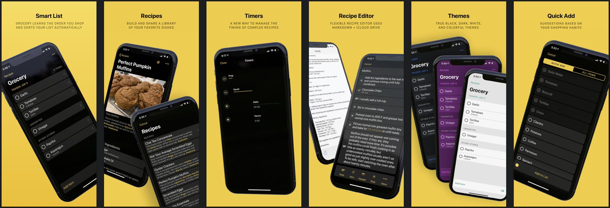
Grocery 2.0

Grocery 2.0

Ryan and I were back home with our families looking up recipes and planning holiday meals. After picking a recipe to make you typically add the ingredients to your grocery list and go shopping. We both wanted to have our recipes in Grocery to make adding those sets of ingredients easier.

I think it's important that this realization happened with family recipes because family recipes are very special. To many people, they’re as special as family photos: passed down generation to generation. If we added recipes to Grocery it would need be a great recipe feature that we could trust with those recipes. We set out to do just that and started design in January of 2018.

The obvious next step after design would have been to hit File -> New View Controller in Xcode and start adding a recipe screen to Grocery. Instead, we created an entirely new Xcode project to iterate quickly on our recipe concept. Our goal was to prove that our design worked and bring what we learned back to Grocery and quickly ship our recipe feature.

We eventually did bring that recipe feature back to Grocery and we’re excited to be shipping it in the app today! But along the way, we also re-wrote virtually all of Grocery’s UI in a way that greatly improves the consistency of elements throughout the app, as well as how code is structured for re-use across screens.

One way to look at it: Version 1.0 was basically our prototype. Version 2.0 is the real deal.

That probably sounds weird if you've already been using 1.0 and love it. We love it too! But for multiple technical and user experience reasons I can safely say that 2.0 is a huge improvement, not only to the experience of using Grocery but also to its technical future for many releases to come.


What’s the deal with a new Xcode project?

I initially resisted adding recipes to Grocery because I was in love with the idea that Grocery is just a simple shopping list. Building recipes seemed incredibly complicated. You need a list to view all your recipes, a recipe viewer for cooking and selecting ingredients, and an editor to create new recipes. You need a place to safely store all of the recipes a user adds, with all of their section headers, ingredients, steps, notes, timers, and photos.

Using a new Xcode project gave us space to work through design and technical hurdles without worrying about breaking Grocery. Once we had the new project we started attacking all of the problems involved with building recipes:

1. Using Markdown as a storage system for recipes

Our entire concept for recipes hinged around using markdown to improve flexibility for displaying recipe content. We wanted our recipes to stand the test of time with an open document format that supports interleaved ingredients and steps.

Testing this theory in the new Xcode project proved that a basic UI for creating recipe-focused markdown files was easy to use for adding recipes. ✅You can read more about the recipe markdown format we arrived at on GitHub.

2. iCloud Drive

Recipes need to be shareable across devices and with friends and family members. But we weren’t sure how well recipes sync between devices if we stored our recipe markdown files in iCloud Drive.

We tested this feature by adding support for reloading a recipe in real time as changes are made on another device, which actually works VERY well! Syncing is surprisingly quick.

3. How to support multi-line text in list cells

Multi-line text has always been a challenging problem because every cell in your list could have a different height.

Grocery 1.0 supports Dynamic Type, which requires some variation in the height of each cell, but we still limited the length of items in the list to a single line. That would never have worked for recipes that usually include long steps that span several sentences.

So instead of a standard table view, we built the recipe screen as a collection view and worked through all of the details to get multi-line text working. Our solution worked really well for recipes, and we even made the solution re-usable so that we could use it in other screens like the recipe list and ingredients list.

4. Themes

We'd been wanting to introduce different app theme colors for a long time. Because why not?

Themes!

Themes!

Building new UI components from scratch in the new project seemed like the perfect time to try it! We ended up with a very clean solution using a notification system that lets each component style itself for the selected theme. We even used Swift enums for all of the theme options!

We had assumed that there would be a new system dark mode setting in iOS 12 that we'd be well on our way to supporting, but that only debuted on the Mac. We'll be ready if that ships in iOS 13 though!


What else did we get from a new project?

Using a new Xcode project to develop recipes helped us solve a lot of problems quickly, but we actually got a lot more out of it than we could have predicted.

We eventually realized that our new Xcode project had essentially become a component-based layout system for building lists that fit our app's style. A component is just a collection view cell with enum-driven customization options like:

  • Title font style

  • Note font style

  • Left thumbnail image

  • Right thumbnail image

  • Full size image

  • Background visible or invisible

  • Attributed text (e.g. for timers and links)

  • Checkmark visible or invisible (e.g. for grocery list items)

  • Disclosure indicator visible or invisible

Example of most of the types of cell configurations that Grocery supports

Example of most of the types of cell configurations that Grocery supports

All of these cells are actually the same type of component-based collection view cell

All of these cells are actually the same type of component-based collection view cell

Each component supports theming and multi-line text for all of its labels right out of the box. Multi-line support also extends to images which are automatically sized to fit the width of the screen with their aspect ratio intact. The components were exactly what we needed to build a flexible recipe layout system, but also worked great for building any other screen we wanted to.


The recipe feature works! Now what?

Our original plan called for iterating quickly on recipes in a new Xcode project before bringing the recipe feature code back into the Grocery project. In my head that essentially meant moving some files from one project to another and linking them together to present the new recipe screens.

There still wasn’t anything wrong with that plan. Grocery was still working well, and we wouldn’t have to make any changes to Grocery before inserting the new recipes feature. There was essentially zero risk to Grocery by going this route. Why would we consider doing anything else?

The other option was to go nuclear and make some major code changes to Grocery itself, while moving the recipes from the new Xcode project back into the main Grocery project. There were a few reasons why this seemed like a great idea:

  • We were way more excited about the UI system we had created in the new project than we were about the UI we had created in Grocery. The code was a lot nicer to work with, and the components fully reflected our entire visual style for the app.

  • By this point we had committed to shipping new app themes alongside recipes, and our component-based layout system already supported theming.

  • We'd been fine tuning the marginal layout in the prototype and it simply felt nicer and more consistent than some of the layout in Grocery. We were building every new screen with these components, and so all of the screens benefited from those improvements.

  • The original Grocery project essentially used different table view cells for each screen. The Grocery List and Quick Add screens had different cells to accommodate one having a checkmark selection and one having a circle selection. There were different cells for settings too, and for lists and stores. This of course caused plenty of issues any time we decided to tweak our layout spacing in the app...which led to us not doing that very often. You never want brittle code to be a reason to avoid change, and our original layout code was too brittle for our liking.


Plot twist

Instead of just moving recipes back into Grocery and calling it a day, we decided to re-build the existing Grocery UI using the new component-based layout system without changing Grocery’s existing model layer.

Grocery List + Recipes

Grocery List + Recipes

We still loved Grocery's internal model and controller layers. The interaction with Reminders, our internal sorting algorithm, Apple Watch, and the Realm database that we use for sorting were all very solid and abstracted out into their own classes.


The Merge

Besides support for themes, we also knew that two of the screens in Grocery needed to be overhauled before our next major version anyway: Stores & Lists, and Settings.

Stores & Lists:

Confusion about the difference between Stores and Lists and how to have items associated with a specific Store was easily the largest source of customer feedback from Grocery 1.0. We'd been brainstorming solutions to that almost as long as we'd been working on recipes!

The solution we arrived at was to merge Stores & Lists into one feature called Stores, and give each Store an assigned Reminders List. That gives users the flexibility to configure Stores however they want to: with a shared list for multiple stores, or a unique list for each store.

New Stores:

The new Stores feature was different enough from the original that it really needed a brand new UI no matter what. The original store/list selection screen just didn’t make sense for the new feature.

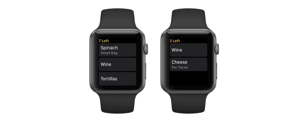
Building the new screens with the component-based layout system was incredibly fast! They were easy to build because the components handle all of the layout. The data source for each screen is essentially the a-la-carte counter at a restaurant:

"I'll take three cells with images on the left, titles, and notes on the right; a section header with some top spacing; two cells with some text and images on the right; one cell with two lines of note text; and two cells with tinted titles that make them look like buttons."

Settings:

We re-built settings in the same manner, and that only took a weekend to finish. Because the logic behind most of these screens is relatively minimal, handling all of the layout through shared components cuts out most of the work for adding new screens.

Of course, this component-based layout system only works within the constraints of what our shared components can be configured to do. Adding an entirely new "type" of component still means work. But knowing which components exist and how they can be customized is also really helpful from a design perspective because you have a better sense of what your palate looks like while designing a new screen. If you use those components in the design, you know it's going to be easy to build. It's really a tide that lifts all ships.


The Grocery List Refactor

Grocery is still a pretty simple app. When you exclude the Recipes, Stores, and Settings screens that we already re-built...the only thing left to rebuild is the list screen itself.

I have to admit, the list screen was a little embarrassing to behold. It was actually still called ViewController.swift from when I first created the Grocery Xcode project in January of 2017!

ViewController.swift wasn't quite as massive a view controller as it could have been, in part because of how much logic Grocery had abstracted out into classes that could be shared with the Apple Watch app. But it was still cluttered and disorganized and largely incompatible with the multi-line layout and theming features we were adding in 2.0.

The new list screen is infinitely nicer and actually has a real name: GroceryListViewController.swift!

GroceryListViewController + Extensions

GroceryListViewController + Extensions

Developing the new GroceryListViewController was an incredible lesson in refactoring that I want to describe for you here. This is what the process looked like:

The simple stuff:

Some pieces of the original ViewController had an obvious home in the new GroceryListViewController. If a method is simple and important, just putting it into a more organized place in the new GroceryListViewController or one of its extensions was all that was needed. I saw those pieces as low hanging fruit and tried to move all of them first.

Anything I moved to the new GroceryListViewController I also deleted from the old ViewController.

More complex parts:

Certainly some parts of the original ViewController weren’t needed anymore, or could be better replaced by newer components we’d been developing alongside recipes. After clearing out the low hanging fruit I started combing through the remaining methods following this pattern:

  • Select a method in the old ViewController.

  • Figure out what it's doing.

  • Write a new method in GroceryListViewController that implements the essential features of the old method, generally using newer support systems.

  • Delete the old method from the old ViewController.

As the ViewController file shrank, other files related to the new GroceryListViewController grew. The refactor would be complete when ViewController.swift was empty and could be deleted from the Xcode project.

Drag and Drop:

The most care was needed around features like Drag and Drop. Grocery's original table-view-based drag and drop was incompatible with the new iOS 11 Drag and Drop that supports dropping items from other apps. That sort of refactor required saving the underlying logic of what to do when an item is dropped while supporting a new type of user interaction.

Gaining support for features like iOS 11’s Drag and Drop was yet-another reason that I'm glad we decided to give the grocery list screen a do-over. Eventually the last method was removed from the old ViewController.swift and the file was deleted from the Xcode project. Refactor complete!

Once the refactor was finished, every screen in the Grocery project worked the same way. Having one way of doing things makes the app easier to maintain because there's less context switching across features, and less surface area for bugs to pop up. That by itself can be a very valid reason to perform a major refactoring effort if it means unifying the way core functionality in your app works!


Grocery list, recipes, and back again

A friend at work asked an important philosophical question recently: if you replace every plank on a ship is it still the same ship? Grocery still feels like the same app to me. Sorting the list and adding items still works the same way. Settings carry over to 2.0, with the addition of a few new ones. Quick Add works the same way. But using the app with recipes and themes is so much nicer as a user, and the code base is easier to work with as a developer. I'm not sure if it's truly the same ship or not, but I do know it's a ship I love using and working on!

We're really excited for people to try the new version and hope that you enjoy it. Grocery is free to download and available on the App Store!

Nineteen Step Process to Faster Apple Watch Button Actions

The upcoming release of Grocery focuses on speed. We can all agree that the main thing your app does should be fast, and for Grocery that's checking items off your list. As we added features to the apps the performance of checking items off a list slowed down - a lot. For some users, checking off items could take 3-4 seconds on iPhone, and 5+ seconds on Apple Watch. We needed to address that now before adding more features.

The problem on iPhone was simple to understand and solve using Instruments. When you mark an item off your list on the iPhone, we were waiting for the update to Reminders to finish before moving the table cell. Making that update asynchronous and moving the cell immediately solved the problem. When you mark an item off your list now, the list update happens instantly, just like it should be!

The problem on Apple Watch was harder to understand and harder to solve, and that's the focus of this blog post. Troubleshooting performance on Apple Watch can be tricky. You can try to identify red flags if they exist by running Instruments against the simulator, but the only way to truly evaluate performance on Apple Watch is with the physical device itself. Everything that seems slow on device will feel completely normal on the simulator. You have to test on hardware to solve the problem.

Grocery's Apple Watch app is very simple - just one table view where tapping on a cell checks the item off your list. That's why this particular issue was so perplexing: the app isn't doing anything that seems too complicated. When an item button is pressed, the app sends a message to the iPhone to tell it which item was checked off, and then removes the cell from the table view. The app isn't updating the Reminders database itself, so why is it so slow? Time to investigate!

This blog post describes my nineteen step process to faster buttons on Apple Watch, which is composed of the following individual steps that can be used repeatedly starting with the first one:

  • Disable Everything and Re-evaluate Performance
  • Refactor/Extract Functionality As You Go Into Their Own Methods
  • Start Adding Trivial/Simple Functionality Back
  • Turns Out Some "Trivial" Functionality Actually Hurts Performance
  • Identify Major Problem Areas and Either Improve or Remove Them
  • Put it All Together and Test The Final Version on Device

Step 1 - Disable Everything and Re-evaluate Performance

When tapping on a button feels slow on the Apple Watch the best thing to do is remove everything from the IBAction method and test it again. Button taps should feel as close to instant as possible on the watch. That's a major focus for watchOS 4 with the Unified Process Runtime - making touch interaction feel even faster and more reliable. If you remove everything from your action method and performance returns to normal, then you know something in that method is causing the slow down.

Commenting out the implementation also made me realize just how much functionality had been added to that button press action over time. What started out as a very simple method now included a laundry list of functionality:

  • Update the Apple Watch's Sorting Database
  • Updating the Table Data Model
  • Removing the Table Cell
  • Sending a WatchConnectivity Message to the iPhone
  • Playing a Haptic Feedback
  • Updating the Remaining Items Count
  • Hiding a Placeholder Group
  • Updating the Complication

Sure enough, after commenting all of that out things felt fast again. This approach is also very motivating because you get to see how fast it can feel which makes you want to achieve that performance with the rest of the functionality restored.

Step 2: Refactor/Extract Functionality As You Go Into Their Own Methods

While you're working on the button action method I think it's a great idea to refactor and re-organize the functionality of that method into smaller methods with a single responsibility. As I had been adding features and functionality to that button action I had just been adding them to the same method. I took this opportunity to move each area of functionality into its own method. This has the dual benefit of cleaning up the code as well as making it easier to see what you're turning on and off while evaluating button performance.

Step 3-7: Start Adding Trivial/Simple Functionality Back

I started adding functionality back one piece at a time, beginning with the most trivial pieces that I assumed wouldn't have any impact on performance. I installed a new device build after each piece to test performance on a physical watch. 

Most of the trivial features didn't affect performance at all. Haptics and hiding the placeholder group had no impact. Drawing a strike-through line through the item label with an attributed string didn't seem to hurt. Removing the table cell and removing the item from the array didn't hurt either.

Updating the remaining item count was the first place that I noticed a small change in performance. That involved counting the number of remaining items and updating the Interface Controller's title property. The change was barely noticeable though, so I decided to keep that feature in.

Step 8-10: Turns Out Some "Trivial" Functionality Actually Hurts Performance

The next seemingly trivial feature I added back to my button action was updating the complication. Updating the complication isn't slow on its own, but the way I was updating the complication was triggering a reload from the Reminders database. When I added this method back to my button action performance slowed down considerably. Once that happened it gave me an area to investigate further, which lead to identifying the database reload. By addressing that issue I was able to reload the complication after marking an item off the list without hurting button performance!

Step 11-18: Identify Major Problem Areas and Either Improve or Remove Them

The two major problem areas turned out to be updating the sorting order on the watch, and sending the message to the iPhone to tell it which item was marked off the list.

Updating the sorting order was actually completely unnecessary. In an earlier version of the Apple Watch app we had been moving marked off items down to the bottom of the list instead of removing them. Removing them from the list made more sense because of the small size of the Apple Watch screen. When we changed that behavior we didn't remove the sorting change - which was actually a pretty significant performance penalty. Removing that made a huge difference!

Sending the message to the iPhone using Watch Connectivity made more of an impact than I expected it would. Making that method call asynchronous by calling it on a background queue made our button action feel a lot faster, so that was the only change we needed to make there.

Step 19: Put it All Together and Test The Final Version on Device

Once all of the button action features are refactored, removed, disabled, moved, or improved then it's time to put it all back together and test the final product out to make sure that all the effort actually made a difference in performance. After a few days of testing it's definitely feeling like a big difference.


Conclusion

Troubleshooting performance on Apple Watch can be tricky but the effort is well worth it, especially for a device intended for small and quick interactions. It's truly a device where every second counts, and a little bit of testing can help make the difference between an app that feels fast and an app that feels too slow to use. Even with the upcoming improvements to app performance with watchOS 4, anything that we can do to help our apps feel faster will make a big difference for Apple Watch users.

Grocery Version 1.1 Includes Quick Add and Usability Improvements

The reception Grocery has received from users since launching has been great. Several of the reviews really capture why we wanted to make the app:

Couldn't have said it better ourselves, and in that spirit we've been working on some meaningful improvements to the app while staying true to the simple design and focused purpose.

Grocery 1.1 featuring an improved list layout and Quick Add

Grocery 1.1 featuring an improved list layout and Quick Add

The main grocery list interface has received lots of attention. When we released Grocery the title and notes fields were aligned horizontally, which limited the maximum length of titles that could fit on most phones. Stacking the fields vertically removes that limitation and improves readability. It also frees up space on the right side for persistent drag handles to quickly re-order items manually. Grocery learns the order that you shop for items pretty quickly, but it's still helpful to be able to move an item into place if you already know where it should go.

We're also introducing a new feature that we call Quick Add. This feature uses your shopping history to help you remember items you shop for frequently and quickly add them to your list. Quick Add makes suggestions based on how often you shop for repeated items. If you buy Eggs every 6 days, and it's been 5 days since your last trip to the store, then you would expect to see Eggs on your Grocery list. Quick Add learns to recognize those patterns and make adding those items to your list faster.

Grocery 1.1 includes many other general usability improvements:

  • Use custom URL Schemes to open Grocery and add items
  • Improvements to Apple Watch Complication and Snapshot reliability
  • Support for Handoff from Apple Watch to iPhone
  • Alexa can add items to your Grocery list. Check the FAQ for setup instructions.
  • We made a handy text-selection-menu shortcut to "Clean Up" a title by moving extra text besides the title into the notes field.
  • A much requested "Share this app" button to simplify sharing the app with friends and family :)
  • Emoji now correctly appear in the title and notes fields
  • Keyboard shortcuts for iPad
  • Performance improvements for manual re-ordering
  • The number of items in your list are visible at the top of the list
  • Grocery automatically scrolls to reveal the position of new items after they're added to your list.

If you haven't gone for a trip to the store with Grocery yet, give it a try. We think it could be exactly what you need too, but if it's not please reach out and let us know!

Introducing Grocery - An Opinionated Shopping List App for iPhone and Apple Watch

I'm excited to introduce Grocery, a new app that Ryan Considine and I built specifically for grocery shopping with the goal of making trips to the store more efficient. We started the project with a question — what if our app knew the path we took through a store, and how would it use that to make the trip more efficient? What we are launching is a simple shopping list with a focused interface that includes a lot of intelligence to always keep your list sorted in the order that you shop.

Grocery for iPhone

Grocery for iPhone

Smart Sorting

Sorting a grocery list is no small task. There's no end to the variety of different ways that people shop. Paper lists are still very common, and people have different ways of manually sorting their lists. Grocery store layouts are almost as varied as individual people's shopping behavior — even among the same chain of stores. Some stores have tried to solve this problem with technologies like geolocation and beacons, but those are expensive to install, unreliable to use, and just haven’t caught on.

We wanted to build something that would be easy and reliable for everyone to use, regardless of store location or shopping habits. Our first step was to create our own intelligent sorting algorithm that can learn from an individual's shopping behavior. This is a new approach that we haven't seen applied before, but we chose to pursue it because it doesn't require hardware or analytics, or even a user's location to build a custom sorting order.

The algorithm we built learns from each trip you make to the store and sorts based on the order you shop for items and check them off your list. All of this analysis is taking place on the user's phone and stored locally. We aren't doing any machine learning in the cloud — not just for privacy reasons, but because there's no need. Everyone shops differently, and we don't need to learn from someone else's behavior to build a better sorting order for you.

Let's say you make a trip to the store for a few essentials, in this case:

  • Eggs
  • Milk
  • Avocados

You move through the produce section of the store first, and this was the order that you picked up the items and checked them off your list:

  • Avocados
  • Eggs
  • Milk

From now on, Grocery knows that Avocados come before Eggs and Milk. The next time you go to the store and only need to visit the produce section, but added a few new items to your list:

  • Kale
  • Carrots
  • Onions
  • Bell Peppers
  • Avocados

After this trip to the store, Grocery knows how to sort all of these items relative to each other, and because you previously shopped for Avocados, it also knows that these items all come before Eggs and Milk. If your next trip to the store is for Kale and Eggs, Grocery will know which item comes first and sort your list accordingly.


Apple Watch

Grocery for Apple Watch

Grocery for Apple Watch

Efficiency in the store is our number one goal for Grocery, and an even more efficient place for the app is on the Apple Watch. We learned early on that the Apple Watch was a great device to use at the grocery store because it keeps your hands free to hold items or push a shopping cart.

We wanted the Apple Watch experience for Grocery to be the best possible. To that end we actually built the Apple Watch UI before we started on the iPhone. We spent a lot of time optimizing it to be as fast as possible - which is key for third party watch apps.

Always having your Grocery list in sorted order is the key to an efficient and effortless user experience on the watch. Because your list is in order, the item you just put in the cart that you’re looking to check off is visible immediately after raising your wrist without your needing to scroll to find it.

Raise your wrist, tap the item to check it off, look at the next item on the list, and lower your wrist. It’s a very quick interaction that makes shopping with the Apple Watch feel easy and efficient.


Adding Items

We also wanted adding items to your list to be as simple and fast as possible. The iPhone UI for adding items is optimized around speed and efficiency. The text field for adding an item and associated notes is always present at the bottom of the screen, within easy reach. Tapping the + button after entering an item keeps the keyboard up, ready to enter more items. And we built our own autocomplete system that populates from your personal history of purchased items, making repeat entries fast and easy.

You can also add items to the list on your Apple Watch, via dictation or scribble, or by picking a past item to add back to your list. We've all been in places where using our watch to do something is simpler than taking our phone out, and we wanted to make sure Grocery supported that use case.

But we didn't stop there. You can also add items to your Grocery list from the Mac, iPad, iCloud, and Siri! And even, via IFTTT, from Alexa. That's because Grocery is built on top of the iOS Reminders database, which supports shared lists on iCloud. When you start using Grocery, we prompt you to create a new list called "Grocery" (which you can change if you want to), that can be edited from any device with the Reminders app, or access to iCloud.com.

Support for Siri is something we've really grown attached to. Even the phrasing is simple with the default list name — "Add Eggs to my Grocery List", and items show up immediately after they're added. Voice assistants like Siri and Alexa work great in kitchen settings, and adding items to your shopping list that way is a great example of why.

And finally, because we're supporting iCloud Reminders lists, you can also share your list with a partner or roommate, and they can add items to your shared list from Grocery or from the Reminders app. You'll each see the items the other added in your list - but each person will still have a unique sorting order based on the order in which each person shops for items.


Conclusion

Grocery is launching today as a free app that includes Google app install ads, with an optional in-app purchase to remove ads and support future development of Grocery. We love using the app and are excited to introduce it. We hope you enjoy it!
 

App Launching on Apple Watch

Let me start by saying that I am very excited about watchOS 3. If I could have made a list and told Apple, "Here are the improvements I would like to see made to watchOS at WWDC this year" then I would consider that list to be thoroughly crossed off. A focus on performance, background updates for workout apps, and ditching the Friend button in favor of the new Dock are exactly what I wanted to see.

A lot of people watching the announcements caught that one notable Apple Watch feature was omitted from the commentary. The App Launcher, or Honeycomb / Home Screen, wasn't mentioned in the keynote or subsequent discussion about how users interact with Apple Watch. The subtext is clear. I don't think Apple intends or expects people to interact with their watch by launching apps from the Honeycomb any more than we do.

It's still clear that launching third party apps on the watch is very important. The Dock is a big step forward here but it can't be the only answer. The Dock is a more concise list of apps than the Honeycomb is, but the only context its aware of is which apps were launched recently or that the user favorites. The Dock is glance-able and meant to keep apps visible and freshly updated, but it's still not as easily accessible as the user's watch face with all of their complications.

It's been clear for several months that complications truly are the best app launchers. That's why the new ability to easily swipe between watch faces is absolutely game changing for Apple Watch despite not being something I was expecting. Next to the flashy new Dock it's an easy thing to miss, but I think it will have the biggest impact in how I interact with apps on my Apple Watch. 

The Apple Watch apps that I launch regularly are ones that I have complications visible for. I routinely use two fitness apps, UA Record and Runtime, because their complications are so easily accessible to me. The only time I go deeper into the Honeycomb is to launch apps that I don't have room to show their complications...like Stopwatch, or Timer. I choose not to keep their complications visible on my watch face because they usually don't have any content that is contextually relevant to me.

The significance of complications being the best way to launch apps is why swiping between watch faces is so valuable. It allows users to literally switch their context on the Apple Watch. One day this could presumably happen automatically, but at least it only takes one swipe to switch from your primary daily watch face to one with the type of information you want to have at a glance in another context.

This is going to completely change the way I use my Apple Watch. I'll be experimenting with this for a while in the coming weeks, but for now I've created three watch faces that I intend to switch between depending on what I am doing:

- Cooking
- Daily Activity
- Distraction Free / Movies

I love using the Stopwatch and Timer apps while I'm cooking or brewing coffee, but I don't want their complications visible during the rest of the day. The ability to swipe left and bring up an entire watch face devoted to them and any other complications relevant to cooking is a game changer for me. I'll keep my existing primary watch face configured with the date, and a few activity / fitness complications, and I'll also have my Movie watch face with no distractions that Ryan Considine inspired me to use.

Apple clearly intended for this usage pattern to take hold when designing watchOS 3. Craig Federighi stated so himself in tonight's live episode of The Talk Show in San Francisco. Watch faces are the true app launcher for watchOS, and users will start to customize their watch faces based on the contexts that are most important to them. This is where I could see some really exciting things happen with the platform. Collections of activity and fitness complications seem very likely to become popular, as well as watch faces with complications related to travel. I hope Apple will use curation to promote this concept and apps with great complications because of how much better this will make the experience of using an Apple Watch.

This is a really exciting week for watchOS developers. This is where the platform really starts to take off and we start to see what people will really do to build amazing watch apps.

Great Watch Apps are Great Complications

A great point came up in the Wrist UX panel I was on yesterday at SXSW, prompted by a user question about what makes the best watch app.

The best Apple Watch apps in my mind are the ones that include the most useful and frequently relevant complications. The watch face itself is the best piece of real estate on the watch. That's park avenue. It's what people will see all the time. The complications that inhabit it are the fastest way for users to launch your app. Having a great complication puts you in a prime position to have users interact frequently with your app while inherently giving them quick, timely updates at a glance. It’s an amazing feature for users, and the most rewarding should you get it right.

Designing a great complication is actually very hard to do. For complications to be used frequently they need to be something that a user would keep on their watch face at all times, meaning they should always have something relevant to show. 

Weather and fitness apps are great use cases, and I think the biggest reason why is the data they present you with is easy to take action on. If your activity ring or dashboard wheel isn’t full when you check the time before dinner, you might choose to go for a run. If you glance at your watch while getting ready in the morning and notice the temperature, you’ll remember to bring a coat. The fact that you notice these bits of information while doing something unrelated like checking the time helps you in a way you didn’t expect it to.

A complication that tracks a flight or a package is also very useful, but it's only relevant for a limited portion of time. These are the types that power users might set on a secondary watch face to use occasionally. Ultimately, I hope that Apple will eventually allow complications to be more dynamic based on context, but for now the best complications are the ones that are literally always relevant to the user.

Complications are also very difficult to design for because they have to provide relevant data without needing to be updated frequently. Generally speaking, a complication can only update itself once every 10 minutes. If your concept for a complication requires more frequent updates than that, then you may have to go back to the drawing board.

Getting the complication right is the key to unlocking a huge amount of potential on the Apple Watch. Once you get your one main use case nailed on the watch app, I would focus the rest of your energy on designing a great complication. It's difficult to do, and competition for space on the watch face is stiff, but when a user chooses to place your complication on their watch face that's when you know you've built a great watch app.

Wrist UX - Designing for Apple Watch

Today I was on a panel at SXSW focusing on the challenges designers face when creating apps for Apple Watch and Android Wear devices. I've spent the better part of the last year and a half building different apps on the Apple Watch, ranging from fitness trackers to news readers and collaboration tools. I really enjoyed speaking on a design focused panel and wanted to continue the conversation by sharing some of my thoughts here on what works and what doesn't when it comes to smartwatch UX.

The Apple Watch is both a blessing and a curse for designers. It has a very small screen that provides natural constraints for what you place inside of it. The watch invites simplicity, and welcomes a minimal approach to app design. But it is also very easy to overthink your design and create a complex and confusing user experience.

One of the reasons people complain that the Apple Watch is too slow and that apps on the watch aren't great is that many of them are trying to do too much. We're used to iPhone apps that can do 10 things really well. An Apple Watch app can’t really be great if it’s trying to do more than one of them.

Pick One Feature, and Maybe Not Your Most Obvious One

When it's time to gather around a whiteboard and start designing your Apple Watch app, draw all of your features and start discussing some of your least obvious ones. It’s very likely that one of them represents a better use case for the watch. If you start with the secondary features you might realize that focusing there can actually improve the utility of your overall product.

I think there are two great questions to ask yourself when considering a feature for the watch. Will having this feature on the watch make my combined wrist+phone experience better? Or is this feature simply a better fit for the watch than the phone?

I think that we are moving towards a place where watch apps become standalone. The Apple Watch is already a great standalone fitness tracker and information dashboard. It's great for quick updates and simple bursts of interaction. But it’s also still safe to assume that the user has their phone with them, so an augmented experience that improves with both devices is also important to consider.

What each app does best on the watch will be very different. And honestly it doesn't even need to be an app. Notifications are a core feature of the watch for many users, and providing excellent contextual notifications that a user can take action on is huge win for many apps. Richly detailed notifications are a big differentiator on the watch, and I think that’s an important area for any iOS designer to consider.

It’s very hard to do more than one thing well in a watch app. Screen space is one issue, but there’s also limited context around what the user might be doing while using your app. It’s very hard to build an app that will be easy to use in multiple different situations. Scrolling through a grocery list on your watch while sitting on the bus is a very different experience than trying to scroll through it with two hands while pushing a grocery cart. That's why it's better to solve for one use case, and make that one interaction simple, fast, and intuitive in as many contexts as possible.

Protect The User

One of the reasons it’s so important to focus on a single use case and keep your design simple is so that you can protect the user from getting lost or feeling like they can’t get to where they want to go. The watch just isn’t big enough for bread crumbs or detailed error states or handling issues like that. Think about protecting the user to keep your interactions quick and to the point.

On our panel we discussed the concept of an undo action. How would you undo something on the Apple Watch? Would you scroll down to reveal more buttons, or force press to find a reset button? Or would you just shake your wrist, like the system undo gesture on the iPhone? In reality, none of those interactions work or are standard for this action, and that’s probably for the best because we ought to design our apps such that they aren’t necessary.

One example of very focused simplicity on the Apple Watch are the Activity rings. A discerning user might think that if they stood for 6 full hours on a walk and at the park that it should count as a full 12 hours credit on the stand ring, because 6 full hours is a greater amount of time than 12 partial ones. But the beauty of the activity rings is how simple the UX is. There is only one way that system ever behaves. If that ever changed, it would confuse people.

The same principle applies to our apps too. If you have to invent logic that changes the behavior of a feature based on information the user doesn't have or that isn't obvious to them, then you can't expect for them to understand what is happening.

One of the hardest things to do well in an Apple Watch app is to keep its scope and feature set limited. Usually when you start building the app you’ll be surprised at how easy it is, and that success will lead you to want to do more. Remember that is a slippery slope and take care to avoid overcomplicating your app by trying to make it do more than it should. Avoid the Hamburger Force Touch navigation pattern.

It’s also important to prototype and test your designs with users before shipping the final product. The fastest way to prototype a watch design is on paper. Draw out your screens and see how it makes sense to you and your team. You can actually get really far into your design just using paper or a whiteboard, because of how simple a watch app should be.

One of the lessons we learned while user testing our apps is that even experienced Apple Watch users are trained to tap and scroll and don’t intuitively reach for the Digital Crown as an interaction mechanism. Adding a coach mark or guide post to the screen to indicate interactivity actually improved the usability of our app quite a bit. We actually validated this by prototyping the feature in code, which was a really great way to try our assumption and get it in front of users quickly to see how they reacted to it in a real situation with working software.

Apple Watch Users Are Passionate

It's easy to look at Apple Watch users as just a subset of iPhone users, but I think that’s too shallow of a view of the smartwatch landscape. People that own an Apple Watch and use it every day LOVE that watch. If they're passionate about your app too then you have a great problem on your hands, which is that they want to use the app on their wrist too.

There have been a number of key moments for me that showcased just how much users of the Apple Watch care about the device and its software. I remember scrolling through the App Store reviews after shipping a new watch app several months ago, reading the comments left by people excited about the update. People that were excited about the watch app took the time to leave a positive review. Many included ideas for improvement or feature requests.

Users of another Apple Watch app I worked on are incredibly engaged on Zendesk. Proportionate to the number of users, there are a lot more comments left about the Apple Watch app, and many of them include very useful feedback from people who WANT to use the app. That was really the key moment for me with this lesson. Apple Watch users are clearly using the app enough to WANT it to be better so that they get more out of it.

Remember that these users are motivated to go the extra mile to make the experience on their watch better. I think it’s important to consider that and add watch-specific settings to your iOS app to allow people extra control over the type of notifications they receive on the watch or prioritize content they see on the watch. That’s a great way to keep people using your app who might have otherwise lost touch with it.

A lot of people think that third party apps on the Apple Watch are dead. I disagree. I think that third party apps on the Apple Watch are a big opportunity to delight your most passionate iOS users who also use an Apple Watch.

Conclusion

Apple will eventually ship a better, faster, newer model of Apple Watch and a new version of watchOS. But the principles of design that we apply to watch apps now will continue to serve us well even as people expect more from apps on the watch. Keeping things simple and focusing on doing one thing really well is the best way to make your passionate users love what you made for them, and serving those users is a very worthy goal while you think forward to future versions of the platform.

Runtime for Apple Watch

When I used to wear a watch on a regular basis, the feature I used most was the stopwatch. I remember timing myself running around a track or around the block in high school and college. Eventually I stopped wearing a watch, but that’s about to change when the Apple Watch ships. I’ll be getting one as soon as it’s available, and I’m excited to also be bringing a version of Runtime to the watch.

Runtime for Apple Watch

Runtime for Apple Watch

Runtime for Apple Watch is a feature rich stopwatch fit for the age of the iPhone. It’s what you would expect a stopwatch to be in the age of the smart watch. Not only can you fully control a run from your wrist, you can see your current location, split times, stats, and an elevation profile all at a glance while you’re out on the trail – without ever touching your iPhone.

The Apple Watch version of Runtime builds on top of Runtime 2.0 which was released for iOS 8. That version included the Stopwatch Widget and advanced statistics support. Both of those features proved to be key stepping stones towards building a great watch app for Runtime.

Runtime’s Stopwatch Widget is a close cousin to Runtime for Apple Watch, but it’s amazing how much more capable WatchKit apps are than Today Extensions. For starters, WatchKit apps can open their iPhone app in the background, so you can start a new run from your watch without ever touching your iPhone. You can also navigate between pages of information on the watch, which is how you swipe between the Runtime stopwatch, current location, split times, and elevation profile.

Another key to building Runtime for Apple Watch is MMWormhole, a lightweight message passing library I worked on at Mutual Mobile. MMWormhole drives everything about Runtime for Apple Watch. It keeps all the statistics up to date and relays all of the start, pause, cancel, and save commands from the watch back to the iPhone.

When WatchKit was announced, I wrote about the limitations of the built in interface timer control. I ended up not using the control in the shipping version of Runtime. The irony though, is that I’m not using a label for the elapsed time either! My friend and designer Ryan Considine came up with the brilliant idea to include the elapsed time inside the start/pause/resume button, which is exactly what I’m doing. Fortunately, MMWormhole is capable of relaying the elapsed time every second to the watch, resulting in an accurate display of information as the title of the button. I’m really happy with how this design maximizes use of the space on the watch.

The elevation profile is really a killer feature on the watch. I had the idea for this while I was out hiking at Big Bend. I wanted to see how far up the ridge I was to get an idea of how much further I had to go. Elevation is key to cyclists as well, many of whom also use Runtime. An elevation profile that shows the elevation of a completed run was already part of Runtime, but there wasn’t yet a concept of the elevation on your current run or hike. I added that to the iPhone soon after, and it’s a huge addition to the watch as well.

The challenge with building the elevation profile on the watch is that WatchKit doesn’t include support for custom drawing like you would do to render the graph of an elevation profile. To work around this limitation, I am rendering a version of the elevation profile graph as an image on the iPhone, and transferring the image over when you view the Elevation page on the watch. This trick is a great way to include rich and detailed information on the watch that you can access quickly without pulling out your phone.

Another new concept to both the iPhone and Apple Watch versions of Runtime are split times. Runtime’s splits are your mile or kilometer times. A split time is recorded automatically every mile or kilometer without pushing a button. Many distance runners use Runtime, and having an automated way to track their mile times is a great way to measure training progress and overall endurance. I think this’ll prove to be a popular feature on both apps.

Glances are a great new interface paradigm on Apple Watch. Runtime’s Glance is very similar to the default state of the Stopwatch Widget, which shows your total step count for the day. I really like keeping track of my daily step count, which is why this features so prominently on Runtime’s Glance. Runtime’s Stopwatch Widget remains one of the few Today Extensions that I use on a regular basis, and I expect I’ll frequently use the Runtime Glance as well.

Runtime's Apple Watch Glance

Runtime's Apple Watch Glance

While a run is in progress the Runtime Glance also shows all the relevant stats for your current run, including your location, time, pace, and distance. If a run isn’t in progress, you can always tap on the glance to start a new one!

I’m really excited to ship this update to Runtime with support for Apple Watch. The update also includes a few bug fixes, as well as the new accompanying features on the iPhone’s stopwatch screen. I was initially a bit skeptical of WatchKit when it was announced in November, and worried about building a watch app that required the presence of an iPhone. But now that the app is finished, I’m actually very happy with what I was able to do with it and really looking forward to getting my watch so that I can use this on all my runs going forward.