Wrist UX - Designing for Apple Watch

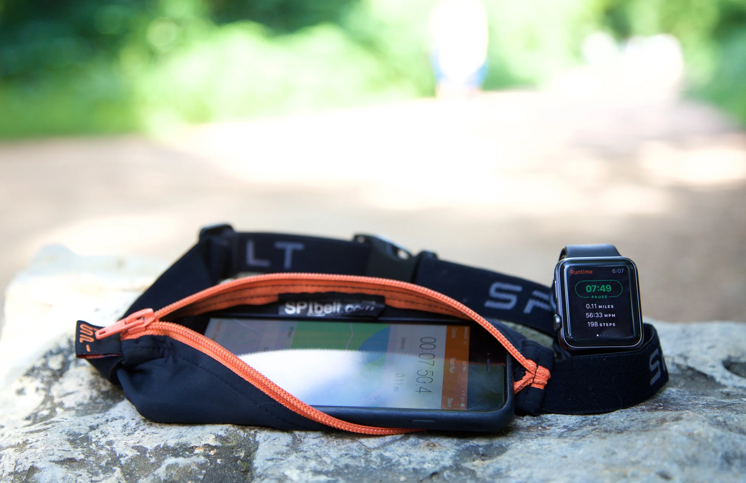
Today I was on a panel at SXSW focusing on the challenges designers face when creating apps for Apple Watch and Android Wear devices. I've spent the better part of the last year and a half building different apps on the Apple Watch, ranging from fitness trackers to news readers and collaboration tools. I really enjoyed speaking on a design focused panel and wanted to continue the conversation by sharing some of my thoughts here on what works and what doesn't when it comes to smartwatch UX.

The Apple Watch is both a blessing and a curse for designers. It has a very small screen that provides natural constraints for what you place inside of it. The watch invites simplicity, and welcomes a minimal approach to app design. But it is also very easy to overthink your design and create a complex and confusing user experience.

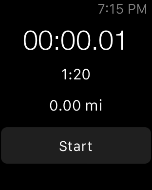
One of the reasons people complain that the Apple Watch is too slow and that apps on the watch aren't great is that many of them are trying to do too much. We're used to iPhone apps that can do 10 things really well. An Apple Watch app can’t really be great if it’s trying to do more than one of them.

Pick One Feature, and Maybe Not Your Most Obvious One

When it's time to gather around a whiteboard and start designing your Apple Watch app, draw all of your features and start discussing some of your least obvious ones. It’s very likely that one of them represents a better use case for the watch. If you start with the secondary features you might realize that focusing there can actually improve the utility of your overall product.

I think there are two great questions to ask yourself when considering a feature for the watch. Will having this feature on the watch make my combined wrist+phone experience better? Or is this feature simply a better fit for the watch than the phone?

I think that we are moving towards a place where watch apps become standalone. The Apple Watch is already a great standalone fitness tracker and information dashboard. It's great for quick updates and simple bursts of interaction. But it’s also still safe to assume that the user has their phone with them, so an augmented experience that improves with both devices is also important to consider.

What each app does best on the watch will be very different. And honestly it doesn't even need to be an app. Notifications are a core feature of the watch for many users, and providing excellent contextual notifications that a user can take action on is huge win for many apps. Richly detailed notifications are a big differentiator on the watch, and I think that’s an important area for any iOS designer to consider.

It’s very hard to do more than one thing well in a watch app. Screen space is one issue, but there’s also limited context around what the user might be doing while using your app. It’s very hard to build an app that will be easy to use in multiple different situations. Scrolling through a grocery list on your watch while sitting on the bus is a very different experience than trying to scroll through it with two hands while pushing a grocery cart. That's why it's better to solve for one use case, and make that one interaction simple, fast, and intuitive in as many contexts as possible.

Protect The User

One of the reasons it’s so important to focus on a single use case and keep your design simple is so that you can protect the user from getting lost or feeling like they can’t get to where they want to go. The watch just isn’t big enough for bread crumbs or detailed error states or handling issues like that. Think about protecting the user to keep your interactions quick and to the point.

On our panel we discussed the concept of an undo action. How would you undo something on the Apple Watch? Would you scroll down to reveal more buttons, or force press to find a reset button? Or would you just shake your wrist, like the system undo gesture on the iPhone? In reality, none of those interactions work or are standard for this action, and that’s probably for the best because we ought to design our apps such that they aren’t necessary.

One example of very focused simplicity on the Apple Watch are the Activity rings. A discerning user might think that if they stood for 6 full hours on a walk and at the park that it should count as a full 12 hours credit on the stand ring, because 6 full hours is a greater amount of time than 12 partial ones. But the beauty of the activity rings is how simple the UX is. There is only one way that system ever behaves. If that ever changed, it would confuse people.

The same principle applies to our apps too. If you have to invent logic that changes the behavior of a feature based on information the user doesn't have or that isn't obvious to them, then you can't expect for them to understand what is happening.

One of the hardest things to do well in an Apple Watch app is to keep its scope and feature set limited. Usually when you start building the app you’ll be surprised at how easy it is, and that success will lead you to want to do more. Remember that is a slippery slope and take care to avoid overcomplicating your app by trying to make it do more than it should. Avoid the Hamburger Force Touch navigation pattern.

It’s also important to prototype and test your designs with users before shipping the final product. The fastest way to prototype a watch design is on paper. Draw out your screens and see how it makes sense to you and your team. You can actually get really far into your design just using paper or a whiteboard, because of how simple a watch app should be.

One of the lessons we learned while user testing our apps is that even experienced Apple Watch users are trained to tap and scroll and don’t intuitively reach for the Digital Crown as an interaction mechanism. Adding a coach mark or guide post to the screen to indicate interactivity actually improved the usability of our app quite a bit. We actually validated this by prototyping the feature in code, which was a really great way to try our assumption and get it in front of users quickly to see how they reacted to it in a real situation with working software.

Apple Watch Users Are Passionate

It's easy to look at Apple Watch users as just a subset of iPhone users, but I think that’s too shallow of a view of the smartwatch landscape. People that own an Apple Watch and use it every day LOVE that watch. If they're passionate about your app too then you have a great problem on your hands, which is that they want to use the app on their wrist too.

There have been a number of key moments for me that showcased just how much users of the Apple Watch care about the device and its software. I remember scrolling through the App Store reviews after shipping a new watch app several months ago, reading the comments left by people excited about the update. People that were excited about the watch app took the time to leave a positive review. Many included ideas for improvement or feature requests.

Users of another Apple Watch app I worked on are incredibly engaged on Zendesk. Proportionate to the number of users, there are a lot more comments left about the Apple Watch app, and many of them include very useful feedback from people who WANT to use the app. That was really the key moment for me with this lesson. Apple Watch users are clearly using the app enough to WANT it to be better so that they get more out of it.

Remember that these users are motivated to go the extra mile to make the experience on their watch better. I think it’s important to consider that and add watch-specific settings to your iOS app to allow people extra control over the type of notifications they receive on the watch or prioritize content they see on the watch. That’s a great way to keep people using your app who might have otherwise lost touch with it.

A lot of people think that third party apps on the Apple Watch are dead. I disagree. I think that third party apps on the Apple Watch are a big opportunity to delight your most passionate iOS users who also use an Apple Watch.

Conclusion

Apple will eventually ship a better, faster, newer model of Apple Watch and a new version of watchOS. But the principles of design that we apply to watch apps now will continue to serve us well even as people expect more from apps on the watch. Keeping things simple and focusing on doing one thing really well is the best way to make your passionate users love what you made for them, and serving those users is a very worthy goal while you think forward to future versions of the platform.

Designing in Swift

I've been slowly easing into Swift over the past few months. Some projects I've helped with at work have been in Swift, and my last personal app, Picturesque, was written completely in Swift. I've really enjoyed using the language, but until recently hadn't designed a major new component from the ground up in Swift. Fortunately, last year at WWDC I think we got a great primer for doing this: Protocol Oriented Programming.

I've been attempting to follow a protocol oriented methodology, and so far I've really enjoyed it. The rule of thumb I've been trying to follow is not to use classes for anything. It's obviously possible to take this rule to the extreme, but I think it is a good standard to start by for learning how to design in Swift.

Without using classes (much), you're left with Protocols, Protocol Extensions, Structs, and Enums. I'm going to cover how I am currently using each of these in my design.

Protocols

Protocols are, of course, the primary interface to what I am building. They represent the capital-T Types that another developer would be interacting with, and the methods they would be calling. But they also represent the plumbing between internal components. 

For a message passing framework there are public facing protocols like Listening, and internal protocols like Persisting or Encoding. Since Protocols are also just Types, the Listening protocol can have a reference to the Encoding Type that its implementation can use to decode a message. This form of dependency injection has always been a good idea, but the reason this is so useful in a Swift design should become clear below.

Protocol Extensions

Not only can Swift protocols inherit from other protocols, but they can also be extended to provide a base implementation of their methods, or add new ones. Using this feature to provide a base implementation of a common protocol is a huge deal for Swift. You know exactly what I mean if you've ever defined a protocol in Objective-C that many classes implement, and had to copy-paste the same method implementation between all of them.

I'm also using protocol extensions to drive out the dependency injection scheme described above. Since a method implemented in a Swift protocol extension has very limited access to Self (after all, this isn't a Class implementation), you have to make sure that anything that implementation needs is available from the protocol definition. 

That's why having your protocol reference other Types, like an Encoding type, is so useful. Those referenced types end up forming the shared base implementation of the protocol. If your varying implementations of the protocol need to change the behavior of one of the base methods, they won't override the method, they'll just override that dependency instead.

Structs

One nice thing about structs is that they're really not intended to mutate. Once I find myself starting to insert mutating keywords in front of method definitions I start to think through A) whether or not I should just use a class, or B) does this method really need to be changing state after all? Many times, having a struct (instead of a class) implement a protocol has helped me make better decisions about how my methods handle object state, which I think makes me more careful when adding or changing state. Of course, structs shouldn't be encapsulating state anyways, which leads us to:

Enums

Enums are my favorite feature of Swift. I don't think we could have asked for a better tool to manage state and branching in our programs. Enums can have methods, hold associated values, and conform to protocols. Their initializers can even take parameters. They're beyond cool.

One of the ways that I use enums is to support different behaviors for different cases - a common programming problem. I have an enum conform to various protocols that can return a Type. A message passing system could use an Enum to represent the form of messaging, which could return a different version of the Encoding type for each case. Other implementations only need to hold onto the current case in order to receive an Encoding type for that case, and don't need to care about state. All of that is managed by the enum itself. Generally speaking, if you start to define a switch statement outside of an enum, consider just using an enum instead or adding your functionality to the existing enum.

Conclusion

We're still in the early days of discovering what makes for good design in Swift. From what I've seen so far, I'm very excited about adopting a protocol oriented methodology and continuing to learn more about good code design in swift.

Swift is clearly a language that presents us with a lot of options from a design perspective. Once we get accustomed to protocol oriented programming, the next big decision to master is going to be when to use reference types (classes) versus value semantic types (structs, and enums). That's a decision we really weren't accustomed to making regularly with Objective-C, but one which presents a whole new set of options to consider in Swift. I don't have an answer for this one yet, but stay tuned for a future blog post.

Review: Running Belts for the iPhone 6s Plus

It's prime running season here in Austin, TX and I've finally finished up a new batch of running belt reviews. I've been using several of these belts for a while now with my iPhone 6s Plus, though the FlipBelt Zipper is a very recent (if greatly anticipated) addition. The iPhone 6s Plus is of course the same basic size as it's predecessor, so running with a large iPhone isn't a very different experience than it was last year. But, I do think the popularity of the large phones is fueling a larger market for iPhone running belts, which warrants expanding my reviews to include more products as they come on the market.

Note: The links below are Amazon Affiliate links. If you find this review useful and decide to purchase any of these belts, consider using the links below and you'll support this site.

Note: You can find a link to all of my previous (and future) running belt reviews here at the Running Belt Mega Review.

Daswise Waterproof Running Belt

Daswise Waterproof Running Belt

Daswise Waterproof Exercise Runners Belt (Amazon) - Facebook

I picked up the Daswise runners belt after seeing the great reviews on Amazon and being curious to try a waterproof belt. Even though I'm usually not taking my phone out to run in the rain, protection from sweat was a key reason for me switching to running belts over armbands in the first place, so moisture protection is a welcome feature.

The pocket on the Daswise feels like the right size for an iPhone 6s Plus. It needs to stretch a little when headphones are plugged in, but that's very typical with most running belts. The snugness means that the phone will lay flat while running and not tilt down to either side.

I did notice that the Daswise straps were fairly smooth. The friction point between the straps and the buckles is low, making it fairly easy to adjust by pushing on the buckles. For this reason, I feel like this belt was probably designed to be worn with the pocket on your back. In this orientation, one would simply grab both buckles and pull backwards to tighten, or flick forward to loosen. That seems like a natural interaction to me, but for someone who wears their belt facing forwards, I had a little trouble getting the right fit. Once I found the right fit it did stay put without accidentally loosening.

While I haven't tested the Daswise out in a storm, I have noticed that my phone feels less damp after a long run when using this belt. I definitely think that it protects against moisture better than my other belts, but I would hesitate to call it waterproof. Fortunately though, the iPhone 6s Plus has been tested as far more resistant to moisture than previous iPhones, and the iPhone 7 is rumored to be totally waterproof, so this feature may not be required for long.

The build quality of this belt felt better than the TAPP-C, but not quite up to the level of the higher priced and very popular SPIbelt or FlipBelt. But for the price ($9.99 at time of writing) and with the additional moisture protection, this belt feels like a great bargain.

FlipBelt Zipper

FlipBelt Zipper

FlipBelt Zipper - Website

A favorite from my original Running Belt review last year, FlipBelt recently released a Zipper addition that addresses one of my early qualms with the original. Adding a zipper pocket makes a lot of sense for people running with loose items like a credit card or a single key that they don't want to worry about losing.

As I noted in my expansion review last year, the FlipBelt has actually become one of my favorite and most used running belts. A lot of this just comes down to comfort. The FlipBelt is soft and fits evenly around you, which makes it feel great for longer runs.

One downside is the sizing. FlipBelt isn't adjustable, so if you're really on the bubble between sizes I suggest ordering the smaller of the two. I actually ran into this issue this year because of losing weight. I'm now closer to the Large fit than the XL. My FlipBelt still fits and does work, but it's not quite as comfortable as it was previously.

The FlipBelt Zipper retains the great ease of use of the original. Getting your large iPhone 6s Plus in and out is still the easiest of any belt I've tried. Distributing snacks and other objects around the belt to spread out weight or bulk is also still a thing you can do.

As for the zipper pocket, it feels well made with a quality zipper, and is actually pretty large. It's big enough to hold an iPhone 6s Plus, but I wouldn't recommend putting it there. You have to really stretch the pocket to make the phone fit, but I think that's fine because that's not the intended use for that pocket. Keep the phone in the primary pockets, and use the zippered pocket for keys/cards/cash. If you've been holding out on FlipBelt until they added a zipper, then this is definitely the one for you.

Run Baby Running Belt

Run Baby Running Belt

Run Baby Running Belt (Amazon) - Facebook

Run Baby's belt borrows an aspect of its design from FlipBelt, going with a slot opening pocket rather than a zipper. While this design for a pocket works well, especially given its size, the other aspects of this belt are very different from FlipBelt.

The Run Baby belt uses a large band with a wide buckle. It's actually the largest buckle of any of the belts I've tested. In practice, this buckle felt too large for me. The size of the band and buckle are necessary to support the size of the rest of the belt and its pocket. Of course, having a buckle also makes this belt more adjustable than the FlipBelt, but the tradeoff didn't make this belt any more comfortable.

The downside of the Run Baby belt's pocket design and how it impacts comfort is the woven seems around the edges of the main pocket. The seems were irritating whenever they came in contact with skin, scratching in a similar way to velcro. If you tend to wear your belts over clothing this wouldn't be an issue, but I usually run with mine underneath my shirt.

The final area where this belt differs from the FlipBelt is around the pocket slot openings. The FlipBelt slots are fairly easy to locate because of an inseam that separates them from the rest of the main seam. The slots on the Run Baby blend in a little more, and are also a tad smaller. My iPhone 6s Plus still fits, but experienced a fair bit of friction when used with a case.

While I appreciate the ability to adjust a belt with a slotted pocket, the comfort issues were enough for me not to want to use this belt day to day.

Gear Beast Running Belt

Gear Beast Running Belt

Gear Beast Running Belt (Amazon) - Website

Gear Beast's belt is of a minimal style similar to SPIbelt or Daswise. The pocket is only barely big enough to hold an iPhone 6s Plus, and does hold it tightly. The straps are thin, but not too thin. The material is wicking, but isn't advertised to be waterproof.

After testing a large number of running belts, I appreciated the tight-elastic nature of the band on the Gear Beast. You can definitely tell that your phone isn't going to end up bouncing around, because the band does hold very fight after you snap the buckle.

The band attaches to the pocket in an interesting fashion, whereby the pocket itself sort of wraps around the back of the band. While I can see this being a win for durability, it has the side effect of torquing the pocket around the band. This means that unless your phone is perfectly leveled within the pocket, the compartment could be torqued up into your waist, or down towards your groin while running. This likely wouldn't be an issue for people that run with their belt behind them on their back, however I found it to be a little fiddly until I got the positioning right.

Similar to the Daswise belt, the straps on the Gear Beast were fairly low friction. I found them to be just a little bit tighter than the Daswise, making it easier to get the right fit while wearing the belt facing forwards.

With the same price and a very similar build quality to the Daswise, it might be difficult to choose between these two belts. I think the difference will come down to fit preference. The Gear Beast will be easier to get and keep the right fit, because of it's higher friction point and tighter elastic. The Daswise pocket is more evenly leveled though, so your phone will sit straighter in the pocket while at rest. Either way, both belts are quite cheap and are a good value.


SPI H20 Companion

SPI H20 Companion

SPI H20 Companion (Amazon) - Website

While not itself a running belt, the SPI H20 Companion water bottle does fit nicely as an accessory to really any running belt because of it's clip on design. The companion is marketed as an add on to the SPIBelt (Amazon), but really applies to anyone interested in trying to add hydration to their running routine.

What I found while testing the companion is that carrying hydration during my workouts was an adjustment I hadn't really considered before. It's something extra you need to plan for and optimize, and I honestly just hadn't thought about that challenge before. I've been very used to running in urban areas with lots of water fountains, but that's not always something that people have available to them while training.

I found the companion bottle to be an easy fit on the belts I tested it with. The clip on the back is easy to use while running. Drinking out of any bottle while actually running is a skill all of its own, but I appreciated the nozzle design of the companion that felt easy to direct the flow of water.

The one area that I wish were improved was the angle of the nozzle backwards towards the clip. When worn beneath clothing, I could feel the nozzle rub against my skin. I found myself just tucking the edge of my shirt around it, which had the benefit of preventing the rubbing as well as making it easier to pull out of the belt.

While the companion isn't something I carry with me on every run, it is something I can add to one of my belts for longer runs or when I'm out running in a place with less hydration available.

Note: SPIBelt supplied me with a SPI H20 Companion bottle for the purpose of this review.


Conclusion

So which belt do I choose which running belt I use for a given run? I usually go with lighter weight ones for longer runs, unless I need to carry bars or gels, when I'll choose one like the FlipBelt that offers more options for packing extra goods. Moisture protection isn't a big factor for me, and neither is fit. All of these belts fit me well. Comfort is very important though, and I usually find the smaller/lighter belts to be more comfortable for me, with the exception of the FlipBelt which remains my most comfortable belt.

Whichever belt you go with, I'll give one more shout out to running with the Apple Watch. In watchOS 2, Apple further expanded the workout tracking capabilities of the watch, making it a wonderful companion to any runner. I still carry my phone with me when I go running though, which is why I still feel it's important to have a good running belt.

I hope this helps you choose the running belt that is right for you. I think it's safe to say that larger iPhones are here to stay, which will make these running belts great running companions for us for a long time to come.

Mega Review: Running Belts for the iPhone

When the iPhone 6 Plus came out I decided to buy several running belts to try out for my own use as a runner, and after realizing how much I enjoyed using each unique belt I decided to start reviewing them.

FlipBelt Zipper

FlipBelt Zipper

Running belts have been a trend for a while now because of how well they solve the issue of carrying a large phone while running. They're quite comfortable, and not overly distracting while running. They're worn over your shorts or shirt which makes them get far less sweaty than an arm band, and they hold other things like keys or food. They're useful for more than just running, more comfortable than velcro arm bands, and are now made in dozens of models.

This post is a reference point to those reviews to make it easy to find information about each of the belts that I've reviewed. You can visit each of the reviews for details and images of each belt, or tap the links to visit the Amazon page or manufacturer's website for more information.

Review: Running Belts for the iPhone 6 Plus

Further Review: Running Belts for the iPhone 6 Plus

Review: Running Belts for the iPhone 6s Plus

Running with my phone in a belt ends up being a far better experience than running with an arm band. It's more comfortable and less intrusive, doesn't get as sweaty, and lets me carry some extra goodies for longer runs.

For runners looking to stay connected with their phone in a belt, running with the Apple Watch has been a great experience for me. It allows me to keep my phone tucked in its zipper pocket while tracking my workout and changing music tracks from my watch.

If you found any of these reviews useful and plan to purchase a running belt through Amazon, please consider using one of the affiliate links above to help support this site.

Introducing Picturesque - National Parks Image Trivia Game for Apple TV

I'm happy to introduce Picturesque, my first game and first app for the new Apple TV. Picturesque is an Image Trivia game focusing on America's great wonders - our National Parks. If you want to lean back get inspired for your next adventure, or challenge your friends to test their knowledge of these natural wonders, then try this. It's available today on the Apple TV App Store.

Home Screen

Home Screen

In Picturesque, the player's objective is to correctly identify as many parks as possible based on a random image of the park. It's a great fit for the TV because it combines social game play and interaction with rich photographic imagery. The pictures look amazing on a wide screen TV, and the new Apple TV remote makes the game play fun and interactive.

It's always exciting when you can build a product that bridges different hobbies and interest. Picturesque combines my work as an iOS developer with my passions for Backpacking and Photography. I'm happy for the result to be both my first game and my first foray into this new platform.

Game Screen

Game Screen

Designing the game modes was a fun part of working on Picturesque. We made the game modes include a time limit based on difficulty so that the game becomes more challenging as you progress to new levels. But we didn't want people to feel rushed to move on if they were enjoying the current photo, so we made the game require an explicit button press to move to the next image, instead of using an automatic timer. Enjoying the photography is just as much a goal of playing Picturesque as correctly identifying the parks are.

Because tvOS includes all of UIKit and Core Animation, we had a lot of flexible to design and build fluid animations between images in the game. You'll notice that the entire UI moves to advance to the next image. Transition animations like this look great on the large interface of a TV screen, but do still require a degree of subtlety the same as they do on smaller devices.

Picturesque is the first app I've shipped that is written entirely in Swift. I have to say that I am really enjoying developing in the new language. It's clear that this is our future as iOS developers. More and more of the work we are doing at Mutual Mobile is in Swift, and I feel very comfortable that this is the right direction for us to be moving in. Developing for tvOS in Swift 2.0 was a great experience.

Picturesque was designed and developed by myself and Ryan Considine. Working on this with Ryan has been hugely rewarding, and as an added bonus, we now have an added excuse to visit more National Parks!

With any new platform, this really is only the beginning. Developers have only had a few weeks to build products for this device, and I'm excited that it's now here and looking forward to seeing what's to come.

Game Complete

Game Complete

MMWormhole and WatchConnectivity on watchOS 2

This year at WWDC Apple introduced watchOS 2 and the ability for apps to run natively on the watch. If you already created an app for Apple Watch then your work can be easily migrated to a native watch app. The user interface and interaction model are the same. The biggest consideration when migrating your app to watchOS 2 will be updating your communication system.

The key difference between inter-app communication on watchOS 1 and watchOS 2 is where your message is going after you send it. On watchOS 1 your message was being transferred to a shared container that was accessed by two processes running on the same device. All of this was handled via App Groups and Darwin Notification Center. On watchOS 2 your message is being transferred over a Bluetooth or WiFi connection between different devices. For some apps, that means it's important to rethink your overall strategy for how, when, and what you choose to transfer between the app running on an iPhone and the app that is now running on an Apple Watch.  

Because your communication path now exists between two different devices, your communication architecture needs to make sure it takes latency and device availability into account. Complex apps will need to understand the tradeoffs between various communication mechanisms and how to use each one to achieve the best result. Now that the watch app runs on the watch itself, and the watch also has access to a WiFi network, you'll be using a combination of NSURLSession APIs as well as the new and extremely useful WatchConnectivity framework.


WatchConnectivity

The WatchConnectivity framework offers three core types of communication operations.

The Application Context is a shared data structure where you can store information that is synced in the background between the watch and phone. This is a huge deal for watch app developers because it gives you an opportunity to store information for the initial state of a watch app's UI that can be available on the watch before the user opens the app the first time. Anything that can be serialized as NSData or a Plist can be stored in the context. This is almost certainly going to be the centerpiece of your communication strategy for native apps on watchOS 2. It's a very elegant way to implement a basic View Model for configuring the UI of your Apple Watch app.

Here's an example of how you might use the Application Context. Lets say you are building an audio control Apple Watch app that can play a list of tracks on your iPhone. You could store an array of tracks and the currently playing track index in the Application Context. Any time that data changes on the phone, you can update the Application Context. The next time your Apple Watch app loads, it will have the latest information available to update its UI. The Application Context is a very easy to use API to achieve this result.

WatchConnectivity also supports background file transfers. This API should be used for longer running transfer operations. If your audio player app requires the presence of large media files on the watch, then this API will likely be the best fit for you. It affords you a much higher degree of control over the order and timing of file transfers than other communication tools do.

Interactive Operations most closely model the message passing system in MMWormhole. These operations are meant to send information between apps while both are running in real time. This operation might make sense to use for updating a playback indicator on the watch for audio playing on the phone. If the user is looking at their watch while your app is running on both devices, this API will be a great tool for keeping the two experiences in sync with each other. While this method is capable of waking up your iPhone app in the background, your communication system shouldn't rely on this too heavily because of how that will affect power usage on the user's iPhone.

As you can see from our audio player app example, there are very specific use cases for each of the APIs introduced in WatchConnectivity that come into play for our native app on watchOS 2. You'll want to think through all of your scenarios for sharing data between your iPhone and Apple Watch app to decide which one makes the most sense for each situation in your app.


MMWormhole

Many initial Apple Watch apps were built using MMWormhole, and we want to make it as easy as possible for those apps to migrate to watchOS 2. We are creating a new subclass of MMWormhole called MMWormholeSession that uses the WatchConnectivity framework. This means that if you were using MMWormhole to share information between your Phone and Watch apps then you can swap in MMWormholeSession and gain basic support for the WatchConnectivity framework in your native Apple Watch app. 

The MMWormhole implementation of WatchConnectivity is based on the Application Context. The context provides a useful persistence mechanism for MMWormhole, as well as an opportunistic background syncing engine to make data available to your watch app before the next time it loads. The MMWormhole unique message identifier is used as the key for the application context, and the serialized data structure of the message is saved as its value. This way, you can pass messages to the wormhole without worrying about having an active connection between the phone and the watch. By the time the watch app activates in the future, the latest information will have been stored in the Application Context and will be available through MMWormhole's messageWithIdentifier API. This is a really nice feature for building more responsive native apps on watchOS 2. 

Another popular feature of MMWormhole is real time message passing between an app and its extensions. The real time messaging operation of WCSession is a perfect fit here. The MMWormholeSession subclass uses this API for both sending messages and triggering listener blocks when a new message is received.


Conclusion

So, was MMWormhole "sherlocked"? Not exactly. The existing version of MMWormhole will continue to be supported and will be a great tool for sharing information between apps and extensions running on iOS and OS X. If you already have an Apple Watch app and have considered building a Today Extension, MMWormhole will still be a key component for your extension's communication system.

The new MMWormholeSession will be a useful tool for developers migrating to native apps on watchOS 2, but it is not a replacement for the WatchConnectivity framework. For instance, MMWormholeSession won't be a wrapper for the WCSession file transfer API, or handle message reply blocks. It will help make it easier to support watchOS 2 today, but developers will want to learn the WatchConnectivity APIs in order to build the best experience possible for their native app on watchOS 2.

We're going to keep iterating on MMWormhole throughout the iOS 9 and watchOS 2 beta process.  If you have any feedback or want to help, check out the library on GitHub.

MMWormhole 1.2.0

WatchKit apps have been out in the wild for several weeks now and I'm excited to release the first major update to MMWormhole since the launch of the Apple Watch. MMWormhole has been a big part of building many apps for the Apple Watch. This 1.2.0 version should help the library mature alongside the practice of developing for the Apple Watch.

Most of the changes included in this version represent bug fixes and improvements from many community contributors. Chief among them were several fixes to issues resulting in multiple message notifications being sent to listeners for single messages. There is also a great troubleshooting feature to alert users of issues with their App Group configuration. Check out the release notes above for a full run down of what's new.

This release is also geared towards keeping MMWormhole current with the latest developments from Apple. There are improvements to using MMWormhole with Swift involving the nullability flags introduced in the latest updates to the Swift programming language. There are also improvements to support NSFileCoordinator which was fixed in iOS 8.2 to support coordinated file access between apps and extensions. Special thanks to Tom Harrington for pointing this out on his blog.

In order to support coordinated file access, the underlying architecture for MMWormhole was refactored to support a message passing protocol called MMWormholeTransiting. This protocol defines the means by which messages "transit" from one side of the wormhole to the other. The default implementations include straight up file access or optional coordinated file access. Additional subclasses could be created by the community to support features like NSUserDefaults message persistence, or queued message delivery.

I'm glad this mechanism now exists because it makes MMWormhole more extensible without adding any new complexity to the simple interface that has been so key to the library's approachability and ease of use. It also makes the library more future proof. If Apple ever implements a first party system for passing messages between apps and extensions, MMWormhole could likely support that system through a new implementation of the transiting protocol.

The community of people using MMWormhole has been incredibly supportive. If you have any feedback or thoughts and suggestions on ways the library can improve, or simply want to share how you're using it, feel free to share an issue, pull request, or blog post. If you'll be out at WWDC this year and want to chat about MMWormhole, come find me or one of the other engineers from Mutual Mobile

Running with Apple Watch

I never ran with anything on my wrist before, but the prospect of running with the Apple Watch was a major factor in me deciding to purchase one. I've been running with mine for a month now and it's been a fantastic experience thus far. The Apple Watch was designed with fitness in mind, and it certainly feels like a very useful fitness companion to me.

Runtime for Apple Watch


Remote Control for my Phone

I use my watch out on the trail primarily as a remote control. I realized early on that I was using both Overcast and the Now Playing glance far more than any other app except Runtime. I have always run with my iPhone for listening to music or podcasts. But my phone is never where it's easy to reach, making it impractical to adjust my music or podcast selection on the go. Controlling audio from the watch is much more convenient, which makes going for a run feel more fun.

Having a remote control for my phone is key, because for the last several months I've been running with my phone in a running belt. It's not really practical to look at your phone to check your stats when it's in a belt, so I just wasn't doing it. Some apps have settings to periodically read your stats to you over audio, but I've never liked that experience because it takes me out of the zone of listening to something or focusing on my run. Being able to quickly glance at my stats on the watch suits my running style far better. It's a huge part of how I use Apple Watch when I run.


Training with Apple Watch

As far as hardcore runners go, I am probably still on the more casual side, but I am trying to push myself to improve my long distance endurance. I've been focusing on maintaining my pace over the course of several miles. Recently I've built up to running 7+ miles at a 9 minute per mile pace. Before I started using Apple Watch on my runs, evaluating my data was a mostly post-run activity for me. Now I find myself checking my pace and split times every 5-10 minutes while I'm running to see how I'm doing. About half way through my run I switch from the stats screen in Runtime to the splits screen to gauge how my mile times are doing. It's been a fairly effective way to gauge my progress and keep myself honest on my longer runs. I wrote a previous article about Runtime for Apple Watch, and in practice I am really enjoying using it to train while running.

1425851786060.png


Apple Activity and Fitness

Of course, the Apple Watch is a very useful fitness companion even when not running. I keep the activity circles complication on my watch face, and I do generally try to fill it every day. Sometimes I take a day off after a long run the day before, but I like having a visual reminder to stay active. I'm not fanatical about filling the circles every day, so I wish I could configure my circles to act more like a weekly goal than a daily one. But for someone that has never used another fitness tracker, I feel like the Apple Watch is a very useful one.

I also experimented with using Apple's Fitness app to track my run, in addition to tracking it with Runtime. From my testing, the Fitness app felt very accurate. Distance and Pace were very close to what I was seeing with Runtime, which is using GPS to track your route. Of course, the Apple Watch also includes a heart rate monitor, so the Fitness app shows your current heart rate as well as those statistics.

Showing my heart rate is a nice feature for the Fitness app, but I've stopped using the Fitness app on my runs. Its interface for stats doesn't feel well optimized for the watch. I prefer the Runtime watch app that includes all of the stats I care about on a single screen. I don't like swiping between stats on the Fitness app. It feels redundant to track my run on both apps, especially since Runtime tracks my route via GPS and breaks out my pace into split times. Runtime also tracks elevation, which is something I'd like to see in the Fitness app.


My Apple Watch Setup

The key Apple Watch feature for making it a running companion is the Activate on Wrist Raise -> Return to Previous App setting. That means that either Runtime or Overcast remain in the foreground when I raise my wrist. This is critical to me so that I can check my distance with literally just a glance, or skip to a new podcast with a glance and a few taps. I usually launch both apps at the beginning of my run so that I can double tap the digital crown to switch between them. Between them I have everything that I need for my run.

I do occasionally get text message notifications when I am out for a run. I usually don't stop to read or reply to messages when I am out running, and would simply ignore them when my phone is in my running belt, but it is nice to glance at a notification and know immediately if I do actually need to stop to respond to a message. It's easy to glance at the notification without breaking stride, and in a few cases I've used a contextual reply to respond to a message, or let the person know that I'll message them back later.

Because I knew I'd be using it for running, I opted for the black sport Apple Watch with the black sport band. I'm glad I went with the lighter weight model, because I can barely feel it when I'm out running. I've also tried running with the milanese loop, and it's doable in a pinch, but I find the sport band to be better suited for exercise. I tend to wear the watch slightly tighter while running, and the sport band is more comfortable to wear tightly. I tend to wear the milanese loop a bit looser.


Conclusion

I've really enjoyed running with my Apple Watch. Even as just a remote control for my phone, it makes going for a run feel more enjoyable. But I think there's a lot of potential for it as a training tool, especially when it integrates more with other fitness accessories and developers have more access to the native sensors and taptic engine. And of course, when future models include GPS, then we'll really be off to the races. Running with Apple Watch is already great, but I am sure the best is yet to come.

Further Review: Running Belts for the iPhone 6 Plus

Immediately after getting my iPhone 6 Plus I started testing out several running belts to hold my phone while out running. I wrote a review about my experience using each of them and the response to that has been overwhelming. That blog post has become the most popular article on my site, and I think it's because people love running with their iPhones and are looking for a good way to carry them on the go.

Between the three belts I tried out, I had plenty to choose from for my workouts. But I decided to try out two others that have come on the market recently to see how they stacked up against the belts I was already using. Especially now that the Apple Watch has come out, running with a running belt has become a core part of my workout routine. Never have I considered switching back to arm bands for running. And while I look forward to the day that I can run with only my Apple Watch, I don't mind running with my phone in a running belt at all.

Note: The links below are Amazon Affiliate links. If you find this review useful and decide to purchase any of these belts, consider using the links below and you'll support this site.


Large Pocket SPIbelt

Large Pocket SPIbelt (Amazon) - Website

In my original review, I mentioned SPIbelt as a product worth considering but wasn't big enough to fit the iPhone 6 Plus. SPIbelt actually reached out to me later and let me know that they had released a larger version of the SPIbelt that does support the iPhone 6 Plus. They sent me one to try out that I've been using for several weeks now.

The Large Pocket SPIbelt is the most well made with the best materials of all the belts I've tested so far. The band, buckle, pocket and zipper are all high quality components. The design and branding are all very tasteful. The fit and feel is also very good. The band feels like just the right width and thickness. It's also easy to adjust and seems to keep it's adjustment well. 

The pocket itself is comfortable and plenty big enough to fit an iPhone 6 Plus, even with a case. I started using a case on my iPhone after it cracked falling out of my workout shorts pocket, ironically enough. The SPIbelt pocket is made of a stretchy material that expands to easily fit more than just a phone. I've run several times with my car key and an energy bar or gel pack in the belt along with my phone.

It's fairly easy to get your phone in and out out while wearing the SPIbelt. I attribute this to the stretchiness of the pocket, since you don't have to apply much pressure to fit it snugly into the pocket. The pocket just compresses to fit around the phone.

SPIBelt advertises it's product as not bouncing, which is important. The last thing you want is your phone bouncing around while you're running. In practice, I don't feel like the SPIbelt bounces up and down while I run, which is a good thing. This is most likely because the band and pocket are stretchy. If you tighten the belt to where it fits snugly, the elastic will already be tensioned around your waist, which prevents it from bouncing.

However, the stretchiness and size of the pocket creates a separate issue. I notice that my phone tends to shift position in the pocket fairly easily. The most comfortable resting position for your phone in the belt is parallel to the band and your waist line. Sometimes though, especially on longer runs, my phone will shift in the pocket to rest at an angle. This results in the corners of my phone sticking up and down, which tends to be uncomfortable while running. This could be solved by making the pocket slightly smaller to prevent the phone from moving around quite as much.

The SPIbelt does tend to be fairly comfortable to use at the Gym, mostly because of the relatively thin straps and smaller buckle that can be positioned off to the side depending on your preferred adjustment. The only issue I've had with it at the gym is wearing it while doing pushups. The pocket tends to flip over a little and can hit the ground below your body if you go low enough while doing a push up.

The Large Pocket SPIbelt has definitely earned a place in my running belt rotation. It's well made and comfortable and feels like it will last a long time. But there a few improvements that could be made to turn it into an even better product for my purposes.


Active Rhino Adjustable Running Belt (Amazon)

I picked up the Active Rhino belt recently after reading about it on Tools and Toys. It's named the "Adjustable" running belt on Amazon, and with good reason. The entire band is covered in velcro, making it simply and infinitely adjustable. Of all the belts I've tried, this one is the easiest to get the right fit.

The Active Rhino eschews the zippered pocket of many other belts, making it very similar to the FlipBelt (Amazon), which I tested in my original review and continue to use frequently. This design makes it very easy to slide your phone in and out through slots along the main section of the belt. The Active Rhino also includes a welcome addition to this design that the Flip Belt lacks, which is a tether hook to keep your keys from escaping if they pop out. I felt much more confident storing my car keys in this belt because of that feature.

The downside to the Active Rhino's reliance on velcro to create the band is that velcro tends to be itchy or scratchy if not perfectly adjusted or when worn beneath clothing. This was always something that bothered me about the running arm bands I used to use. I end up having to fidget with the band quite a bit to position the velcro where it isn't irritating while I run. This isn't an issue that I've had with any of the other belts I've tested.

Finally, the pocket of the Active Rhino isn't sown symmetrically on both sides. The seams are set at the top and bottom of the pocket, rather than in the center. You can see the seam running across the top of the belt in the image above. As a result, the seams themselves are also friction points that can be irritating while running. I think this is mostly caused by the difference in design between the two sides. On one side of the belt is the Active Rhino logo, and on the other are the slots to slide objects in and out. The fabric for the side with the logo sticks out slightly above the pocket, adding to the seam irritation issue.

While the seam and velcro imitation issues frustrate me while running, I still anticipate using this belt for going to the gym. The lack of a buckle, and a secure fit for both my phone and keys make this one a better gym companion than any of the other belts I've tested except maybe the FlipBelt.


Conclusion

Running with both a running belt and Apple Watch has been a great experience. The Apple Watch makes it easy to check my running stats on Runtime, and having several belts in my workout bag lets me cycle through them so that no single one ends up getting worn out.

So which belt do I use the most now? I've been using the SPIbelt quite a bit lately, but the FlipBelt has really become my go to favorite. After several months of running, the Tapp C belt has started to wear out, which is unfortunate. It would be easy to replace it, but the SPIbelt is a similar product with higher build quality. The Amphipod is still in the rotation, but tends to stay in my travel bag for when I need to work out away from Austin. It's a great travel companion because it's so small and light.

I hope this helps you choose the running belt that is right for you. I think we can anticipate Apple shipping an iPhone 6s Plus this year, which will make these running belts great running companions for us for at least another year.

Runtime for Apple Watch

When I used to wear a watch on a regular basis, the feature I used most was the stopwatch. I remember timing myself running around a track or around the block in high school and college. Eventually I stopped wearing a watch, but that’s about to change when the Apple Watch ships. I’ll be getting one as soon as it’s available, and I’m excited to also be bringing a version of Runtime to the watch.

Runtime for Apple Watch

Runtime for Apple Watch

Runtime for Apple Watch is a feature rich stopwatch fit for the age of the iPhone. It’s what you would expect a stopwatch to be in the age of the smart watch. Not only can you fully control a run from your wrist, you can see your current location, split times, stats, and an elevation profile all at a glance while you’re out on the trail – without ever touching your iPhone.

The Apple Watch version of Runtime builds on top of Runtime 2.0 which was released for iOS 8. That version included the Stopwatch Widget and advanced statistics support. Both of those features proved to be key stepping stones towards building a great watch app for Runtime.

Runtime’s Stopwatch Widget is a close cousin to Runtime for Apple Watch, but it’s amazing how much more capable WatchKit apps are than Today Extensions. For starters, WatchKit apps can open their iPhone app in the background, so you can start a new run from your watch without ever touching your iPhone. You can also navigate between pages of information on the watch, which is how you swipe between the Runtime stopwatch, current location, split times, and elevation profile.

Another key to building Runtime for Apple Watch is MMWormhole, a lightweight message passing library I worked on at Mutual Mobile. MMWormhole drives everything about Runtime for Apple Watch. It keeps all the statistics up to date and relays all of the start, pause, cancel, and save commands from the watch back to the iPhone.

When WatchKit was announced, I wrote about the limitations of the built in interface timer control. I ended up not using the control in the shipping version of Runtime. The irony though, is that I’m not using a label for the elapsed time either! My friend and designer Ryan Considine came up with the brilliant idea to include the elapsed time inside the start/pause/resume button, which is exactly what I’m doing. Fortunately, MMWormhole is capable of relaying the elapsed time every second to the watch, resulting in an accurate display of information as the title of the button. I’m really happy with how this design maximizes use of the space on the watch.

The elevation profile is really a killer feature on the watch. I had the idea for this while I was out hiking at Big Bend. I wanted to see how far up the ridge I was to get an idea of how much further I had to go. Elevation is key to cyclists as well, many of whom also use Runtime. An elevation profile that shows the elevation of a completed run was already part of Runtime, but there wasn’t yet a concept of the elevation on your current run or hike. I added that to the iPhone soon after, and it’s a huge addition to the watch as well.

The challenge with building the elevation profile on the watch is that WatchKit doesn’t include support for custom drawing like you would do to render the graph of an elevation profile. To work around this limitation, I am rendering a version of the elevation profile graph as an image on the iPhone, and transferring the image over when you view the Elevation page on the watch. This trick is a great way to include rich and detailed information on the watch that you can access quickly without pulling out your phone.

Another new concept to both the iPhone and Apple Watch versions of Runtime are split times. Runtime’s splits are your mile or kilometer times. A split time is recorded automatically every mile or kilometer without pushing a button. Many distance runners use Runtime, and having an automated way to track their mile times is a great way to measure training progress and overall endurance. I think this’ll prove to be a popular feature on both apps.

Glances are a great new interface paradigm on Apple Watch. Runtime’s Glance is very similar to the default state of the Stopwatch Widget, which shows your total step count for the day. I really like keeping track of my daily step count, which is why this features so prominently on Runtime’s Glance. Runtime’s Stopwatch Widget remains one of the few Today Extensions that I use on a regular basis, and I expect I’ll frequently use the Runtime Glance as well.

Runtime's Apple Watch Glance

Runtime's Apple Watch Glance

While a run is in progress the Runtime Glance also shows all the relevant stats for your current run, including your location, time, pace, and distance. If a run isn’t in progress, you can always tap on the glance to start a new one!

I’m really excited to ship this update to Runtime with support for Apple Watch. The update also includes a few bug fixes, as well as the new accompanying features on the iPhone’s stopwatch screen. I was initially a bit skeptical of WatchKit when it was announced in November, and worried about building a watch app that required the presence of an iPhone. But now that the app is finished, I’m actually very happy with what I was able to do with it and really looking forward to getting my watch so that I can use this on all my runs going forward.

Review: Running Belts for the iPhone 6 Plus

I've been a runner for a long time, but I didn't start out running with my iPhone. For years I only carried an iPod Shuffle clipped to my shirt, and before that I ran without audio. It wasn't until I started building a running app called Runtime around 4 years ago that I decided to strap my iPhone to my bicep when I went for a run.

I was never particularly happy with any of the iPhone arm bands that I used. I've owned a few, mostly made by name brands like Belkin. They've all had essentially the same set of problems:

- They aren't very comfortable. All of mine were held tight with velcro, that could occasionally chafe on your arm. It's easy for them to be too tight, or to slide down for being too lose. When you're running you always notice that it's there. Depending on your build, extra weight on one side can throw you off balance while running.

- They smell terrible. Even if you throw it in the wash machine with your gym clothes, they continue to smell like you just went for a run.

- They leave your phone vulnerable to getting sweaty. I went through a phase where I tried putting my phone in a ziplock inside of the armband to try to protect it, but I gave up. Being on your arm, directly next to your skin, they have no protection from sweat or moisture.

So when I decided to get an iPhone 6 Plus and realized that there was no way in hell it would fit in a running arm band, I wasn't exactly disappointed.

Running belts have been a trend for a while now in large part because of how well they solve the problems I laid out above. They're comfortable, and not overly distracting while running. They're worn over your shorts or short which makes them get far less sweaty, and they usually offer quite a bit of protection to your phone. Some even hold other things, like keys or energy gels. All in all, they're actually a much better solution for a lot of runners, but they also happen to be the obvious choice for iPhone 6 Plus runners.

Immediately after ordering my iPhone 6 Plus I went on Amazon and started looking at running belts. They weren't expensive, so I decided to order three completely different varieties and try them all out. As someone who runs almost daily with an iPhone 6 Plus and one of these belts, I thought I would share my opinions on what I do and do not like about each of them.

Note: The links below are Amazon Affiliate links. If you find this review useful and decide to purchase any of these belts, consider using the links below and you'll support this site.


Amphipod AirFlow Microstretch (Amazon) - Website

Although I appreciate the protection offered by many water-resistant belts, protection from the elements wasn't a requirement for me when considering a running belt. I'm used to avoiding the rain when I go for a run, but I also appreciate a minimal design. The Amphipod AirFlow belt is a very minimal belt with a thin waist band and mesh pocket. It's light weight and quite comfortable.

One thing I like about the Amphipod is that I can see through the mesh to read the screen on my iPhone. If I get a notification I can flip the belt up to read it without taking the phone out. Likewise, you can actually control the screen through the mesh. Obviously typing out a text message is out of the question, but finding the pause/skip buttons on the audio controls is easy to do.

The Amphipod is also ideal for going to the gym. Because of how thin the band is, and the position of the buckle on the side rather than your back, it's comfortable to use the Amphipod belt while working out with benches/weights. 

At this point you may be wondering where people position their phone on their body while using a running belt. Personally, I wear my phone on my front, right around my waist. To me it's more comfortable than wearing it on my back. I don't have any issues with my phone bouncing if I carry it in front of me. It seems to bounce more if I wear it behind me. It also poses less risk of the dreaded bending than if I wore it on my side. After a few months use my 6 Plus is still straight and level, but you can never be too careful.

The only thing I don't like about the Amphipod is the size of the phone pocket. The pocket is large enough for a 6 Plus, but just barely. The phone fits fine once inside, but you have to fiddle with it a bit to get it into the pocket. It's not a big deal when I leave to start my run, but this isn't the sort of belt you would want to use if you plan to pull your phone out of your pocket often while on a walk or a jog.


Tapp C. Runners Belt (Amazon)

One thing you have to love about the Tapp C belt is the price. At just under $5 you really can't beat it, even if you were going to make a belt yourself.

In slight contrast to the Amphipod, the Tapp C pocket is just about the perfect size for the 6 Plus. It's easy to take my phone in and out of the Tapp C while out on the go if I need to snap a picture or change podcasts. It's also got enough space to add a gel pack or energy bar if I'm heading out for a longer run or going out on the trail.

The belt on the Tapp C is comfortable but it's also fairly large. The band is thick and wide and the buckle is downright industrial grade. For the cheap price this belt feels relatively sturdy, but I could see it being too much for some people.

The Tapp C has become a good choice for me when I go out for a longer run. It's not comfortable to use at the gym though, so for my shorter workouts or combination run/gym days I tend to leave it at home.


IMG_2128.jpg

FlipBelt (Amazon) - Website

FlipBelt is a radical departure from the other belts I bought or looked at. FlipBelt doesn't have a buckle at all. It's a single stretchable piece of fabric with multiple pockets sewn into it in a circle. You put the FlipBelt on by stepping into it like a hula hoop and sliding it up around your waist. This seemed weird at first, but the result is actually quite comfortable to wear.

What really seemed weird to me about the FlipBelt is that the pockets don't have zippers or clasps. The pockets are actually just slots in the stretchy fabric that you can slide something into, sort of like a mailbox slot. The result is that the FlipBelt is the easiest by far to get your phone in and out of. 

One of the selling points for the FlipBelt is the ability to carry multiple items all around your waist due to the multiple pockets. This works quite well when you're carrying your phone and an energy bar. You can slide the phone into the pocket on your front, and an energy bar into a pocket on your back. Their marketing materials also include carrying your keys on your back or side. This is a great idea, because it solves the problem of scratching your phone's screen by carrying them in the same pocket, like you would have to do with other belts. But, it's difficult for me to trust my keys in a pocket without a zipper. It's easy to see while using the FlipBelt that my phone is at no risk of falling out of the pocket, but I wouldn't feel the same sense of security if my keys were in one.

While the FlipBelt is very comfortable for long runs or for going to the gym, I don't tend to use it as often as the others. I think the reason has to do with being more difficult to put on. Sliding a belt up around your waist isn't difficult by any stretch, but it is slightly more complex than buckling one around you. 


Conclusion

Running with my phone in a belt ends up being a far better experience than running with an arm band. It's more comfortable and less intrusive, doesn't get as sweaty, and lets me carry some extra goodies for longer runs.

The only downside I've seen with running belts is that while some are easier than others to pull your phone out of, none of them are particularly easy. This same issue existed with running arm bands, but to me this really points to the utility of having an Apple Watch while I run. That should significantly reduce the number of instances where I would feel the need to pull my phone out while running.

So which belt do I use the most? I alternated between all three on a daily basis for a few weeks, then settled into nearly a month straight of using the Tapp C belt. I've had no issues with it, beyond taking it to the gym. That led me to re-introduce the Amphipod into the rotation, but I don't use it as much for longer runs. I still use the FlipBelt occasionally, but it isn't a permanent resident in my gym bag yet. 


Addendum

I did want to add one last comment about a very popular and well made running belt called the SPIbelt. Created right here in Austin, TX, the SPIbelt is by all accounts a great product that is very popular with runners. However, it doesn't seem to be big enough to fit the iPhone 6 Plus, so I didn't buy one. I have tried using a friend's with my 6 Plus, but it didn't fit. I wouldn't be surprised if SPIbelt released a new version at some point that did support the 6 Plus and other larger phones. But, if you're in the market for a running belt that fits an iPhone 5s or iPhone 6, the SPIbelt would be worth considering too.

MMWormhole and WatchKit Beta 2

MMWormhole was released two days ago and the response has been phenomenal. It feels like many iOS developers who jumped into extension development were dealing with this challenge already, and this library seems to solve that problem for everyone. That's really great to see!

The main challenge that MMWormhole could not overcome though was opening the containing app in the background to deliver a message. Many developers requested this feature and to Apple's credit the WatchKit team has been very receptive. Today with the release of WatchKit Beta 2 we got -openParentApplication:reply: that will wake up your containing app in the background to allow it to handle a request. This is exactly what so many developers needed to build more innovative Apple Watch apps, so it's exciting to see Apple taking those requests seriously.

Given the timing of just releasing MMWormhole a few days ago, I was curious whether or not it had jumped the gun. Does this new API in WatchKit obviate the need for MMWormhole? I don't think it does. I think that the two actually work really well together.

One of the areas where we are finding MMWormhole to be so valuable is passing information to the extension that is used to setup the UI on the watch. That includes things like the title or date of a label, or the contents of table cells. If the wormhole represents a set of mailboxes, the messages passed to mailboxes on the extension are a great way to tell the watch app what it's UI state should be whether the watch app is awake or not. It can check the contents of those mailboxes when it wakes up and setup it's UI accordingly. This is a case that can be handled all sorts of ways, including NSUserDefaults or Core Data persistent store sharing, but I think this method of passed JSON or NSCoded messages is a simple and elegant solution.

The other area that MMWormhole tends to make more sense is passing large chunks of data between locations. Because (we assume) the openParentApplication method passes data via XPC, that implies data isn't being written to disk. MMWormhole now supports NSCoding and writes objects straight to disk, and only passes a notification to check the contents of that data to the other side.

Finally, there is the case of informing the extension of change from the containing app. This may be a relatively rare case, but I think it still bears mentioning. One example of this could be a network request on the containing app to download a list of items that need to be populated on the watch in a table view. Rather than frequently check to see if the contents of changed with a timer in the extension, MMWormhole can notify the extension of a change, and the extension can repopulate the table.

The way I plan to use these tools in the apps that I am working on is to use MMWormhole to pass information and updates to and from the extension, and to use openParentApplication to invoke critical commands on the containing app. For example, lets say that the watch app needed to trigger a background save request to update a web service, and that request needed to happen immediately because the user would expect that change to be reflected in real time. Or if having fresh data is essential to the experience on the watch, then waking the app up to provide that may be required. 

I think it's important that developers consider carefully when to open the parent application and when not to. Opening the parent app every time you want to transfer data is likely not a good use of this method. Using it to invoke critical commands or beginning a user-initiated background task, like location tracking for a navigation or fitness app, seem like great examples. Imagine having a runners stopwatch app that required you to pull out your phone to start the run, rather than just tapping a button on your watch. This API is a perfect way to provide that user experience. But you wouldn't really want to use the reply block to tell the watch how far you've travelled. That's where I think MMWormhole still provides a lot of value.

It's great to see this much progress on WatchKit already. If you haven't already, please file radars on WatchKit and participate on the WatchKit Developer Forums. There is a lot of exciting activity already happening there.


Update: 

This thread on the WatchKit Developer Forums outlines the expected means of communication between the containing app and its extensions. The official response includes using using Darwin notification center to communicate with a running iOS app or a running extension. That makes me feel even better that MMWormhole will continue to be a big help for building extensions, because it directly addresses several communication scenarios for sharing data between an app and its extensions.

Massive External Photo Storage

It's been two years since the last major change to my photo storage setup. The same considerations apply now: cost, performance, and simplicity. Once I decided to move away from an all-encompasing Mac Pro to an iMac, I needed to find a way to bring my photo storage setup along with me.

Honestly, the options for external storage I had this time were very similar to those of two years ago. Drobo's continue to be poor options due to low performance and questionable reliability. Direct attached hardware RAID enclosures are still extremely expensive and probably not worth dealing with for my needs. 

That really just left NAS enclosures versus Thunderbolt enclosures. In terms of price, the two options are virtually the same. Good 4-bay NAS and Thunderbolt enclosures tend to run anywhere from $400 to $700 without drives. Fortunately the hard drive manufacturers seem to have recovered from the typhoons that wrecked havoc on their production pipelines and hard drive prices have come down quite a bit. 4TB drives are well under $200 now, and 6TB drives are in the sub $300 range as well.

I decided to go with a Thunderbolt enclosure purely for performance reasons. Large capacity disk drives in a RAID configuration blow past what iSCSI interfaces can offer pretty quickly. 300MB/s read/write isn't uncommon at all, with RAID 5 enclosures quickly surpassing 500MB/s. That's faster than many entry level SSDs, all with hard disk drives. Another reason was backup. You can easily backup a Thunderbolt enclosure to services like Backblaze, while backing up a NAS to an online backup service is incredibly difficult to do. This way I get to maintain my backup setup with Backblaze, which was a big deal for me.


Hardware

I didn't have to shop long to find a Thunderbolt enclosure that would suit my needs. The OWC Thunderbay 4 is an excellent option with terrific performance and a very reasonable price. The Thunderbay 4 is purely a JBOD enclosure that you can configure any way you want using software RAID. While some forms of proprietary RAID, including the popular SoftRAID 5 are supported, I decided to go with Disk Utility and RAID 1+0 for my setup. I'm sure some people have had great success with SoftRAID, but things like questionable Yosemite support and possible issues around future upgrades were enough to convince me not to try it. I've used Disk Utility RAID for nearly 10 years without issues, so I decided to keep trusting it.

My experience with the Thunderbay 4 so far is mostly positive. The performance on the enclosure with RAID 1+0 is excellent. Here's a screenshot:

The enclosure is mostly quiet while in normal operation. The fan is just barely louder than the 2010 Mac Pro's case fan. It's far quieter though than the iMac's fan on full blast. Anything above 1600 rpm on the iMac's fan will drown it out.

I can, however, hear hard drive noise over the fan from time to time. This tends to be most prevalent when the drives are spinning up or spinning down. I haven't decided what to do about this yet. I'm wondering if placing the enclosure on a rubber mat would insulate some of the noise. I'm also wondering if it's a sign that the hard drives I ordered aren't perfect. It isn't annoying enough for me to abandon the setup or change directions (I've certainly used louder hard drives than these before), but, it's not quite what I was hoping for.

In addition to the Thunderbay 4 I also picked up an OWC Helios 2 PCIe Expansion Chassis to house two PCIe SSDs that I got last year to help extend the life of my 2010 Mac Pro a bit. I already knew this chassis existed when I got the SSDs, so I knew that I could carry them with me if I ended up getting a new computer later.

Fortunately, that has worked out extremely well! The Helios 2 is an incredible product. Transferring the SSDs to the Helios was completely painless. It booted up and recognized the drives immediately, and even preserved their RAID-0 volume configuration. Just awesome.

The performance of the drives via Thunderbolt 2 is also amazing. Here's a screenshot:


System Configuration

Getting all of the necessary hardware is only the first step in the process. How it's all setup to work together is just as important to maximize both performance and usability of the overall system.

I broke everything out into three main volumes:

iMac SSD - The internal SSD on the iMac which is used only for the operating system, applications, and other things like Dropbox and software repositories that can be easily recreated or downloaded from the cloud.

Photo SSD - The striped SSDs in the Helios array combine to create an incredibly fast volume for photo library storage. The only thing on here right now is my Aperture library, which includes metadata, thumbnails, and previews of all the images. Soon this may also include a Photos library or a Lightroom library, but for now it's just Aperture.

Photo RAID - The 4 drives in the Thunderbay enclosure combine to create a 12TB fast and redundant bulk storage volume. This is where the bulk of my data lives, including over 260,000 RAW photos and a few video projects. This drive also contains mirrors of the other two SSDs for backup purposes.

With this system I wanted to maximize performance, redundancy, and portability.

Performance is self explanatory. Redundancy is hugely important to me. Not only do I have a full backup running automatically to Backblaze, and a periodic offsite backup in a secure location, but I want to have as close to full redundancy onsite as I can as well. Part of that strategy is using something like RAID 1+0 to gain 1-2 disk fault tolerance on my primary storage, but it's also got to include backups of my boot volume and photo library. That is achieved by cloning the two SSD volumes back to the bulk storage array.

The third criteria, portability, is an interesting one. What I realized while researching this is that having most of my storage needs met using Thunderbolt that I gain an unprecedented level of portability of my storage system. If I were to decide to use a laptop instead of a desktop, or move to a Mac Pro instead of an iMac in a few years time, all I would have to do is plug in two drives and I'm ready to go. No longer being tethered to internal storage is something of a relief to me now that I think about it this way.


Conclusion

When I wrote about my solution to this two years ago I knew I was essentially choosing the stop gap solution. 

Hopefully this system will buy me another 2-3 years of storage. The bet I am essentially making is that there will be a better solution to this problem in 2-3 years. That will likely be near the end of life for my MacPro, and if Apple is moving away from towers then perhaps Thunderbolt mass storage will be cost effective by that time. Or maybe there will be 8TB HDDs then, and I’ll just upgrade to two of those :)

I had 2TB of photos, and I knew I was adding over 600GB a year, so I hoped that by the time I ran out a better solution would be available. Thankfully, I think it now does, in the form of cost effective Thunderbolt mass storage. 

I actually could have applied the same logic again, and simply swapped out my 4TB drives with 6TB ones and used my Mac Pro as a giant aluminum NAS machine. But in reality, that would have just been prolonging the inevitable. Moving to external storage was necessary and gives me a lot more freedom and flexibility with my data. It also gives me some degree of longevity for this setup. At my current rate of photo taking with a Canon 6D I am adding around 750GB of RAW photos per year. This time around, I'm going to hope that this system buys me another 5-6 years of storage.

I want to also thank macperformanceguide.com again for all of the wonderful work on Mac performance and storage. I found their resources to be incredibly beneficial.

Limitations of Dates and Timers on WatchKit

WatchKit was announced today and I've been taking an early look at it. I've been excited about building a version of Runtime for the Apple Watch even from the time I thought it would be called the iWatch, so seeing what it would be possible to build with the first version of WatchKit has been a lot of fun. While this is clearly only the beginning of what we can do on the watch, if you're familiar with programming for extensions then you have a pretty good idea of what to expect. Thanks to the Today Extension I built in Runtime for iOS 8, I had a working prototype of Runtime for the Apple Watch up and running in under an hour!

Because your iPhone is required to be present for third party apps and GPS connectivity, the core of a running app on the Apple Watch is going to be showing users stats about their run at a glance. It's so amazing and powerful that the watch can display UI simply by the user lifting their wrist. This is perfect for runners because you don't have to futz with using your other hand to tap a button on the watch. Just raise your hand, read your time and pace, and continue on your way. Naturally for my Runtime prototype I decided to tackle this use-case first.

WatchKit includes two rather amazing new controls that previous required all sorts of custom logic and intricate programming to create on iOS: WKInterfaceDate and WKInterfaceTimer. The top label below is a Date, the second label is a timer, and the third is just a normal label.

WKInterfaceDate is a class designed to show a time and date in a label. The time and date automatically update on a per-second basis. The label can be formatted using any custom date format string to show or hide days, minutes, hours, seconds, years, AM/PM, etc. It's visual style can also be customized with different fonts and colors. It's really nice, and completely encapsulates what would previously have required tons of code from developers. I hope it makes its way back to iOS. In an interesting twist, WKInterfaceDate doesn't actually accept a date object as a parameter. Instead, it accepts a calendar and a time zone, showing it's intended to be used to display the current date (or perhaps a future or previous date) to the user.

WKInterfaceTimer is similar, but is designed around a timer instead of a date. It's slightly less customizable than it's sister class, providing only check boxes to choose which calendar components are visible and which are not. It also provides a selection of pre-defined styles to pick between numerical and textual display of time information. It's the difference between "6:42" and "6 hours and 42 minutes".

The real benefit to both of these classes in the context of WatchKit is that their behavior can be pre-defined and updating their contents doesn't require any interaction with the WatchKit extension running on the user's iPhone. Imagine if the only way to display a timer were to fire a refresh timer on the extension and push those updates to a label on the watch? What a terrible experience and drain on power that would be. This is clearly a much better solution.

These classes clearly do what they are designed to do very well, but they do have limitations. I want to document these limitations and propose a few ways that they can be improved. My goal is to help provide feedback to the WatchKit team early in the process. As we saw with Swift, the team addressed a huge amount of feedback and shipped a high quality version of Swift in the 1.0 release. I'm less optimistic that WatchKit will be heavily changed before it's released, but I want to provide feedback as early as possible in the hope of increasing the odds this will happen.

So, here goes. These are some issues I've noticed with WKInterfaceDate and WKInterfaceTimer.


WKInterfaceTimer Does Not Support Counting Up (rdar://19024346)

I believe the WKInterfaceTimer is intended to work both as a countdown and count up timer, but currently the timer only supports counting down. The control description in interface builder actually states "Timer - Displays a string that counts up or down to a specified time." But from the detailed class description online, it is clear that the control is currently implemented as a purely countdown timer.

The issue here is that really the only way to build a count up timer that starts from 00:00.0 and counts up is through this class, so it needs to support this.

The only attribute this class has so far for controlling it's behavior is the date. You can set a date (which the header states will be counted up/down toward). Here's how that actually seems to work now though.

If you specify a date with a positive time interval from the current date, say, 3600 seconds (one hour) from now, the timer will start at 59:59 and counts down like you would expect.

If you specify a date with a negative time interval from the current date, say, -3600 seconds (one hour earlier), the timer will start at 1:00:00 and begin counting up, sort of like you would expect. But this behavior isn't really defined. I haven't actually waited an hour to see if it would stop, but I'm still confused why it would start at 1:00:00 instead of 0:00:00 and count up towards 1:00:00.

Let's say I wanted to implement a count up timer that counted up to a maximum of 12 hours. Given the behavior above, I'd probably expect to input -(3600 * 12) as the time interval offset for the WKInterfaceTimer's date parameter. But that results in a timer starting at 12:00:00 and counting up. :(

The other alternative I could see is specify a date of zero, or possibly -1, as the offset to the date, in the hopes that those would result in a timer that counts up starting from 0:00:00. Unfortunately, neither of those result in the desired behavior either. In both cases the timer simply displays "1" and stays there. The same is true until you specify a negative offset greater than or equal to 60. In other words, the timer really doesn't feel like starting anything below a minute of precision. If you specify -60 as the time interval, you'll get a timer that starts at 1:00 and counts up from one minute.

I'd like to see a cleaner interface to the WKInterfaceTimer class that allows you to specify a boolean for "count up or down", for example. At the very least, I'd like to see a documented and working count up behavior that allows a 0 or -1 time interval that supports a count up timer starting at 0:00 or 0:01.


WKInterfaceTimer's User Interface is Not Sufficiently Customizable (rdar://19024361)

The timer class in WatchKit provides basic support for a few pre-defined date formats, and for which possible calendar components (days, hours, minutes, seconds, etc.) the timer will show. This is actually a pretty nice form of customization, but it's not quite deep enough. Some timers may wish to show hours or minutes even when their contents are zero, or format the text in different ways.

This level of customization is actually available in the WKInterfaceTimer's sister class, WKInterfaceDate, which takes a customizable date format string as a parameter. My proposal is that the WKInterfaceTimer should take an optional date format string as a parameter as well. If a date format string is present, it should use that format for displaying the timer. If the format string isn't present, then use the default customization parameters.


WKInterfaceDate Time Zones Do Not Have Second Level Accuracy (rdar://19024376)

In a last ditch effort to create a properly formatted count up timer on a Watch App, I turned to the WKInterfaceDate control. My goal was to create a WKInterfaceDate control that was configured to show a time in 00:00:00 (hh:mm:ss) format. The control would also be configured with a calendar and time zone to start with a displayed time of 00:00:00 and count up one second at a time from there. I know it's not the intended purpose of this control, but it seems like a reasonable customization to make.

However, the control doesn't seem to respect the seconds component of the time zone. I attempted to create a NSTimeZone where the seconds from GMT are started from zero, and with the current GMT time subtracted away from that. So if the time were 1:07:26 AM, GMT, then the time zone would be created from a GMT offset of 4046 (3600 + 420 + 26).

This actually works beautifully well for the hours and minutes. They will correctly line up at the 00:00 position you would expect them to. But the seconds will not. No matter what you supply as the seconds offset for the time zone, even say -5, the seconds on the WKInterfaceDate always match exactly to the seconds of the system clock. There doesn't seem to be any way to provide a time zone or calendar which changes the seconds of the displayed time/date from that of the system. That means that it's not possible to use this control for displaying a time as an offset from a specific second value. But it would be if the time zone seconds offset were honored.

My proposal here would be to make the time zone's second component honored by the control. If the time zone supports initialization with second level accuracy, and the date control supports presentation at a second level accuracy, then the two settings should work correctly together.


WKInterfaceTimer and WKInterfaceDate Don't Support Milliseconds (rdar://19024387)

The default WLKInterfaceTimer class does not have an option to display milliseconds in the label for the given date as either a count down or count up timer. It also doesn't support a custom date format string, so the option to add this information isn't there.

The WKInterfaceDate actually does support a custom date format string, so supplying a format string that includes milliseconds actually is an option. However, when you supply milliseconds to the format string, the millisecond value is not updated. The WKInterfaceDate control's internal timer seems to be firing once per second, which means it can't update the label's contents on a millisecond basis anyway. 

I'd really like to see millisecond support because it creates a more accurate and better overall experience for runners to gauge their speed and run duration. It's also just a better visual experience to feel like the watch is actually working if the user can see milliseconds counting up. Without that, it feels like the watch is running slow, or that the user is running slow. I do understand the power tradeoffs involved with timers firing at shorter intervals to make this possible, and I know it's not ideal, but some support for it in at least a limited fashion would be nice to have.


I'll be experimenting more with WatchKit over the next few weeks. I fully intend to do my best to ship a compelling Apple Watch app for Runtime when it's released. However, issues like this do show that it's still only the beginning stages of what we can do on the watch. I expect that we'll have more freedom and flexibility over time. My hope is that we'll get just a little bit more of that before the Watch is released, so that we can deliver really compelling experiences to users.


Retina iMac Tests: Xcode

I got my Retina iMac a few days early and I have been spending some time putting it through it's paces. Honestly, I feel like the police are going to show up at any minute and take this thing away...because it feels like it must have been stolen from a secret lab somewhere. It's just delightful to use.

While the primary use case I had in mind when purchasing this was photo editing, I'll probably spend just as much time with Xcode open as I will with Aperture open. Fortunately, testing Xcode performance is pretty easy: hit build, and use a stopwatch.

For my basic test I selected a fairly large project with about 1900 source files and a dozen or so external dependencies linked through CocoaPods. Then I made sure Xcode was finished indexing, cleaned, and built. My goal was to time the build and also monitor whether or not the fans spun up.

I ran the test on a Retina MacBook Pro (2012), a Quad Core Mac Pro (2010), and the new Retina iMac with the Core i7 processor upgrade. Here's the results:

  • Retina MacBook Pro: 1 minute and 3 seconds
  • Mac Pro: 1 minute and 7 seconds
  • Retina iMac: 44 seconds

The iMac is definitely wicked fast. But running a parallelized build process for even that long does have some impact on temperature and therefore fan volume.

On the Retina MacBook Pro the fan did spin up for a second or two towards the end, but as soon as the build finished it spun back down. The Mac Pro never made a peep, of course. The Retina iMac's fans did spin up, and were definitely noticeable to me. Out of the 44 seconds, I would guess that the fan was active for around 10 seconds. As soon as the build finished, it spun back down.

I spent some time watching the fan speed with iStat Menus. The idle RPMs for the fan seem to be around 1200. At 1200 I basically have to put my ear behind the vent to hear anything. So I ran the build a few more times while watching the numbers and listening to what happens.

Around half way through the build the RPM would start to climb slowly. 1250, 1300. What interested me was that by the time it reached 1400 I could definitely hear it over ambient room noise. 1600 was pretty noticeable. Xcode never caused it to climb above that.

I'm definitely not excited about the fan but I'm not hitting the panic button about it just yet either. During normal activity, including incremental (non cleaned) Xcode builds, I haven't noticed any issues at all. 


Buying the Retina iMac, Instead of a Mac Pro

Before the release of the Retina 5k iMac today it had been almost exactly 4 years since I bought a new Mac. But every time I do there is a lot of analysis that goes into it. With the Retina iMac it was no different, but in this case the analysis started quite a while ago. The path to this purchase began over a year ago with the release of the new Mac Pro. But before going into why I bought the Retina iMac, let me explain why I chose not to buy an iMac when making an almost identical decision 4 years ago.

I've always used a Desktop Mac as my personal Machine, and the choice has always been between iMac and the Pro lineup of towers. I switched to towers in 2004 after three different generations of iMacs and and I was very happy with it. The performance was well worth it for the price, with dual G5 processors for $2999. That machine proved to be very capable and served me well throughout my college career.

That lead to 2010 and the release of two amazing new Mac products: The 2010 Mac Pro, which would become the professional Mac user's workhorse for nearly 4 years until the space age Black Cylinder Mac Pro was released last year. And the 2010 iMac, featuring a gorgeous 27" display, Core i7 processor, desktop grade Radeon 5750 graphics, and internal SSD storage. Both machines provided out-of-this-world performance and at very similar price points. Here's a chart that I made 4 years ago for the stats on each machine and the effective price.

2010 iMac vs. Mac Pro

2010 iMac vs. Mac Pro

The Mac Pro turned out to be about $500 more expensive than the iMac, but the iMac had an integrated Cinema Display. The display in the iMac has not always been the best in the world, but with the 27" Cinema Display it was pretty close. This was a significant factor in the iMac's favor. In terms of CPU performance the two were about even, honestly with the iMac beating out the lower tier Mac Pros in every-day tests. The best CPU I could afford at the time was the Xeon 3.2GHz Nehalem, rather than the impressive and consideraly more expensive 6-core Westmere, but the Nehalem proved to be beefy enough. It also turned out that the Radeon 5870 in the Mac Pro did outperform the iMac's internal graphics by a significant margin in most benchmarks, but this alone didn't tip the scales.

Certainly a major factor in anyone's computer purchasing decision is what they intend to use it for. As a professional photographer a critical component for my personal computing needs is fast, reliable, and MASSIVE connected storage. In those days, the options for cost effective reliable external storage were not great. I've written about external storage before, and in general the price increase over internal storage has usually been huge. In 2010, a properly equipped Drobo would have cost north of $1200, and been connected over either Firewire or USB - not nearly fast enough compared to SATA. That and reliability concerns with Drobo and other manufacturers at the time were enough to steer me away from external storage. In effect, I ended up choosing the 2010 Mac Pro almost entirely because of it's internal storage capability and how that effected both storage reliability and performance as well as a significantly lower total system price. That ended up being an extremely wise choice. I now have 4x4TB internal drives in my Mac Pro, for a total of 8TB of redundant RAID Mirrored storage. I currently rely heavily on the Mac Pro's internal storage.

If all of the above considerations were still true today I probably would not have bought a new iMac today. But two things have changed dramatically in the last year that really tip the balance for me, and I think for many other professional and pro-sumer desktop Mac users.

Expandability

The first is the way in which expandability works on high end desktop Macs. In previous models  the most important form of expandability was internal. Certainly there are cosmetic benefits to internal expandability in the form of simplicity and having a clean desktop working environment. But the biggest benefit was performance. Having access to an internal SATA bus for storage was critical. Having access to PCI slots to install additional cards was a key requirement for many users. Even having access to RAM slots or the GPU was important to many people. You could even upgrade the CPU on the Mac Pro if you really wanted to.

But all of that has changed over the years. Apple has begun bundling more and more components permanently into products. First was the CPU and graphics in the iMac and Laptop lines, then came RAM and storage being soldered onto the motherboard. The iMac and Laptops were never easily expanded but pro users always had the option of purchasing an expandable Mac tower if they needed that feature, until the new Mac Pro debuted last year. The new Mac Pro leveled the playing field for expandability. Now all of Apple's products had the exact same expandability option: Thunderbolt.

My friend Thomas Duesing really nailed this 4 years ago. In discussing whether or not the iMac or the Mac Pro were the right call back then, he pointed out that all of this logic would change if Lightpeak (now Thunderbolt) were available. Well here we are in 2014, and Thunderbolt 2 is the missing link in expandability across the Mac lineup, not just for storage but for other accessories as well. Thunderbolt allows you to add super fast SSD storage, bulk HDD storage with better than SATA performance that is no longer limited by USB or Firewire, and best of all: PCI slots. With accessories available from OWC, you can add PCI slots to an iMac for the first time in that product's history. The expandability fight between the iMac and the Pro desktop is now dead even, and all it took was the Mac Pro dropping internal expansion from it's lineup. Accessory makers took notice of that and created a whole new lineup of products to fill that market. The results of that are huge for the professional market, and are now making it possible for someone with professional storage needs to consider any of Apple's Mac products as a viable option.

Display

The second and most obvious change in the calculus between the Mac Pro and the iMac is, of course, the display. In 2010, the bundling of a 27" Cinema Display was essentially a nice to have. Afterall, an equivalent monitor was an expensive but available $999 accessory to any other Mac computer. Now, though, the iMac has a tremendous advantage. I haven't seen the new 5k Retina Display in person yet, but I have no doubt it will be absolutely stunning. When I was at CES this year I went around to every display manufacturer to see their 4k computer monitors, and all of them were simply gorgeous. I would have used any of them as a desktop monitor, and for most of December/January I desperately wanted to. That was when my purchasing decision began: should I continue using my 2010 Mac Pro, or go all in on the new Mac Pro with an external 4k monitor?

But by early 2014 it was clear that there were actually a lot of problems with 4k monitors on the Mac. For starters, most Macs weren't capable of powering them - only the new Mac Pro and the latest retina MacBook Pro were capable of running them above 30hz, and even then only with the right model displays. The 4k monitor sold in the Apple Store by Sharp was capable, but this monitor sells for $3595, over $1000 more than the basline retina iMac does. Moreover, driver support for these monitors in OS X was poor. OS X Mavericks didn't include support for scaling the resolution of these screens the same way that it did for the Retina Display in the MacBook Pro. As a result, icons and text were rendered unusably small for everyday use, even if photos and video were beautifully sharp. At best, these monitors were only useful as extra monitors for detail-checking photos and 4k video - not as monitors for normal every-day productivity.

All of that has dramatically changed with the 5k Retina Display on the iMac. We got our first hint that this display would hit the market about a month ago which is when rumors started running rampant about the retina iMac. This display would literally pixel double the existing display in the Apple Cinema Display and 27" iMac, making it the perfect solution for a retina Mac desktop monitor.

For the photographic professional and anyone interested in fine pixel level detail this display is the best there is. To me, it's an absolutely must have. Now that expandability has been equalized, the existence of this monitor tips the balance enormously in favor of the iMac. Honestly, without the existence of an economically priced external monitor of the same quality, it's hard to justify the purchase of a Mac Pro at all, except for extreme cases where raw workstation grahpics and multicore CPU performance are required.

When I re-recreate my 2010 chart for the new Retina iMac and latest Mac Pro, and also factor in the purchase of an external display, the results are stunning and obvious. 

2014 iMac vs. Mac Pro

2014 iMac vs. Mac Pro

When you include the purchase of a new monitor the Mac Pro costs more than double what a retina iMac costs with similar specs and likely similar performance in real-world tasks. In the chart I chose to max out the graphics processors on both models, since the graphics on both are not upgradeable, and having the best graphics possible makes the most sense from a product longevity standpoint. Of course, and equivalent display to the 5k Retina Display on the new iMac does not exist, but I went with $2499 as the estimated price, because of the article by Anandtech claiming that as the eventual price point

Of course, this comparison is further complicated by the fact that the current Mac Pro (and all current Apple computers) are incapable of powering that Dell 5k monitor at all, let alone over a single Thunderbolt port. This is also why the retina iMac does not appear to work at full resolution in Target Display Mode - because no Mac can actually run it as an external monitor. This consideration makes the Retina iMac the only choice for a desktop Mac with best-in-class display performance.

So those are all of my reasons for going with the Retina iMac now. But there are still some possible concerns that I have about the machine.

Concerns

The biggest one has got to be graphics. Driving that many pixels is going to be taxing for any GPU hardware, and will likely be quite a task for the AMD mobile GPUs included with the new iMac. I know from experience that this can be the case, because of what happened to mine and several other 1st generation Retina MacBook Pros. About 6 months ago, the GPU on my 1st generation Retina MacBook Pro died suddenly. It was replaced under Apple Care, but I expect that it just burned itself out working so hard to power that display. It's possible that the same thing could happen on the Retina iMac. Because of this, I would recommend to anyone considering the purchase of one that they upgrade the GPU to the 295X, just to be safe, and that they also purchase Apple Care (as I did) to offset the financial risk if an issue does arise.

Of course, there is also the possibility that the machine will simply be underpowered, certainly compared to next year's model or even to an eventual second generation Black Cylinder Mac Pro with the hopefully inevitable external version of the 5k display. So why not wait until next year and see how the rest of the desktop landscape shakes out?

For starters, I think I have waited long enough for this level of quality machine. While my Mac Pro may only be 4 years old, the three displays connected to it are each nearly 10 years old. I've still got the original 20" Aluminum Cinema Display that I purchased in 2005, and two additional ones of the same model that I purchased used more recently to pair up three of the same monitor on my Mac Pro. I love the three monitor setup, but the quality of these displays is clearly lacking compared to even the normal Apple Cinema Display. I held off purchasing one of those in order to wait for something like this, and I want to take advantage of it immediately. I don't want to wait to get 5k Retina.

But personal feelings aside, I've learned that when Apple releases an obviously breakthrough product like this that the time to jump onboard with it is immediately. There's no way to tell when an external version of this display will be available. Given the support in the rest of Apple's hardware landscape, I don't think I'd expect it to happen next year. We were hoping for a retina iMac last year, and it took an additional year from those rumors. From the early reports I am reading, Apple is having to bend standard specifications like Displayport just to get the iMac to work at all. I don't think they are ready to standardize this into a standalone product just yet, or I think they would have already done so with this one. And even when the external version does come out, it will still likely be priced higher than $999 initially, and will still require the purchase of a separate and very expensive Mac Pro. 

The place where I would still feel conflicted is for users who require their personal machine to be a laptop. Some people prefer to use the same machine at work and at home, which I can understand. But I don't have any issues swapping between a laptop at work and a desktop at home, as I have done for many years. Some people work for themselves and can't afford to purchase two machines, which also makes complete sense. In that scenario, having a laptop is usually of utmost importance for portability reasons. In that scenario I think the price of the iMac at least makes this conversation a much easier one. $2499 for even a baseline Retina iMac may still leave a bit left over for at least the purchase of a baseline MacBook Air, which may satisfy the portability needs of some users considering a pro level Mac desktop. For some users, an iPad may also be a suitable portable computer.

Accessories

But even disgarding the display as a key advantage for the iMac, the level expandability playing field would still favor the iMac because the only real advantage of the Mac Pro would be extreme multi-core CPU and GPU processing performance. For the photographer, and likely for many professional and pro-sumer Mac users, that advantage isn't enough to tip the balance.

Regarding expandability, I want to share two more key details about how I plan to actually use my Retina iMac. There are two products from OWC that made all the difference to me in considering the purchase of the new Retina iMac.

The first one is the OWC Mercury Helios 2 PCIe Thunderbolt Expansion Chassis that supports Thunderbolt 2 and allows the addition of two PCIe card slots to any Thunderbolt Mac for a somewhat expensive but still worth it price of $498. Some users may require this product for adding eSATA slots or something else, but I personally plan to use it with my two OWC Mercury Accelsior PCIe SSD drives that I bought for my existing Mac Pro last year. In a stripe configuration, these drives deliver over 1000MB/s read and write performance, which outperforms a standard SSD by a considerable amount, and should even be faster than the built in PCIe storage in the Mac Pro and Retina iMac.

The second one is the OWC ThunderBay 4, a Thunderbolt 2 capable RAID-ready 4 drive bay for fast and reliable external storage. Basically, this $459 device lets me swap my four 4TB drives straight into this enclosure from my Mac Pro and continue using them without any performance hit that would typically be associated with USB, Firewire, or iSCSI. 

Conclusion

The time feels right to move back to the iMac. 10 years ago the performance gap between an iMac and the PowerMac G5 was absolutely massive. But by 4 years ago the gap was much smaller, and as of last year the situation had actually reversed itself. When the new Mac Pro was released and benchmarks started to appear I was shocked to find that the iMac actually beat the Mac Pro on many benchmarks, including most gaming tests and several real world app tests. Clearly now that the differences of expandability are moot the iMac has asserted itself as a viable computer for professional Mac users.

One of the things I wrote about my purchasing decision to some of my friends 4 years ago was the topic of longevity. Spending over $3000 for a computer is a big deal these days, and you want that purchase to last you a long time. I got over 4 years of life from each of my Mac towers. I believe that I can get 4 years of life out of this iMac too. One reason for that is expandability through Thunderbolt. I know now that I can add as much storage as I would ever need through that, and the inclusion of Thunderbolt 2 means there should be plenty of available throughput to expand into over the years. I expect the availability of great Thunderbolt accessories to grow dramatically as well, even more than has happened over just the last year. But I also know that I tended not to leverage my Mac tower's expandability to it's fullest. I never upgraded my GPUs, CPUs, or other components beyond RAM and storage. I'll max out the iMac's RAM through OWC, and add Thunderbolt external storage, and I fully expect that to last me for years to come.

But the real deal is the 5k Retina Display. What I told my friends at work today is that I could easily see myself spending weeks just looking through old photos in my library on the new display, just because of how different they're going to look now on a better monitor. That's when I started to consider just how silly it was to have a $1999 Canon 6D that shoots super detailed 5472x3648 images but with no good way to enjoy them on a 1680x1050 10 year old monitor. The new 5k display is the sort of monitor that would make switching from Aperture to Lightroom fun, because of how great it's going to be looking through all of my old high resolution photos and seeing them in a new way. And of course, re-playing a few great games and writing a few new iOS apps should be fun too.

All in all, I see the Retina iMac as being the computer that I want to use for the next 4+ years. That's what made it an obvious buying decision for me, even on day one, and even though it means leaving the Mac tower after 10 years and switching back to the iMac lineup. Now just feels like the right time to do it.


Getting Things Done on the "TiBook" G4

The recent articles by Andrew Cunningham at Ars Technica and later by Riccardo Mori were very interesting to me. They include two sides to a discussion on whether or not old Macs remain useful for work. As a life-long Mac user growing up in the 90's Mac OS 8, and 9 were my bread and butter. In 2001 when the Titanium PowerBook G4 was announced, I remember wanting a poster of it for my wall. I certainly never felt like any of these technologies were mediocre or average. They were exactly what I wanted to use for all of my work.

The laptop I took to College was a PowerBook G4 "TiBook" 667 MHz model with 768MB of RAM. My freshman year I treated myself to a brand new 7200 RPM Hard Drive (I think it shipped with 4200). That same year, in 2005, I installed Mac OS X 10.4 "Tiger". This was my primary laptop until 2011 and the same machine with the same hard drive and the same installation of OS X Tiger is still working to this day.

The remarkable thing to me about this machine is that it continues to remain fully capable to this day of performing one of the required capabilities for my job as a freelance photographer: selecting and editing photos at an event to publish to a website. To this day I could pack up this laptop, take it to an event, and select a dozen images from my Canon DSLR to edit, caption, export, and submit to a client. And I could still do it all in under 15-20 minutes without issue.

There are a few key characteristics about this machine that enable this. One of them is Firewire. Having a Firewire card reader gives you great performance reading straight from a  CompactFlash card. The other is software. Two amazing apps continue to run very well on OS X Tiger and were the key components to my photography workflow:

Even today in the field on my iPad, or on my Mac Pro at home, I replicate that workflow on Photo Mechanic in other apps. The basic premise is simple:

  1. Browse through a memory card's image folder and tag 10-20 interesting images
  2. Evaluate the 10-20 to make sure they are sharp
  3. Apply slight color correction/crop if necessary
  4. Name each image in a descriptive way, usually with the subject's name
  5. Export each selected image at a specified size, compression, and color setting

Photo Mechanic made those first few steps extremely easy, and integration with Photoshop CS4 and Droplets completed the process. Narrowing down to those images and emailing them out was a piece of cake.

I think the last event I shot with my "TiBook" G4 was a Texas Basketball game in 2012. The folder of those named and exported images is still on the Desktop when I boot it up.

There are many other memories I have of work I did on that laptop. Countless hours in the CS labs at UT. Organizing photos during summers at Philmont. Even recording and mastering an album for some aspiring musician friends. And much of that more than 7 years after the machine was built.

I really loved using that Titanium PowerBook. That it has continued to work so well for so long speaks volumes about the quality of it's engineering and the quality of Mac OS X 10.4. When I first saw the Ars Technica article I saw the link to a tool called Leopard Assist that lets you upgrade older machines to 10.5. I thought to myself, "man, I could have been using Leopard all of those years?" But upon reflection, I'm glad I didn't try that. I'm glad that I left that machine exactly the way it is. For the work I was doing then, and for the work the machine is still capable of doing now, it was perfect the way it is.

Thoughts on the iPhone 6 Plus

I decided to get the iPhone 6 Plus because of how it seems to be a new class of device, between the iPhone and the iPad. I've noticed recently that I use my iPhone more and more, far more than I use my iPad. Some people decided to get an iPad so that they wouldn't have to carry a MacBook around. But for me, I decided to get an iPhone 6 Plus so that I wouldn't have to carry an iPad around.

I think the key difference between the smaller sized iPhones and the iPhone 6 Plus is that the Plus is better suited for sitting down in a chair or on the couch, and the other phones are easier to use while moving around. Thats the key area where one-handed use really matters. As a 6'5" person I can still use the 6 Plus one handed, but it's a bit of a stretch. It's certainly more comfortable to use while sitting down. And that to me is where the 6 Plus really shines. Text is a joy to read. There's plenty of room for content. The iPhone 6 Plus is by far the best email device I've used. It's quite nice for Twitter as well.

So far it doesn't seem that the larger device is any more difficult to run with. I have slightly changed my running habits though, choosing to carry my phone in a waistband rather than an armband. The iPhone 6 and iOS 8 update to Runtime was released yesterday, and I plan to use it for a few weeks while trying out different waistbands and write up some thoughts on that later. I can already tell that the longer battery life will be useful for hikers and trail runners though.


Apps

The iPhone 6 Plus really demands apps that have been updated for the larger screen. Its just such a better experience when apps are rendered natively to support it. I've already switched from Tweetbot to Twitterific because the Twitterific support for the screen is that much better. I haven't seen any RSS clients that have been updated yet, but that will instantly make the phone more usable for me when one is. We've been in the process of updating two apps that I use on a daily basis at Mutual Mobile, and I already can't imagine going back to the non iPhone 6 Plus versions of those. 


Keyboard

I instantly fell in love with the larger portrait orientation keyboard on the iPhone 6 Plus. The larger space for each key makes typing on it much faster and less prone to error than before. I have pretty big fingers, so the larger tap targets are definitely nice to have.

I can tell a difference between the "scaled up" keyboard in legacy apps, and the natively rendered keyboard. The older one's key positions are just slightly off, which leads to a few more errors. I wouldn't say its a major source of frustration, and in any case, shouldn't be something we have to deal with for too long. I expect most apps to be updated fairly quickly.

When I first saw the new landscape keyboard with a bevy of special keys I thought it sounded like a great idea. But after using it, I have two problems with it. First is that all the letter keys are in the center, which is too much of a stretch to comfortably type on...even for me, a guy with pretty large hands. Also, because there is now so much stuffed into that keyboard, the keys themselves are slightly too small of tap targets for me to comfortably type on. I was wondering if this keyboard would win me over to start using my phone in landscape orientation more, but the answer so far is no.


Camera

As a freelance photographer I am more or less obsessed with cameras, and even though I usually carry a DSLR most places that I go, I still care deeply about the quality of camera on my iPhone. With every iPhone model I've had, the number of pictures I've taken with it has doubled, from about 600 pictures over a year with the iPhone 3GS, to over 6000 last year with the iPhone 5s. The better the camera is on my phone, the more I tend to use it.

The first few test frames I captured with the iPhone 6 Plus were very impressive. Color was incredibly accurate, focus was good (and fast, and automatic). Sharpness was also good. To be honest though, it's easy to make photos look good on the iPhone 6 Plus's incredible display. Yes the camera is good, but its the display that makes the photos look incredible.

Coffee, and Cacti

Coffee, and Cacti

There are two reasons I continue to use a DSLR. The first is the lenses. There's just simply no way for an iPhone to replace a Canon 300 f/2.8 for shooting sports or wildlife. The second is detail and sharpness, which is difficult to notice when judging an image zoomed out on a smartphone display. Here the iPhone continues to get better and better, and especially when viewing that scene on your phone, or even on a laptop, the level of detail is good enough that the image continues to look exceptional.

But when you zoom in on an iPhone image, even one from an iPhone 6 Plus, you start to notice the issues in JPEG compression and the results of having a sensor half the size of a dime versus one larger than a quarter. Below are two screenshots from the Loupe tool in Aperture taken from images of an apartment building in downtown Austin. The one on the left was shot with a Canon 20D and a Canon 17-40 f/4L lens. The one on the right is of an image shot with the iPhone 6 Plus.

Canon 20D vs iPhone 6 Plus

Canon 20D vs iPhone 6 Plus

Notice the difference in clarity in the fine details. When you zoom in on the Canon image, the detail remains. The Canon 20D image is still sharp, all the way down to the balconies and door frames. The iPhone 6 Plus is muddied and has a pastel feel to it. While you would never notice this viewing the image zoomed out on a phone or computer, if you tried to print the image out at 300 DPI you would definitely notice.

This is more than a fair test too. The Canon 20D is 10 years old, produces the same size images as those on the iPhone 6 Plus, and still takes the iPhone to task in fine details and sharpness. The difference between the iPhone 6 Plus and the newer Canon 5DMIII or 6D would be even more striking. 

The iPhone 6 Plus is still an amazing camera. In areas that arguably matters the most, color and focus accuracy, it gets full marks. But if I was hiking the John Muir Trail again today I would still have a Canon 6D in my backpack, without a doubt.


Phone

As a phone, I really enjoy the larger size of the iPhone 6 Plus. It puts the microphone closer to my mouth, which results in better audio quality for the receiver. I really don't have any issues talking on the phone like this, but then again, I don't talk on the phone very much.

I do feel like the phone speaker on the iPhone 6 Plus has taken a step backward. Its a very quiet speaker, and its also very one-directional. If the speaker isn't centered perfectly on my ear, I can barely hear it. I don't remember having that problem with previous iPhones.

My least favorite part of the iPhone 6 Plus is the vibrate motor. The sound it makes flat out sucks. It sounds a more like a buzz than a vibrate. It's also incredibly loud. I wish there were a way to improve this via software, because I'm not looking forward to spending a year being notified by this sound.


Final Thoughts

I enjoy using the iPhone 6 Plus, but I still view this coming year as an experiment. Will I enjoy using the iPhone 6 Plus enough to continue using it's 's' version next year, and completely eschew using an iPad as well. I think that I really will need a year to answer that question. I've already started to become more comfortable carrying the iPhone 6 Plus around every day. It feels comfortable in my pocket, and I'm more comfortable pulling it out and using it on the go. I'm also still learning which ways I enjoy using it most. It still is a bit heavier than I would like, making it easier to hold by cradling it in your hand or resting it somewhere, rather than trying to hold it up in your fingers, which can be tiring. 

But no matter where the iPhone 6 Plus fits in my digital lifestyle, it is still a great phone. And I still haven't bent it yet, which is a plus. 

Introducing Runtime for iOS 8 with Stopwatch Widget, HealthKit, iPhone 6 and 6 Plus Support

Runtime was introduced last year as a simple run tracking app designed to provide a best in class experience for tracking your routes wherever you run, bike, hike, or go to explore the outdoors. The app places your content first and provides an intuitive interface around tracking where and when you exercise. The new version of Runtime for iOS 8 builds from Runtime’s original design for iOS 7, and seeks to become an even closer companion to runners on the iOS platform. The update ships Wednesday alongside iOS 8.

It’s interesting to think about the role apps play in our every day lives. Fitness, of course, is an important part of all of our lives, and so in many ways the fitness apps we choose to use have a major impact on our overall health and fitness levels. Apple recognizes this too, making Fitness a central design pillar of the Apple Watch experience, and a cornerstone of the iPhone line with the M7, M8, and HealthKit.

Late last year I made fitness my primary goal for 2014. I’ve always been very active, but recently my fitness slid more than I was comfortable with. I wanted to pick up the pace in 2014 and get back in shape. I completely changed my diet and ramped up my exercise routine. I enjoy running and I use Runtime to track all of my runs. At my peak in May I was running 3-5 miles every day. I’ve run over 500 miles this year, and lost 65lbs. I’m now in the best shape I’ve ever been in. Some of that is thanks to Runtime, and in that sense, it is the most important app on my phone.

Tracking your fitness goals with Runtime

Tracking your fitness goals with Runtime

Because I use Runtime so much I am always looking for ways to improve it and make it more useful to runners. iOS 8 was a major opportunity to do just that. With iOS 8, Apple focused on providing new ways to enable developers. The goal with Runtime for iOS 8 was to leverage some of these new technologies while also providing new features that runners had been asking for. Here’s whats new.


Stopwatch

Its important for runners to have a way to easily start and stop their workout while also having information about their activity at a glance. The new Today Extensions on iOS 8 are a perfect way to do that. 

Before iOS 8 if you wanted to start or stop a run, or see your current time and distance, you would need to unlock your phone and open Runtime. Now with the Stopwatch Widget all you have to do is swipe down to open Notification Center.

The New Stopwatch Widget

The New Stopwatch Widget

The Runtime Stopwatch Widget lets you start a run conveniently from Notification Center, and have full control while running without opening the app. The widget also shows you your time and distance with just a swipe so that you can stay informed about your progress while working out. When you aren’t running, the widget shows you your current daily step total, to help you get a better picture of your daily activity.

The widget really changes the way that I use Runtime. I listen to podcasts while I run, so Runtime isn’t always my foreground application while working out. I also like to run for time, so having precise control over starting and stopping my run is important to me. The widget gives me that, and its been a joy to use.

But the widget isn’t the only improvement to Runtime’s stopwatch. The in-app stopwatch screen has been redesigned to show an interactive and live updating map of your route. This map is a very important usability feature to many runners, especially trail runners. I decided that this feature had to be added during one of my trail runs, a 15 mile run on Austin’s Barton Creek Greenbelt trail. I ended up getting lost about half way in, and needed to find my way back to the main trail. A live map with my route was exactly what I needed to do that. I think this will be a huge help to a lot of trail runners out there.

The New Runtime Stopwatch

The New Runtime Stopwatch

HealthKit

I’m excited about the potential that HealthKit offers users to gain a better picture of their overall health and fitness. To help further this, Runtime will store your running distance information in HealthKit. This fits with Runtime’s principle of giving users as much control over their content as possible. People using Runtime will have that important piece of their fitness picture available in the Health app for iOS 8.


Stats

Providing more statistics has been the most requested feature from the first version of Runtime. Many runners are very goal oriented and tend to sweat the details. How is my pace, is my time improving, have I been pushing hard enough? The first version of Runtime included a very important feature for giving people a clear picture of their workouts: highlighting time spent running versus walking on a route. Runtime now also includes quick access to 10 important stats and interactive charts to explore each run’s pace and altitude, as well as all of the runs at a given place to spot trends over time.

Getting a better picture of your workout stats

Getting a better picture of your workout stats

The 10 available stats are computed for each place that you run. You can use the places feature to organize runs into groups, either for different specific locations that you run, or for different training periods while you’re building up to something bigger.

The stats themselves are grouped into three different types. Cumulative stats, like the total distance you’ve run. Weekly average stats, to give you an idea of how your performance varies week to week while training. And timeline stats, that chart all of your data over time to give you a fine grained look at individual workouts.

From the stats screen you can select any stat, which will be shown in the header for that place. You can also tap the information icon to view an interactive chart for that stat. The first version of Runtime also featured stats for pace and elevation for a given route, and those are still there, but they now feature an interactive chart as well.

I’d also like to give a shout out to Boris and BEMSimpleLineGraph for powering the interactive charts in Runtime. If you’re a developer looking for a great library for drawing graphs, look no further. 


iPhone 6

2014 was a big year for the iPhone. It has been clear for a while that Apple would introduce larger screens for the iPhone 6, and I started thinking about what that could mean for Runtime. I’m pleased to announce that Runtime will feature native support for the iPhones 6 when they launch.

Runtime places a high emphasis on maps, which make up the majority of the app’s 4 main screens. With a larger screen, Runtime can show you more of the map to give you an even richer picture of where you ran. On the places and routes screens, this means bigger map thumbnails so that you have more information at a glance.

Full support for iPhone 6 and 6 Plus

Full support for iPhone 6 and 6 Plus

The best example though is the new Stopwatch screen. On the iPhone 5s the interactive map is relatively thin. Its still big enough to see your route, but isn’t as glance able as a larger map. You wouldn’t want to make it bigger though, because the start/stop controls and the stopwatch time itself are still the most important objects on the screen. But with the iPhone 6 Plus there is enough vertical space to fit the controls and time, and a rich map that shows plenty of information at a glance. This is a perfect example of designing to take full advantage of the new largest iPhone.


Free

The biggest feature of Runtime for iOS 8 is that the app is now free. The Stopwatch Widget, HealthKit support, and iPhone 6 support are all included for free. This really makes Runtime the best in class app for tracking where you run, for everyone.

Runtime also seeks to be a powerful app for the avid runner. The new version includes an In-App Purchase to upgrade Runtime with many advanced features for the avid user. These include the new powerful stats feature, a customizable interval timer, the engaging flyover mode that shows you a 3D overview of your route, and the ability to track multiple places within the app. All of these features are available at the one-time upgrade price of $4.99.

Upgrade to Runtime’s Advanced Features

Upgrade to Runtime’s Advanced Features

Of course, Runtime already has a large user base, which I am very thankful for. I’m very pleased to be able to provide all of these advanced features, including the new stats feature, to everyone who purchased the first version of Runtime. Users who purchased the app before will all have these advanced features available to them automatically, as well as the new iOS 8 features. Thank you to everyone who supported the first version of Runtime!


Wrap Up

I’m very excited about the new version of Runtime for iOS 8 and I can’t wait for you to try it out. I continue to use the app every day, and its had a major impact on my personal health and fitness. There’s even more included in this release, including bug fixes, stability and performance updates, and some UI improvements. Its a big update for Runtime and I hope you enjoy it. Thanks!


WWDC 2014 and Apple's Trust in Developers

A few weeks into building my first small iOS app in 2010 I decided to watch some WWDC videos covering the various frameworks I was planning on using.

Every single video was something new and exciting that I didn’t know about, and every single one gave me a new idea or feature I wanted to add to my small (but quickly growing) app. It was electrifying and incredibly addicting. But more than anything, it was inspiring. 

Thats the way I felt all week at WWDC 2014. I haven’t felt this inspired by the platform since I started working on it 4 years ago. From all the Kits to Swift. We even got extensions, something I’ve been wishing for since 2012. The amount of new tools and improvements released this year is simply staggering.

When I think back to last week, and also on the last 20 years of being a user of Apple products, I can tell that the state of Apple’s software platform has never been stronger.  

Apple has always been great at building excellent platforms that provide great experiences for their users. And their platforms have also been great for developers. Apple has an incredibly loyal developer following, which has grown exponentially in recent years.

But developers and their creations have not always taken center stage on Apple’s platforms. In many cases both on iOS and on the Mac they have played second fiddle to Apple services and to Apple-provided apps.

There have been different reasons for this at different times. While the Mac was still growing in the early 2000’s, Apple was investing heavily in building the best apps possible on the Mac to attract users to the platform. This was an obvious thing to do. For years, Apple set the bar for quality on the Mac with their own software. This was when we saw the introduction of many landmark apps on the Mac, like iMovie and iPhoto. They blew everything else away, not only on the Mac, but on any other platform. They were huge selling points for attracting new users to the platform. But they were built by Apple, not by 3rd party developers.

On iOS there have been different reasons for Apple’s dominance. There was a time when certain categories of apps weren’t even allowed, or APIs weren’t available to developers even though they were used privately by Apple. But also, while more recent iOS updates have been extremely powerful and friendly towards developers, Apple would usually reserve its own content for center stage. PassBook, the new iWork, Notification Center, and of course the new Maps. All of these were highly emphasized and touted by Apple as key user-facing features of their respective iOS updates, dwarfing improvements made by developers in their own apps on the platform.

But this year we are seeing a big shift. Apple has opened up so many new capabilities to developers. They’ve provided the tools for entire new categories of apps to be built. But most importantly, they are including developers in the story of how these new releases will be perceived by end users.

When a developer installs the beta of iOS 8 they’ll notice how similar it feels to iOS 7. In many ways, the initial beta is the same experience as iOS 7, with very few obvious new user facing features. But there’s a very good reason for that, which Apple highlights clearly on its iOS 8 home page. The best features of iOS 8 are being built RIGHT NOW by Developers!

With iOS 8 and Yosemite, Apple has given Developers the ultimate vote of confidence. Apple is trusting us to make iOS 8 the best release of iOS ever. And they gave us the tools to do it, with the most amazing developer release we've yet seen on the platform. They’ve given us the ability to build entire categories of apps that didn’t exist before, and extend the system in ways never before possible save for system apps and sanctioned services. Its such an exciting time for the platform right now, and thats without even mentioning all of the improvements and the exciting future in store for Xcode, Swift, and the Cocoa development environment.

We’ll remember this year for a long time. Apple just gave us the keys to the family car. And I am super excited about it!