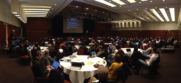
This week I had the pleasure of attending the inaugural Renaissance conference in San Francisco. I decided to go because, like the rest of the people there, I make apps.
All of us know that there is a lot that goes into making an app. First, there's the idea. What is the job that your app will be hired to do? Then there's design. What will your app look like? How will it work? And then finally, there's code, the part that makes your app do what you want it to do. The great thing about Renaissance is how it addressed everything that goes into making an app. There are lots of excellent conferences like WWDC that intensely focus on teaching developers how to leverage the powerful frameworks that allow us to build amazing apps. But this was the first conference I've been to that kept a higher level view that explained more of the what and the why than the how.
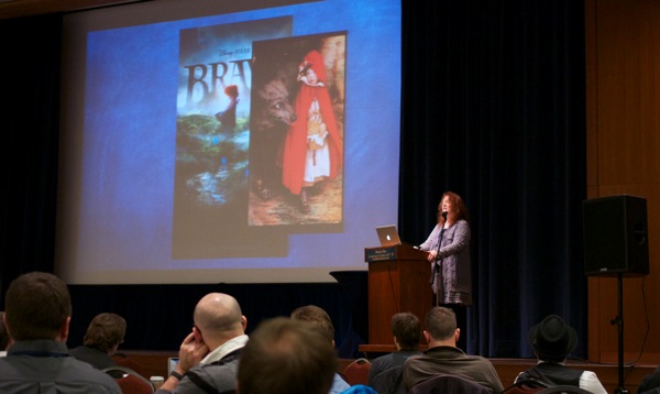
The creative process is a big part of making an app. Renaissance did a great job of setting the stage for a discussion around creativity with a talk by Brenda Chapman, the creator of Brave at Pixar. Brenda's talk was great and was followed by an equally impressive talk by Phil Letourneau on Animating Your App To Life. Animation is something that really enhances the experience in an app and Phil did a great job of explaining some lessons we can learn from Disney when it comes to designing the animations in our apps. Mark Pospesel then explained some strategies that developers can use to make their animations seem more real. The entire talk contained only a single line of code, but was extremely valuable for anyone trying to create engaging animations in their apps.

Those talks really set the standard for the entire conference. They were followed by great talks about the importance of type and copy, which is the true content of your application. Bluetooth Low Energy was a high profile technology at Renaissance, featuring several talks and a half-day lab where attendees could try out some of the technology being worked on by the presenters and ask questions about building apps that take advantage of CoreBluetooth and integrate with BLE devices. Not to be left out was Audio, which is one of the least often considered elements of a great app. It was great to see several great presentations about that there as well.
The business side of making apps was well covered. There were a nice variety of successful game developers (who shared some of their secrets for success), business leaders, and solo indie developers there at the conference giving presentations and talking to attendees. Enterprise app development is a huge market and was well represented at the conference. Members of the teams from Push.io and Parse gave great talks on supporting enterprise development through powerful backend services, and Brent Simmons shared some of his experience with NewsGator and Glassboard - his new enterprise collaboration iPhone app.
One of the recent trends in iOS app development has been a focus on quality. I was happy to see a lot of developers talking about this at the conference, and happy to see several great talks about the topic. One of the best points to come out of the first talk was that we should be testing to build better apps, not just testing to build bug free apps. One way to do this is to automate the testing on your apps, and Jim Puls from Square gave a great talk about KIF - a framework designed to do just that. I had the chance to talk to Jim a lot about KIF and I feel really good about using it as the basis for fully automated regression testing now. I'm looking forward to writing more about that in the coming weeks.
One of my favorite quotes from Steve Jobs is "Design is how it works". While developers still outnumbered designers at Renaissance, design was a major focus of the conference and almost the entire last day was devoted to it. One of the most insightful talks was by Justin Maxwell on the concept of Path Dependence. His point, if I can attempt to convey it, was that it isn't skeumorphism that people are against. What frustrates users is when designers produce a UI that is divergent from what the expectations on the spectrum of experience and functionality are. In the 90's, a UI for a sound mixer that matched a real life sound mixer made a lot of sense, because that's what users of the application would understand and expect since they were coming from a real-life sound mixer. That expectation isn't the same for something like a podcasting app, where there is no real-life path dependence to influence a user's expectation. His talk was fascinating and if the videos come out I definitely recommend checking it out. Finally, the atmosphere at Renaissance was really good.
I enjoyed the single track conference format, and I got to meet a lot of wonderful people before, during, and after the conference. Everything about it was very worthwhile. The venue was well chosen, in part because it gave the opportunity for exercise every morning, but also for being open and close to downtown San Francisco. I would definitely recommend going to anyone considering it next year.
Thank you very much to Tim Burks and Bill Dudney for organizing the conference, and to everyone else who came for making it a wonderful experience.