Sometimes it’s hard to believe that Grocery has been out on the App Store for over 5 years. What started out as my new favorite side-project 5 years ago has become an integral part of my life today. As my excitement for the app has grown so have my expectations for what it can become, and today I’m releasing the biggest update to Grocery in a long time. The version that’s shipping today is the best version of Grocery yet, and the closest so far to matching the vision I have for what the app can become.
Introducing Grocery 3.0
Design and System Features
I think about Grocery all the time and I’m constantly adding new things to my todo list of features and changes. That list tends to grow a lot after major iOS releases, and I don’t always get to everything I want to change when a major new iOS version is ready to ship.
I essentially started working on Grocery 3.0 after iOS 15 shipped. While I was working on my iOS 15 release last year I started to realize several things that I’d missed from iOS 14 and 15 that I didn’t have time to implement for iOS 15.
Some of the system features that really make an app on iOS 15 feel modern are:
Translucent toolbars and navigation bars
Ubiquitous context menus
Large title navigation bars
Consistent buttons and iconography
Consistent padding and spacing
Elevated system background colors for modals
Ever since iOS 14 was released I felt like Grocery was due for a subtle re-design. My goal for the redesign isn’t to change how the app works. The redesign is really all about achieving consistency across every screen of the app, and closely aligning with the system style everywhere that’s possible.
Achieving consistency has proved challenging for me, partly because of the age of the app and partly because of how I had been using storyboards. I started using storyboards early on and I didn’t really have any issues with them. But as I got into updating the app for iOS 14 and 15 I started to realize that they were holding me back.
The issue I was having with storyboards all boils down to consistency. Storyboards make it too easy to have different property configurations on different screens, which was making it especially challenging to get my large title navigation bars and translucent toolbars all working correctly across all screens and with support for all of my color themes. So I made the decision to completely remove storyboards and replace them with a very capable and well-rounded base view controller class that performs all of the necessary setup in one place. Now I finally had one code path for every screen to be setup the same way with the same properties. That was a big win for a consistency and a very necessary part of shipping this update.
Context menus are something I’ve been shipping since they were introduced, but this year I’m going much further with them. Context menu actions are offered on virtually every button in the app that has useful actions to provide. Even better, high-visibility context menus on the shopping list all have customization options now to choose which options are available. I think that’s something users are really going to like, because as I keep adding more and more actions I don’t want to overthink if they’re useful enough to warrant a spot. If they aren’t useful to everyone then some users can hide them.
The need for interface customization in an app like Grocery is high. The app has to strike a very difficult balance between having enough features for power users and being simple and focused enough for users who really do want “Just A Simple Shopping List App”. This release takes the biggest step there yet, by allowing users to hide major features like Recipes, Meal Plans, and Inventory if they don’t want to use them. The app is still all about shopping lists, so you can’t hide that just yet. The only other thing you can’t hide is…Settings….
Speaking of settings, Grocery has accumulated a lot of them. I actually think settings are great and I don’t have any plans to stop adding them. But settings do add complexity and that complexity needs to be organized. All of the settings screens in Grocery got overhauled and the new User Guide goes deep into what each of the settings actually do. I hope that will help people who want to get the most out of the app for them figure out what to customize and how that will affect the app’s behavior.

The user guide goes into detail about all of the settings and customizations that Grocery has to offer
The other big system change I made across the whole app is support for iOS’s elevated background colors. Grocery supported themes well before iOS supported dark mode, so I’ve always had my own system in the app for changing background and foreground colors. I have still integrated with the system for switching between light and dark mode, but until this release I wasn’t changing colors on modally presented views the same way that iOS does. The iOS system colors have a concept of “elevating” the colors on a modal view such that they contrast slightly with the presenting view below them. It’s a great effect and Grocery’s themes have been updated to take advantage of it.
All of Grocery’s iconography and typography has been overhauled too, mostly for consistency. I think everyone that’s worked on an app for more than a few years has realized how easily you can end up with different icons that represent the same thing but in a different way, and Grocery was no exception. I systematically went through and replaced all of the older icons and moved everything over to a new icon set such that the old ones don’t exist in the asset catalog anymore.
Feature Requests
I get a lot of very thoughtful and important requests from users in feedback emails. I always fix bugs that show up in emails, but I also learn ways to make the app more clear. If a dozen people write in with the same question then it usually means the app needs to explain something more clearly. I usually incorporate those kinds of changes in all of my point releases, and there are several of those in this release too.
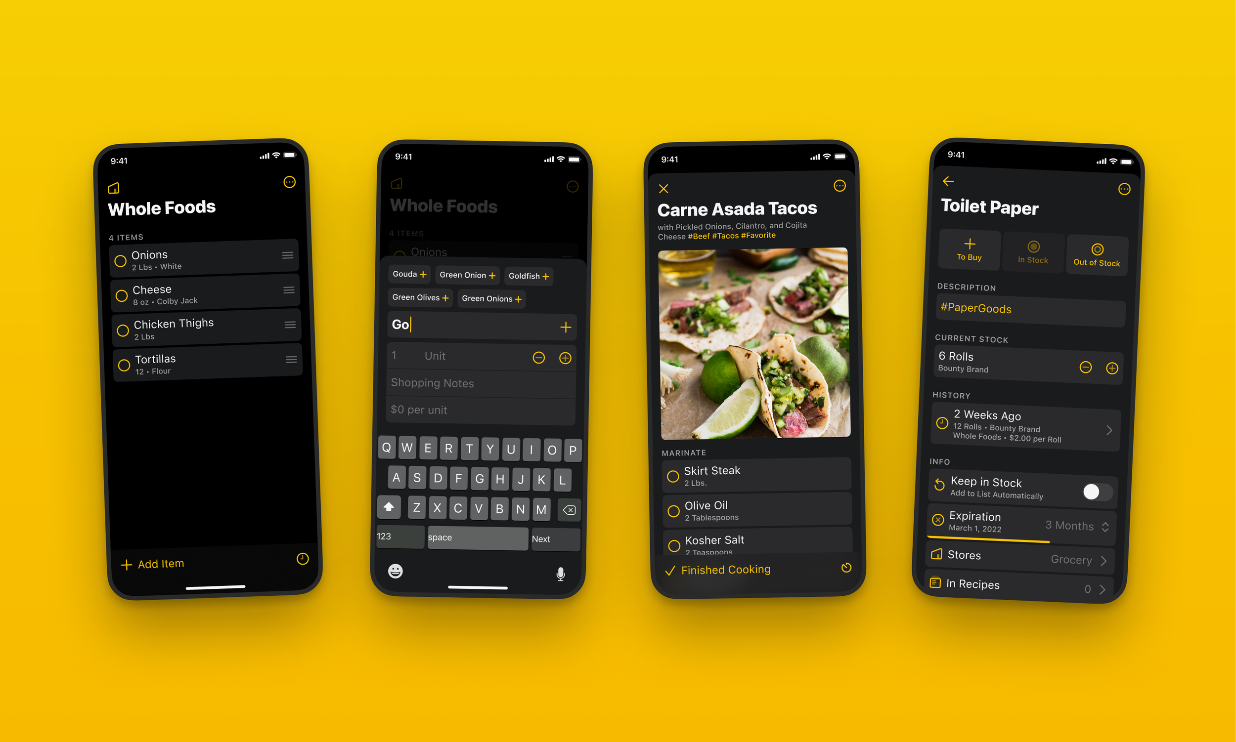
Many of my favorite emails to read involve feature requests. By far the most requested feature, dating back to 2017 when the app was brand new, has been price tracking. I’ve thought about adding support for price tracking for years, but I always resisted the idea because I didn’t want to make the shopping list too complicated. But the requests persisted, and after more than 2 years of brainstorming how to approach the problem I think I’ve finally got something that works.
Adding support for price tracking starts with the add bar. Grocery has always used a custom input accessory view to enter item titles and notes, and now the accessory view has been updated to include new fields for price, quantity, and units. These can all be turned off for users who don’t want them, but I’ve actually really enjoyed having them there. I’ve started adding prices to items as I shop over the last few months and I’ve found it helpful to see an estimated total for what my shopping list is going to cost. I like that it forces me to think just a little harder about what I’m going to buy to make sure I really need it.
Along with price tracking comes quantity tracking, which feeds into another very commonly requested feature for users who track their inventory. Missing from Grocery’s original implementation of inventory tracking has been in-stock amount. Now with quantity tracking you can actually see (and decrement/increment) the amount of an item you have in stock.
Most of the other user-requested features are small details and settings that have been added in this release, but I think one more is worth calling out. A very common request has been a faster way to switch between stores. Most users request this in the form of support for swiping between stores instead of selecting from a modal. I’ve played with implementing this a few times and never felt satisfied with it. I think that I found a better solution though, and it’s replacing the store selecting modal with a context menu. The benefit of a context menu over swiping is that you can see all of the stores instantly and choose which one you want to navigate to, instead of needing to swipe between a couple of stores to get to it. It’s made switching stores for me dramatically faster.
User Guide
The release has been essentially ready to ship for over a month now, but I’ve delayed launching it so that I could finish writing a new user guide. Grocery has had a fairly significant FAQ in the app for most of its life, and a lot of users have really appreciated having it. But overtime the FAQ has gotten out of date in a few places, and the structure of needing to ask a question to explain a feature hasn’t always been the best fit for the style of documentation that I wanted to write.
So in this release, I’m replacing the FAQ with a User Guide. The User Guide is intended to flow sort of like a book. Each chapter describes part of the app including both how specific features work and what the design goals are behind building them. The Mac and iPad chapters are good examples of this. They describe both what makes the Mac and iPad versions of the app unique while also explaining what I actually use those versions of the app for and why I think they’re important to have.
The settings chapter is predictably the longest. There are a huge amount of settings in the app and I think they’re all justified. But they do need some explaining and this chapter helps to describe them. There’s a section header button at the top right of the user guide chapters to jump between sections, and it’s especially useful for longer chapters like Settings if you’re looking for something specific within the chapter.
Conclusion
Grocery 3.0 is without a doubt the biggest release since 2.0. I wanted to wait until I had a release worthy of the jump from 2 to 3 before incrementing the major version number, and this release is absolutely it. Modern redesign, interface customization, major code base improvements, and new features like price and quantity tracking are a big deal for the app. Of course, shipping this close to the unveiling of iOS 16 in just a few weeks means that the work is never done. But for an app like Grocery that’s exactly how I like it.